
Project #5: Paired Color Identities
In this project we had to create a humument and write a description about it as if it were a gallery catalogue entry. My piece was called Dauntless and gave off a feeling of being brave, fearless, and determined. I think I did a good job at explaining all of the aspects of my piece and what they all meant. Creating the first draft of the humument took me about an hour and a half. Making the color palettes and references in class took about 2 hours. Then making the final drawing of the humument took about 2 hours to do. Writing the gallery note took me about 30 minutes and writing the gallery catalogue entry took me about 3 hours. It was a little hard to write as if it wasn’t my work of art. But I do think I ended up doing that really well while still describing the proper meaning of the piece. I could have expanded on my word choices when I was explaining some of the parts of my piece. This was overall a very fun final project to do. I enjoyed having to pick our own text from any book and creating something out of the words on the page.
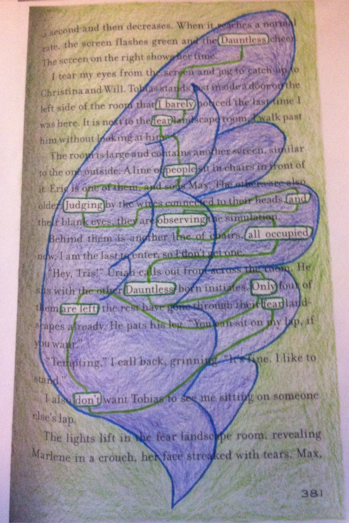
Dauntless is a humument created by Priya Maharban. The artist used a page from the book Divergent by Veronica Roth. The interpretation brought out by the artist in this piece is different than the interpretation of the text. The artist has designed the piece to be read from top to bottom with lines leading the reader from word to word. It reads “Dauntless I barely fear people judging and observing. All occupied. Dauntless only are left…don’t fear”. After reading this piece the artist wants readers to feel inspired by it. It is designed to give off a sense of bravery, fearlessness, and determination.
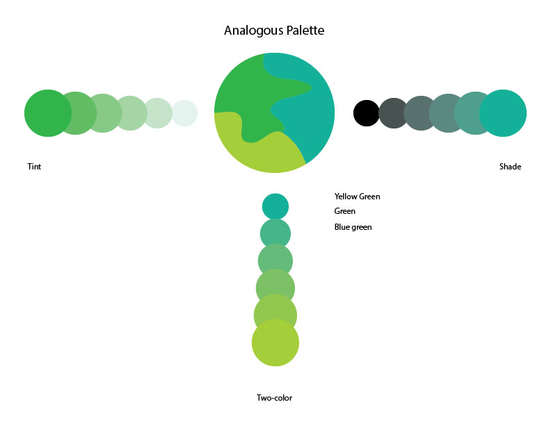
The artist used an analogous palette for the color choices of this piece. These colors are more of cool colors to go with the bravery theme. The blues and greens give off a positive effect. The artist also chose to use a wing to draw around the words to be read in the piece. The wing is the a symbol of bravery in the piece. It can be related to the bald eagle, which is a very brave animal. Always determined. The outline and inside of the wing are colored in shades of blue. The outline of the wing is a muted blue while the inside is filled with a violet blue. These colors both help with the bravery theme as intended. The words to be read are all outlined in a rectangular shape. The shape is also a dark green color. The reader is also led on to what word to read next by lines leading from one to another. Those lines are a yellow green color. Green is an overall positive color that helps with the positive impact of the piece. The outside surroundings of the wing are also colored in a yellow green.
The dominant color of the artists piece is the violet blue inside the wing. The sub-dominant color is the yellow green surrounding the wing and also the lines inside of the wing that guide the reader from word to word. The accent colors are the dark green that make up the rectangular shapes and the muted blue that is the outline of the wing.
The title of the piece is Dauntless and the word is also used in the reading. That word itself means fearless and determined. When the piece is read there is a message of not caring or fearing about people who judge you, especially if they are trying to intimidate you. This is comes from “Dauntless I barely fear people judging and observing”. The next few lines “all occupied. Dauntless only are left.” tells readers that they will keep doing what they’re doing but remaining brave and fearless will keep you going and staying determined. Then there is the last line “Don’t fear” which has the obvious message of telling all the readers not to fear those who judge them, especially if they’re doing it for negative purposes. The overall piece after reading and viewing it makes the reader feel determined and inspired if they see the strong message within it. This message is very different than what is on the original text of the page in the book. It is just a scene that actually gives off a nervous feeling. The message in the humument is the opposite.
Readers may find their own intepretations of this humument by Priya Maharban. Its main purpose is to leave the readers/viewers inspired and determined. Having them feel brave and fearless at the same time too. The artist used bright and cool colors to emphasize the positive impact/meaning of the piece and its message.

This project was interesting and fun to me. I just wish it could have been done when it wasn’t so cold. Though everything is beautiful at this time of year with fall/winter colors and Christmas decorations. Having to to find a new route to go either back home or to City Tech was fun to do because I got to discover new places that I didn’t know of before. I also liked the idea of having to persuade someone into wanting my app and wanting to take my route. The steps of the project were really helpful, how it went from describing the route, to the pitch, to the final revision. Also getting help from other classmates was very useful and it helped me with the revision of my pitch. The feedback helped me with expanding my essay, and I learned that I had to be a little more detailed on certain things. There were also things that I had to take out, I also did add some more information. The feedback was really helpful. I think I need to work a little more on my descriptions in my writing. So the reader can have a better image in their head of what I’m describing on my route. I think I did well at playing a persuasive role throughout the essay, having to make the reader want to take my route, and want to download the app. I also think I did a good job in explaining where exactly I walked on my route.
Priya Maharban
Dauntless
This piece is designed to give the viewers an inspirational feeling. Reading and looking at it, the viewers should get a sense of bravery and fearlessness. The words along with the image of a wing together give off those feelings to the viewers. There are many interpretations of this piece.
The OpenLab is an open-source, digital platform designed to support teaching and learning at City Tech (New York City College of Technology), and to promote student and faculty engagement in the intellectual and social life of the college community.

