Gallery Catalogue Entry Final

Garfield Crumbie

Fahrenheit 451 Text

This artwork is designed to introduce a new concept into an original piece of work that people would have never thought of. It ignites a new form of art that can cause a viewer to have to think, and break down what they just read. Art pieces that are generally known as “Humuments” are where this work originated from, as it conveys its own unique message. This message is brought forth and detailed by using the correct colors. The saturation, value,or even tone of the colors can either take away or add significance to a piece.

My art piece in particular comes from the well known novel Fahrenheit 451 by Ray Bradbury. Specifically from the first page, I skimmed the paragraphs for words that I could place together to create a new sentence. I had to decide if I wanted my sentence to carry out the same message from the novel, or if it should take a different direction. After 5-10 minutes of selecting the right words, I found that it depicted a similar mood as the text it came from. The end result states, ” It was his head burning down, and the fireflies in the furnace died and grinned- Later, that smile never went away- he walked one inch along the Earth as he felt the air there, and detected the temperature rise ten degrees”. This sentence structure has a flow that is broken, but it still makes sense. The slight descriptive language is just enough to help the reader picture the scene.

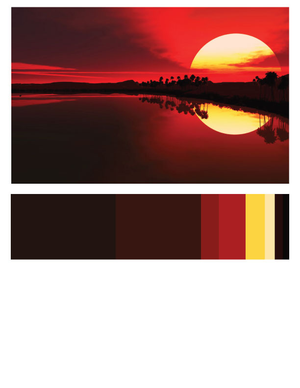
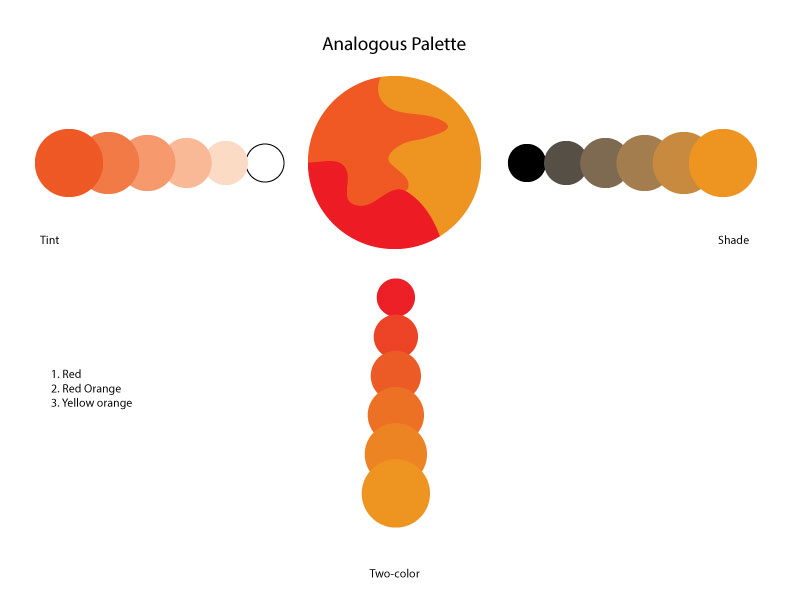
In order to select the right color for this piece, I had to determine which color would best represent the message that is being conveyed. In the piece, there are numerous references to heat, which can portray a dark mood for readers. Specific words such as “burning”, “furnace” or “rise ten degrees”, let me know to search for colors that have high energy. The colors that immediately came to mind was red, yellow, and orange. Generally, these are the colors you see in fire or anything that involves heat, which can give off high amounts of energy. I chose to adjust these colors by using Adobe Illustrator and making a color palette as a guide for my process. This is the most interesting part of the art piece because it was engaging by allowing me to experiment with multiple colors. During the process of searching for the correct color, I discovered colors that were new to me and depicted what seemed like an illusion. I decreased saturation, and increased value so that I can have the appropriate tone. After this portion of the art piece was complete, I was left with the main colors red, red-orange, and yellow-orange.

Figuring out how to apply these colors to the actual art piece was another experiment within its self. I printed out multiple copies of the texts to do test runs on in order to see which one turns out the best. I decided to make an illusion by outlining the words of the page so that it seems as if the text is coming off the page. I used jagged edge lines to help it look more appealing to the reader. This technique is commonly used in comic book art to depict a shock or explosion which gives a boost to the readers imagination. The color palette served the purpose of indicating the dominant colors of the piece as it gradually decreases to colors that are used less. The main concept of this art work is to emphasize the mood of the text by highlighting key words that give it such a mood. And now, as you can see, the end result depicts a new scene for readers, and it holds a similar concept to that of the original text.


Reflection

During the course of this semester, I feel that I have grown mentally as well as academically. I started college with high expectations as to how things would go. Over these view months my work process has improved because I have accomplished a new sense of discipline when it comes to completing assignments. As soon as a new project was assigned, I found my self brainstorming and planning out the timing and hours that I would have to devote to the work. There were numerous times that I had to turn down my friends on weekends because I knew that I couldn’t balance all of these things. I spent 2-3 hours a night writing out and revising work for the projects and asking questions where I found instructions confusing. I realized that college was nothing like high school because I would try to apply my self to my work, but still find it difficult to get an A. I was willing to re-work assignments that I felt had too low of a score because I wanted to start off my first semester with a high GPA. Somethings I think I can work on is adding more information when required, and using more descriptive language to help readers understand the text. I believed that I excelled at planning out and executing assignments in order to hand them in on time. I did a good job at answering all the questions asked,and following the guidelines that are provided. One thing I can tell my peers about my work, is that it will not stop improving over my college career because I know there’s always room for improvement.

Gallery Catalogue Entry Draft

Garfield Crumbie

Fahrenheit 451 Art Piece

This artwork is designed to introduce a new concept into an original piece of work that people never knew could be created. It ignites a new form of art that can potentially cause the viewer to rethink the whole concept of the subject. It also depicts a message that will give a certain vibe to the viewer. Every other art piece that is similar to this one, such as the “Humument” has its own message and vibe that is conveyed, and can be brought forth by using certain colors. The saturation, or even the hue of each color is a significant trait that can either bring together, or take away from the concept of the art.

My art piece in particular is from the text of Fahrenheit 451 by Ray Bradbury. Coming from the first page, I skimmed the paragraphs in search of words that could be placed together in order to make a new sequence. I had to decide if I wanted the sentence to carry out the same message from that of the novel, or if it should take a different direction. In the end it seems to convey the same dark vibe compared to a story about a Utopian society. It was not a difficult goal. It took about 5 minutes to find the proper words that coincide with each other and maintain a certain meaning. I was left with a satisfying result that states, ” It was his head-burning down- and the fireflies in the furnace died and grinned- Later- that smile never ever went away- he walked one inch along the earth as he felt the air there, and detected the temperature rise ten degrees”. The sentence structure has a flow that is broken, which makes the sentence seem incomplete.

In order to find the correct color for this art piece, I had to determine what would represent the message that is being conveyed. In the piece, there are numerous references to heat which in my opinion, can portray an “evil” tone. Words such as ” burning”, “furnace”, or even “rise ten degrees”, let me know that I need to search for colors that represent high energy. The colors that immediately came to mind was red, yellow, and orange. Generally, these are colors that you see in flames, or any thing that involves heat, which can give off high amounts of energy. I chose to adjust these colors in Adobe Illustrator  to make a color palette so that I have a guide for the process. This is the most interesting part of the art piece, because it is the most engaging by allowing me to experiment with numerous colors. In the process of searching for the best color, I discovered colors that seemed like some sort of an illusion. I had to make sure the colors were not too saturated because it would take away from the high energy that I need to convey. After this portion of the piece was complete, I was left with the colors red, red-orange, and yellow orange.

Figuring out how to get these colors onto the actual piece was another project in itself. I printed out several copies of the text to experiment on in order to see which one will come out the best. I decided to make the words pop out from the rest of the page by outlining them with jagged lines. This is a technique used in comic art to depict an explosion or catch the readers attention. I then used a lay out palette that showed the dominant colors that would be the background shade of this piece. The secondary colors would be where I want the readers attention to be drawn to. This section contains colors with the least saturation and high value. The main purpose of this art work is to emphasize the mood of the text by highlighting the key words that make it this way it is. The end result depicts a new scene for readers, that holds a similar concept.

Prevalent

Source: Merriam-Webster.com

Prevalent- accepted, done, or happening often over a large area at a particular time: common or widespread

I can across this word in the text for the final exam for this course. I immediately recognized that I wasn’t familiar with this term. In the text, it stated, ” Attention deficit hyperactivity disorder is now the most prevalent psychiatric illness of young people in America…”. After researching this word the text was much clearer, and I understood it when it came up further on in the text.

Gallery Note

Garfield Crumbie

Fahrenheit 451

This artwork piece is designed to reveal the key words that give this text the mood  it holds.It paints descriptive images in the readers mind as they understand what’s going on in the piece. A dark mood is portrayed as it  describes as scene of burning objects.

Metamorphosis

Source- Merriam-Webster.com

Metamorphosis- a major change in the appearance or character of someone or something.

When I came across this word I already had a slight idea of what was being said. It was mentioned in the sentence stating, ” This one shows the opening or Franz Kafka’s Metamorphosis”. As you can see, the sentence that this word is in doesn’t actually give the reader a sense of it’s meaning because it’s being referred to as the name of a novel. After researching this word I was given more clarity.