- Write a brief paragraph to introduce yourself to your visitors and explain what they will find on this site. Be sure to add more developed content to your About Me page. (Edit this paragraph in Dashboard > Widgets > Text)
Learning Blog Archives
-
Recent Posts
Categories
Tags
- Academic Sample
- ADV 1100
- ADV1100
- Aesthetic Mapping
- A Literary Visitor Strolls in From the Airport
- Bio
- Camera Lucida
- CDMG 1111
- Chart
- City Limit
- City Tech
- coursework
- Drafts
- English 1101
- Field Trip#1
- Field Trip#2
- Field Trips
- Final project
- Glossary
- Inked
- OpenLab
- Part 1
- part 2
- part 3
- Peer Feedback
- project#1
- project#2
- project#3
- Project #4
- Project#4
- Project#5
- Project#6
- Reflection
- Research
- resume
- Section D 306
- Sketches
- Summary
- The Boston Photographs
- Trip#1
- Trip#2
- Word#1
- Word#2
- Word#5
- Written Assessment
Academic Samples
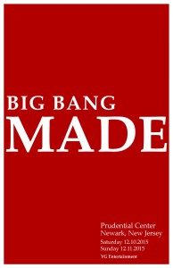
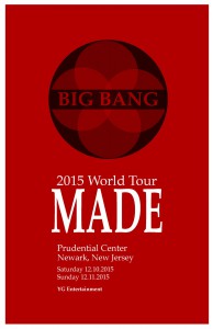
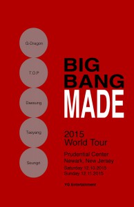
In these site above you can see all my designs I have done. I really worked hard as a design to make sure my designs were the best. However as a designer its hard there are always new ideas and designs.
Bio
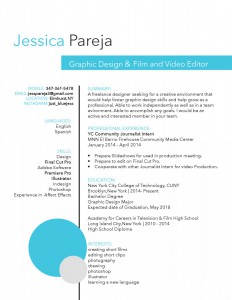
Hi, my name is Jessica Pareja I’m a sophomore at New York City College of Technology. I’m currently majoring in Communication Design. I enjoy photography, I believe once a camera captures an image, it can describe a million words. Before majoring and enrolling in New York City College of Technology, I did film. I enjoy editing videos, as a editor I enjoy creating stories. As a designer I enrolled in City Tech not knowing much of design however my passion for design encourage me to continue. My designs to people might seem weak and in need of work. However, I am thankful for those designs because for every design I do lend closer to my dreams. As a person majoring in communication design there is one thing I would want to say, its simply that design is everywhere. I would like people to understand what design is and how beautiful it can be. As a designer I hope one day I can achieve this. However, currently I want to continue to grow independently and create beautiful designs.
The Society of Illustrators
During our class time, we went on another field trip to visit the Society of Illustrators. The place was a small place however, it had showed me many artwork and gave me ideas of how the Design isn’t just design in posters its art. The Society of illustrators facility has many works from art to picture books and each has different purposes. These artworks had designs that I wasn’t really awarded of. For example, I knew that the art in picture books were made from someone but it didn’t remember inspired me to dig deep. I always liked the images in books but I didn’t really pay close attention. Just like many people, I want to design what is current. The Society of Illustrators facility is well established even though its small. The Society of Illustrators facility is located in 128 East 63rd Street. An area where there is people however, since its located in a small street you can’t realize what it is. As they were saying in Society of Illustrators people come to see what new work artist bring. The person showing us around help me understand that every design is sketched for example, he showed us an artwork of Harry Potter and Chamber of Secret. Every art has a different meaning to it. Society of Illustrators had many different floors and each had did works. The first Floor Books, the second floor a Japanese artist, the third was a restaurant and the last floor was a storage room. Each floor was amazing displaying how art is a step toward design. My favorite art in Society of Illustrators was an artwork of a pig with a red and white shirt. These art was toward the children stories. Another art I liked was the Robin Hood, The black arrow by Robert Louis Stevenson. It was beautiful and well illustrated I enjoyed it. I learned many artwork and the struggles to have a design work in details. It has help me with my design work as an artist.
The Field Trip at UFT Printing Facility
During our class time, we went on a field trip to visit the UFT printing facility. The printing facility has showed me what to expect and gave me ideas of how the Design field works in terms of printing. The UFT Print facility has many different printers and each has different purposes. These printers do so many things that I wasn’t awared of. The UFT printing facility is well established and like an facility it does many jobs for city public schools anywhere. Many people trust UFT printing facility to print their posters, envelopes, letterheads and so much more. Like I mentioned before, the UFT printing facility has many kinds of printing machines and each serving different purposes. Many of this machines are up to date, which is surprising because each machine is very expensive. However, the machines might cost money but the produces are very high quality results which makes the customers satisfy. The UFT printing owns many printers, one of the machines is the Epson Stylus pro 9800 which is used for large photos or graphic prints. Another machine they have is the is first of its kind here in the US which was brought from Japan. That machine was the Konica Minolta bizhub PRESS C8000 which is used for digital color prints. The machine was being beta tested and the owner of the facility Oscar Rivera decided to buy another one to expand his printing business. Many of these machines from UFT are work for thousands of jobs a day and Mr. Rivera makes sure that they always operational and maintain properly. The UFT Printing Facility is successful and it prints jobs for NYC public schools. UFT Printing facility produces also print work for all the 5 boroughs, and any kind of printing jobs that comes in, they make sure it’s done on time and even if there’s a problem they will make sure they get the job done. They print many things that we weren’t awared of like envelopes, school forms, and any kind of document printed work needed. When the UFT facility first began they only had 2 printers and one PC. Now they have many machines and resources that help make the print facility run effectively. I have learn a lot of printing and the approach when printing for client or what machines to look in companies in regards to print jobs. I learned many printers and the equipment of printers to help me with my design work for printing.
Johann Gutenberg Report
Today there’s a big market in Communication Design and it’s needed for all kinds of businesses everywhere. A long way has come and gone in the world Graphic Communication Design and today it continues to grow. However, the field has a long history and it dates back many years ago when it was in its primitive and experimental stages.
The stages of early printing date back years and some have improved along the way which means we still use today. Johann Gutenberg invented the first printing press in 1456, Hence the name the Gutenberg Press. This machine was the first printing machine able to print out type. This machine was able to produced the very first mass production of printed which allowed these reading material ever to be read in the world. The material that was mass produced was the Bible which was made easier to be distributed all over Europe. The bible was name as Gutenberg bible in refers toward the printing press. Gutenberg’s invention was used for many years to come until 1886, when Ottmar Mergenthaler invented the Linotype machine. This machine was even faster and showed more results. As years went on many more new types of print machines were invented, printing documents became faster and in less time. Which was creating and making the Communication Design field bigger, better and more demanding.
There are many methods still used today and one method is the series of fonts that were created years back and have become modernized in order to use them in the 21th century. Communication Design market today is well known to be very demanding and plays a huge part in this world. Today there are there are many kinds of designers and many printing methods. The are many types of designers and examples are designers who do packing, work for publishing companies, and digital publishing and imaging. There are many kinds of printing machines that produce small and massive prints. Each have various type of paper that have been created over time, and each machine that will help print this. The type of printing which is will become a big help is 3D printer which can print 3 dimensional objects that are design in a program. In this world there are many printers and there will come to exist printer far better.
The Communication Design industry has come a long way and is still growing. However, we can’t forget the man who made it possible and was able to create the printing world we know today. It all began with one simply printing press, a press Machine that was able to print a mass produce of bibles, In today’s world mass-production can happen with any printing machine that’s able to print any kind images and documents all over the world.
Project#5: Gallery Catalogue Entry
Love is a humument created by Jessica Pareja. The artist used a double page from the book the famous Romeo and Juliet by William Shakespeare. The interpretation shown is to bring out the artist piece in a different interpretation of the text. The artist had designed the piece to show the reading from top going across and going to bottom with lines guiding the reader from word to word. The reading says “ I cannot nor any other man. I love myself. Love lent me counsel and I never would.”. After reading the piece, the artist wanted the readers to understand her feeling and thoughts. The artist wanted to express that someone dear to her left however, she just tries to love her inside in fear of getting hurt. It is designed to give off a sense of sadness, understanding, and fearful.
The artist used an analogous palette for the color choices of this piece. The colors are meant to give a sign of hope for these character. The theme might be love, looking for love but she just wants to be loved by people surrounding her. The blue and green as well as gray give off a positive color. The color shows more of a sad feeling and yet with the yellow it symbolism hope within herself. The artist chose to draw a heart in the middle and colored it yellow to show around the words more clearly in the piece. The yellow heart is hope of love is within herself and it symbolism a light to her life. All the colors are around the heart to symbolism her darkness and fear. The colors around the heart is a violet blue, dark green, light green as well as gray. The words represented in the artwork can be seen clearly and they are in a rectangular shape. The lines are shaped in blue, the blue is sending out a message of sadness.
In the original text, the artist used Romeo and Juliet to show the opposite of being in love. In these scene the couple just started to fall in love with one another however, the artist try to do the opposite. The message is very different than what is on the original text has however, the artist felt like it was perfect for it describe sadness in love.The scene is when Romeo and Juliet just start falling in love and is actually giving a sense of love feeling. The message in the humument is the opposite, she wants to love herself and scared to love someone.
Overall, the readers and artists might question the artist choice in color or why that scene or they may find out their own intepretations to this humument. The artists main purpose is to leave the readers and viewers inspired and just have an understanding to her inner feeling. This feeling that have a hope and fearful start. The artist tried to used muted color and cool colors to show the impact of her situation and how slowly she grow out of it. The meaning of the piece is to feel love.
Project#5: Gallery Note
Jessica Pareja
Love
This artwork piece is designed to represent what love is, its bringing out an emotion in want is “love” according from the text. The artwork is portraying how the character lost someone dear to her and now she can’t love a man. However, the true feeling is the viewers to understand her own inner feeling. The artist uses a text from Romeo and Juliet and the image is to show her opinion.
Project#4: Revising the pitch
Brooklyn if you walk around the neighborhood, you’ll encounter many lovely places. However, the question is what influences people to choose the path they decision to walk on? Many ideas come to a person’s mind when choosing a path, it can come from using your five senses. If you walk in the streets of Brooklyn you’ll get to see areas full of crowd people and as well as lonely places. I understand the people who choose to walk in crowded places, there you’ll see a lot of commercial areas toward the nearest subway. You get to see buildings toward being able to smell different kinds of food. However, there are people who walk in lonely areas. The feeling of stress that puts people to walk along lonely areas. The sign of freedom that makes people enjoy of being lonely or being with someone to just talk alone with.
There are many people who come visit Brooklyn, some just visit, some just moved here and others just work here. If those people don’t know the area or just came out of work, they’re most likely people who’ll fall for easy traps that led into crowded areas. People who study around City Tech which is located in Jay Metro Tech station. They walk straight from the campus point and straight into the train station. These people whose head are full of work, studies, and extra information won’t pay attention to anything but getting home. How about the people who have free time, they just walk to the store get food and wait till time flies. People shouldn’t just kill time, they should walk on these people lonely areas to realize the bad pain. People can only experiences areas with loneliness, if people decided to walk areas with a calm senses. People can began by exiting out of city tech and heading up towards Johnson St and passing Adams st. Making a right people will see Cadman Plaza East and Tillary Street, there people will witness the Korean War Veterans Plaza. There people will see the park with not enough people to be bothering one another. In the Korean War Veterans Plaza, people just walk around there, however you can feel the presents quietness just by being there. Its a small ahead that people can quietly sit around till all their ideas or pressures they have leave. Comparing the more crowded areas with here people get the feeling often to get lost in their thoughts.
The Korean War Veterans Plaza isn’t the place to hang around people can find lonely areas ahead. However, what happens the Korean War Veterans Plaza is the history it represents. In a local online newspaper, Don Evans stated “It’s a small monument compared to the expansive World War II memorial in nearby Cadman Plaza Park, the heroic arch on Grand Army Plaza honoring Civil War soldiers or the modest Korean War Veterans plaza in Columbus Park. Designed by architects Danby and Nute, it is a tribute to soldiers from an old neighborhood that is being revived by completed high-rise apartment buildings such as Oro and Bridgeview Tower with three others yet to come.” The Korean War Veterans Plaza is a memorial of the World War, for those soldiers who fought. The Korean War Veterans is a place of peace because not only do the people know its an area for respect but its written to never forget its propose. As Evans Stated ““In loving memory of those men of this district who in the war of 1917 and 1918 fought and died for freedom. Their neighbors through the Seawanhaka Democratic Club erect this monument,” the inscription says.” The Korean War Veterans Plaza is a place that has shown peace, quietness and as well as loneliness. The plaza influences the people to find happiness in a memorial.
After a long day, the tour ends and people have to return home. Lonely and quiet areas around the Korean War Veterans Plaza help people gain a sense of peace from any situation they’re dealing. Being in crowd areas maintains people busy it will make people feel annoyed that everyone in your way. However, once your at the Korean War Veterans Plaza you get the sense of relax. Being in busy area doesn’t relax anyone, people try to walk areas they’re going to walk lonely areas to try to avoid the crowd without making someone have a headache. Taking lonely areas gets a person thinking less, sometimes lonely areas can take you the fastest way to avoid the crowded areas. After seeing the history of the Korean War Veterans Plaza. it makes people enjoy there walk and view. Instead of just having to a relaxed area, the history of the Korean War Veterans Plaza opens up minds. There aren’t many people who know the history of the Korean War Veterans Plaza. This will allow people to open up and wonder areas, a quiet area to know about the history.
Work Cited
Evans, Don. “Brooklyn’s World War I Memorial Gets Overlooked on Veterans Day.” Brooklyn Daily Eagle. Brooklyn Daily Eagle, 14 Nov. 2007. Web. 21 Dec. 2014.
Coate, Betty. “Chapter 1 A Year Later: Brooklyn Korean War Veterans Plaza.” The Unidentified Solider in the USO Poster: An Extraordinary Odyssey. By Richard Coate. N.p.: n.p., n.d. N. pag. Web. 21 Dec. 2014.
Project#4: Aesthetic Mapping (Self-evaluation)
After doing project#4, I came to an understanding of this project the point of this was to get a the writer to understand the feeling of the setting. As a writer one must understand how to write a description. As a writer one must come to an understanding of their point and force. According to my essay in the pitch as I stated “Brooklyn if you walk around the neighborhood, you’ll encounter many lovely places. However, the question is what influences people to choose the path they decision to walk on? Many ideas come to a person’s mind when choosing a path, it can come from using your five senses. If you walk in the streets of Brooklyn you’ll get to see areas full of crowd people and as well as lonely places. I understand the people who choose to walk in crowded places, there you’ll see a lot of commercial areas toward the nearest subway. You get to see buildings toward being able to smell different kinds of food. However, there are people who walk in lonely areas. The feeling of stress that puts people to walk along lonely areas. The sign of freedom that makes people enjoy of being lonely or being with someone to just talk alone with.” I felt like it was a good introduce for the essay. I described what my topic of my essay was going to be about however, as Hai Lin commented I should have started stronger. In my body paragraphs an example, ” If Korean War Veterans Plaza isn’t the place to hang around people can find lonely areas ahead. There are more areas that people can enjoy, while walking people can continue there path though walking towards Clinton and Pierreport Street. From Pierreport street taking a right to Hicks street. In the area people will see varieties street that are lonely there, people can just walk in the area and look at the old buildings. The you can see the amazing architecture. People can walk around freely without bumping to someone anyone can almost feel that they own the street however there might be two or three people in the surrounding. While looking around the area, the people who enjoy architecture might draw sketches or take pictures that will help them better the area for the future or keep it the same for their projects.” I wanted to stay force of lonely however, I just describe the place instead of force why it feel and how the surrounding is. Same goes with my other essay, I start to force on other and not my point my essay however, I feel like I did in my second essay.

