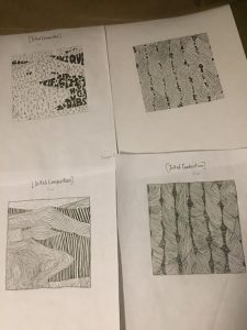
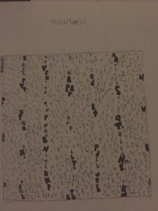
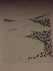
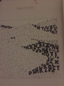
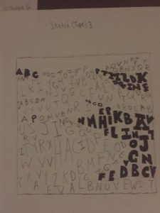
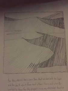
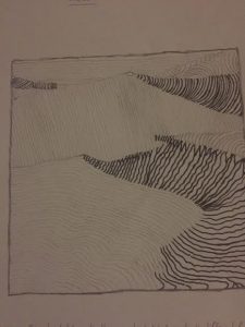
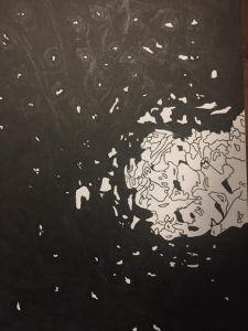
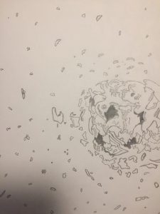
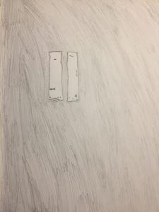
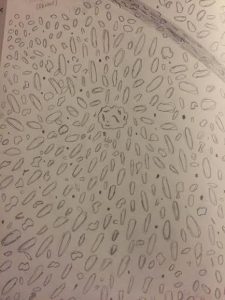
For my inked sketches I’ve decided to really change things up and decided to incorporate major detail into what I was doing. For the handmade twists on the top right I’ve decided to follow the shape of each twist and incorporate it into lowercase type. I didn’t just throw words into it to make it random, but this time I wanted to make it unique. For my line (sand dunes) bottom left, I wanted to add gradient in it to achieve the rich and smooth texture of the sand. On the top left for my type for the sand dunes I wanted the darker side of the dunes which represented the shade to look bigger so that when seen from far away people can see it. Lastly for the bottom right for the lines for my pattern image I kept that same feeling of my first line sketch so that it achieves a rough, itchy, but yet homemade feel. I kept the contortions too add a bit of that hand made feel. Subject to change for final.
Author Archives: Yunique Griffith
Final Pencil Sketches
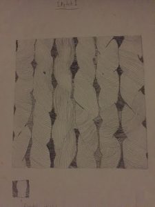
For my first line sketch for my pattern image I wanted to implement contortions and twists that made the feel homemade and the mood smooth. The image I’ve chose was hand crafted and not made by machine, so that meant some things were going to be loose and weird. If it was made to near perfection, then my image would’ve been perfect symmetrical wise.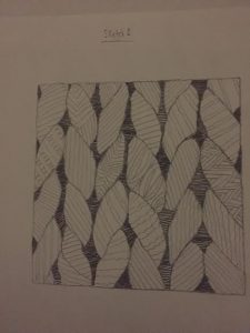
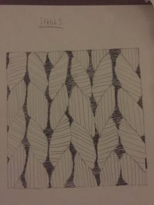
For my second line sketch of my pattern image I’ve felt that I lost the feel of the image I’ve chose. for my first line sketch I’ve added twists and contortions and that’s what I was aiming for, but I lost it for this one. I’v achieved the mood I saw which was a itchy, but calm mood, but I mad the feel of it too perfect. That wasn’t what I wanted. I’ve also implemented patterns of my own to give it a different feel, but again I didn’t think it achieved what the image portrayed. This is only a sketch and not final.
Again for this image I made the lines too perfect and added minor difference form my second sketch. I also didn’t like this image and though it was time to go forth a different path for my ink compositions. Once again this is a sketch and not final.
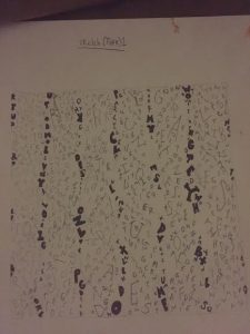
This is my first sketch of my type for my pattern image. I wanted to instead of adding the letters into the shapes of the image, I wanted them to vertically go down. The bold letters shows the dark spots within the image. This is a sketch and is not final.
For my second sketch for type on my pattern image I’ve decided to enlarge it so the type can be more visibly seen. I’m not quite satisfied with my sketches, but as I get to some of my ink and final presentation drawings it turned out great for me. This is a sketch and is not final.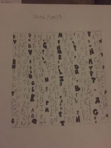
For my third sketch I wanted to enlarge my the type and when I took a look at it I thought this looked ugly. It’s as if I completely lost the feel of both the image and what I wanted. Although this is a sketch and not final I wanted to show people my process from beginning to end. For my refined ink compositions they get better.
For my first sketch for my type I wanted to add the letters in a somewhat horizontal motion so that it gives it the feel of smooth terrain which is also what I’ve described for my mood. I was quite satisfied with my first type sketch for my texture image and it gave me a sense of what I wanted to do. Not final.
For my second sketch for type for my texture image I wanted to make the letters look bigger. I wanted to show the clear contrast between regular sans serif type to ultra bold sans serif type. I liked this sketch I did, but I wanted to make it more clear and aesthetically pleasing. I was thinking about incorporating this sketch into my final ink one, but i had other ideas in mind.
For my third sketch I’ve also made the text appear bigger and for some reason I didn’t think I’ve achieved the mood I wanted. I wasn’t satisfied with the product and brainstormed other ideas to make it look more simple. This is a sketch and final.
For my line sketch for my pattern image I’ve added smooth lines that shows a clear contrast between light and dark elements. One thing I thought I did wrong was by adding lines that separated from light and dark. This isn’t what I wanted and for the next sketch I’ve decided to go for a different approach.
For my second line sketch for my texture image I’ve decided to eliminate all divisible lines. For the bottom right side for the dark elements I think that some areas didn’t work because I’ve added squiggly lines and I thought that it quite didn’t match the mood i was aiming for. Not final.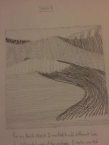
For my third type sketch for my texture image I did the same thing for my second sketch, but decided that I wanted to make the lines smaller. I also made various pattens for different areas of the sand dunes, but once I looked at from far way I didn’t like it. Not final.
Yunique’s Final Inked Composition (Step 4)
This is my final inked composition of my ambiguous photo of the hole in the wall. I can say that this was hard to do, but no matter what I pushed myself through it. I incorporated many elements of black and white and for the hole in the wall I wanted to add some definition to it to make it look exhibited. One thing I wish that could’ve came out better was the ink because for some areas it appears to look lighter outside the top and side areas of the image. 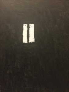
This is my final inked composition of my obvious image of the reflected window. As stated earlier in my other inked composition, I took out a lot of detail that was going to be in the inked out background of the wall. For the actual image of the window I kept in the dirt and mold being shown, but I made it to as where a lot wasn’t being displayed. The original image didn’t have a lot of specs, dirt, and mold so I decided to take it out and add my own details. This came out perfectly and I don’t think I should’ve added anything else as it was going to ruin it.
Note: This project gave me a lot of clarity on obvious and ambiguous images and gave me a better understanding of it. From now on when I look at any photograph I could look at it and determine what it is whether it’s ambiguous or obvious. One thing that was challenging was the lines being displayed because for most of my sketches I had to tune out most lines and configure it into either organic or geometric shapes.
Yunique’s Refined Sketches (Step 3)
This is the refined and final sketch of my ambiguous photo of the hole in the wall. I’ve decided to change it up a bit and just really focus on the hole elements and see how I could put it on my bristol board on ink. The darker shades of black on the actual hole itself was represented in my image and I decided to incorporate it onto the refined version. The specs outside of the hole itself is peeling paint that surrounds it.
This is my refined and final sketch of my obvious image of the reflected window. Now as you can see I’ve also decided to scratch away most of the elements in my first sketch as it made it look a bit more ambiguous. I thought it was one of my best refined images due to me making it simple and not too complex. I focused more on what was being shown in the window reflection which was dirt (30%) and the background which was (70%) . I was going to add aspects of the dirt being in the wall in the back, but I wanted to make it look more unique in my own way.
Yunique Griffith’s Sketches
This was a rough sketch of my gum photo which was obvious. There was a lot of fine detail incorporated within my photo, but I’ve decided to simplify it and give it its own taste. The gum was 30% of my image while the rock and pebbles surrounding the gum on the ground is composed of the remaining 70%. I’ve ultimately decided to not put this in my final pieces due to the amount of fine detail I would have to incorporate in my final inked piece.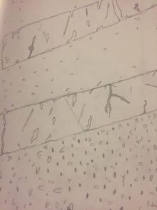
This was a rough image of an obvious image I took which is a sidewalk. This sketch turned out to be one of my favorite amongst the rest of my sketches, but I didn’t like the amount of shades incorporated within it. If this was going to be my first inked obvious image, then I would have needed to have added light and dark compositions into it.
Note: The photo of my sketch didn’t come out correctly as the ground in which holds the crosswalk is supposed to be larger. It was supposed to come out as 30×70. I kept trying to fix it, but to no avail. 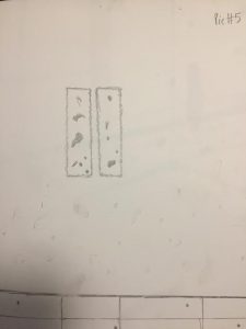
This was a sketch of my last obvious photo which is a window reflection. The window had mold and dirt stains tainted on it, but the reflection with the dirt had been darker when it was displayed. This sketch was later picked for my final composition and I tweaked a lot about it through many suggestions.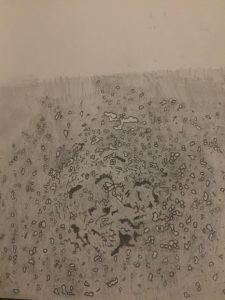 \
\
This was my first ambiguous sketch in which is supposed to be a hole with peeling paint around it. This was by far one of the hardest sketches I had to do, but decided to challenge myself by adding fine detail of the paint and the after effects of the hole. For this sketch and for this purpose only I decided to trace it along some tracing paper and incorporate onto my sketchbook. I loved the way it turned out and chose it for my final inked composition. 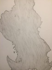
This was one of my second ambiguous sketches of a wall which has peeled paint on a white painted background. The elements incorporated within this image has minimal tearing of paint through the sketch and if you look at it closely, it kind of looks like a pig. The wide tearing of the paint is 50% and the white background in which supports it is 50%.
This is one of my ambiguous sketches of a tear through a wall in which has mold fighting for dominance. I decided to just sketch it out to give me some ideas on what it could possibly look like on bristol paper, but I decided to not put it as my final inked ambiguous composition.
Yunique Griffith’s Photos
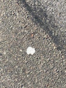
Obvious picture (Gum) George was walking down Adam Street while listening to his favorite podcast. He was a man of rage and anger and everyone around him called him impertenent, careless, and curt. As he was crossing the street to get to his job, a drunk man pushed him and started naming him foul names. George responded by pushing him back in which started an altercation on the street. Nearby cops came in in order to break up the fight, in which George spat out his gum at an officer nearly missing him. George was tackled down by both cops and was later arrested for assaulting an officer. Many months have passed by in which the gum sat there with no interaction. There have been many days, both cold and hot, in which the gum started becoming one with that of the ground.
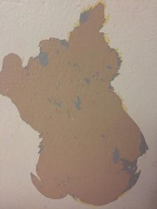
Ambiguous Image (Peeling Paint) On a hot summer day in New York City, there was a local community event in which invited nearby residents for a group activity. Out of everyone there, a young boy named Turner was very excited for what was to come. He loved to paint and it showed throughout his various pieces of art. Each person was given an area on a wall in which to paint on and each had to paint it in different colors. Turner who was only 11 at the time decided to keep the original color of white on the wall while peeling off the old paint from it. Nearby neighbors shouted at him for ruining his image, but Turner was somewhat suprised by his work. Eventually he was kicked out from the activity for negligence. In the end most people looked at what he did and was suprised by what they found. A pig on the wall.
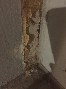
Ambiguous Image There has been an abandoned building in Bedford Park which acts as a symbol of failure to nearby residents. The building was prosperous in the late 80’s serving as a nightclub for the ones that dared to party. Inside the building was a disaster as nearly all the paint was peeling off and termites were desecrating the wood that supported the infrastructure. This building was being dominated by forces that weren’t human and called this place their kingdom.
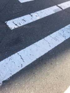
Obvious Image (Sidewalk) It was an early morning in Brooklyn, New York as construction workers were painting newly bright stripes on the street. This was a brand new street created on Astro Plaza in which commuters can use to travel to the newly renovated mall across the street. Each day had passed by with the stripes on the street forming from a healthy glow to a more scratched up version. Apparently it costs New York City approximately thousands of dollars to repaint and repair city streets. This street became more dirty, rugged, and abandoned. The mall across the street wasn’t doing so well so in response the City Council decided to demolish it. This street has been abandoned ever since and has acted as a symbolic representation of failure.
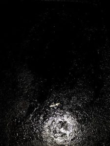
Ambiguous Image (Hole) John had just graduated from college with a psychology degree and has been stressing out due to the man jobs rejecting his applications. He was vexed and almost felt like giving up. One day his friend Wade told him that he should release his anger in classes that allow you to destroy random things. He also said it was the best way to relieve stress in a more manageable way. John agreed and decided to go home, but when he got through his front door, he saw his girlfriend kissing another man. John was furious and in quick response he punched his hallway wall leaving his girlfriend screaming. He immediately told his girlfriend to pack her bags and leave his house.
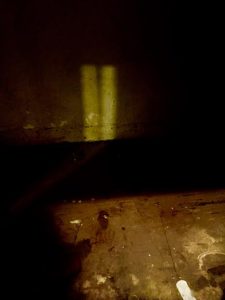
Obvious Image It was Halloween, a day in which children trick-o-treat and where people celebrate watching horror films and by visiting haunted attractions. It was midnight and Travis and his friends decided to enter an abandoned house in which was rumored to be haunted by the locals. As they entered the house it was quiet with spider webs and mold engulfed around the building. Astrid, one of Travis friend’s, was hesitating to move any further. Travis offered him $40 to move forward and with that he agreed. As they went through the hallway of the building, Travis decided to take a picture of the spot in which two serial killers have died near. Everyone was scared with one saying that “we shouldn’t disturb the dead”. Travis took the photo anyway and saw ghastly black images of what appears to be evil spirits looming the hallway.

