
This is my first composition and one of my favorites because the type in this one particularly is clear. One thing I struggled with throughout this one is getting that sort of ragged look on the sides of the letters. I tried to incorporate that by making sure the inside of my letters were darker than the outline to get that washed away kind of vibe.
 .
. 
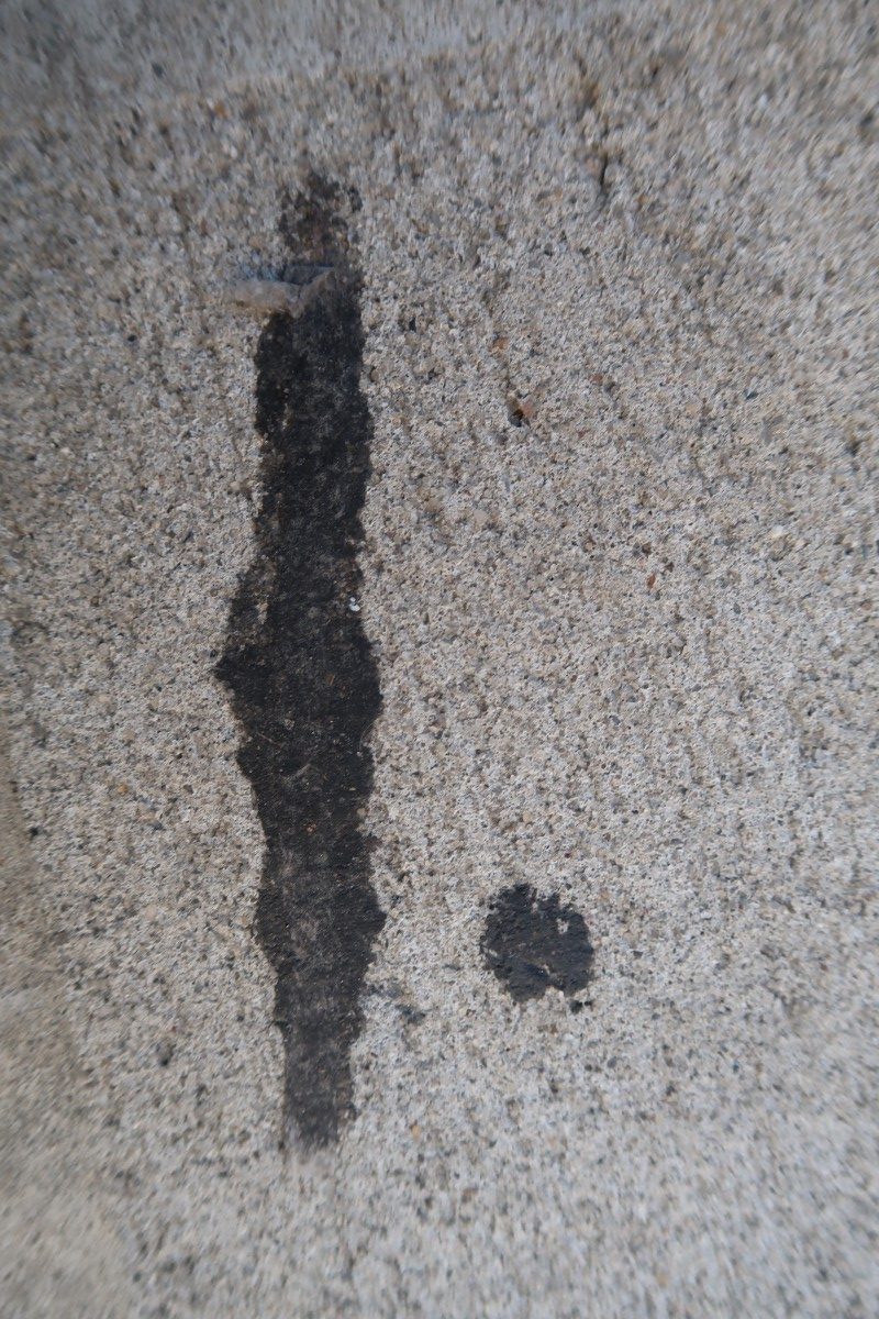
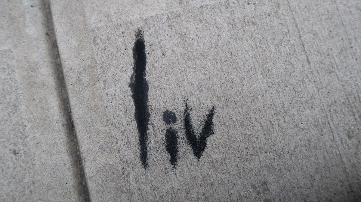
For my second composition chose to do this simple paint streak that i had found. While trying to come up with what letter form could use, I noticed that the line was originally sort of slanted. So I went with a lazy slated kind of look
 .
. 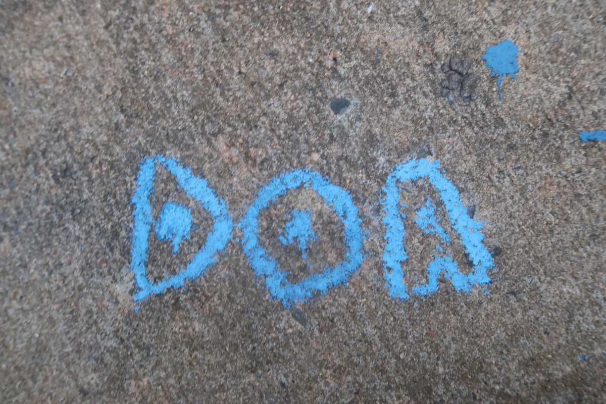
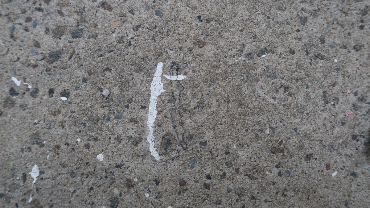
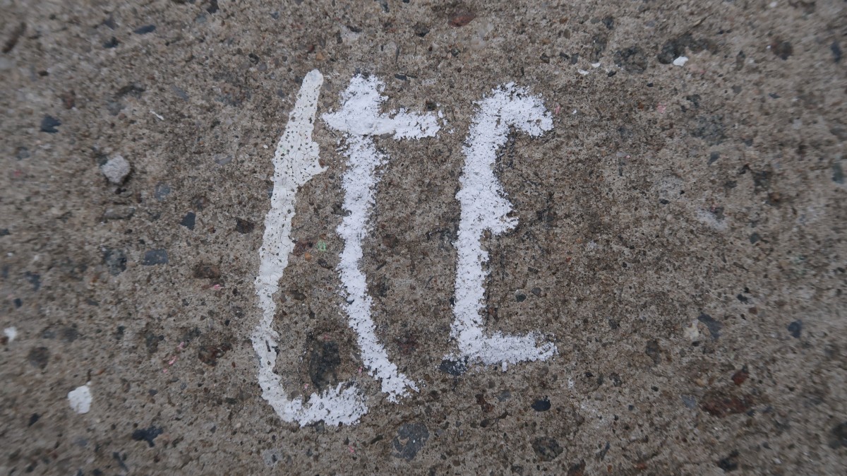
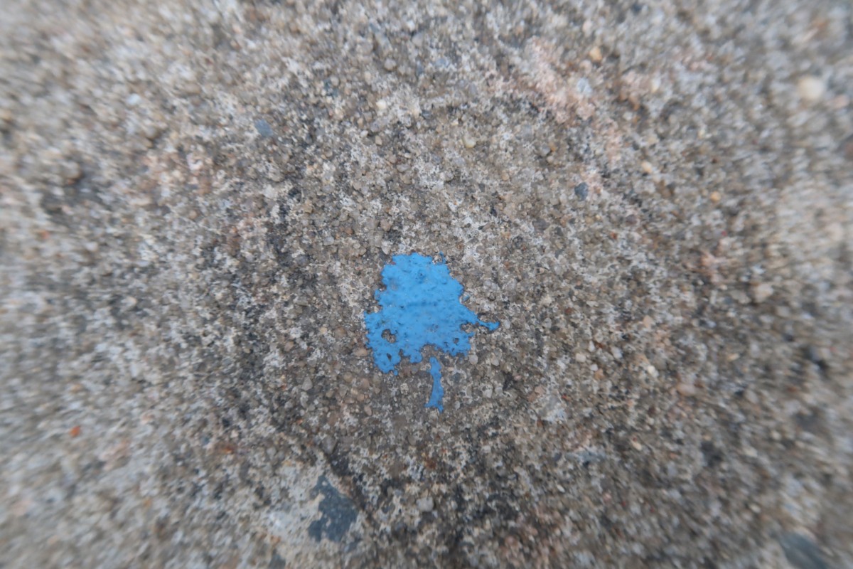
For my last composition I decided to find something with color because black and white can get repetitive and boring. I went with kind of this starting point and worked around it, making taht the middle of each letters. I used A, D, and O because they required a counter which was good for the use of the starting point.
Overall this project was different and made me get out of comfort zone. Despite the events that happened I am pleases with the outcome. Something I would do differently is look for more unique staring points and not stick to simple ones.

