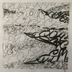
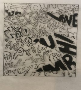
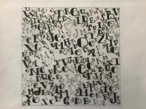
While doing the lines I recognized that the texture of the dunes was part flowing down and the other part was static with no movement at all. I decided to represent this with a mixture of fun, serifed type to represent the flowing sand. While the san-serifed typography represents the parts where the sand texture looks static.
This was the first type drawing, I was still figuring out the thickness of the lines and the typography I was going to follow. Here I did all cursive with inking brush and pen.
Again a more artistic approach. The typography was more of a statement. It says: Sloggishly flowing down.
For this ornamental pattern, I selected medieval-looking, ultra-serifed typography perfect to give that retro feeling that I got from the original picture.


