Monthly Archives: February 2016

Campaign Analysis 4 – Beats and Bose

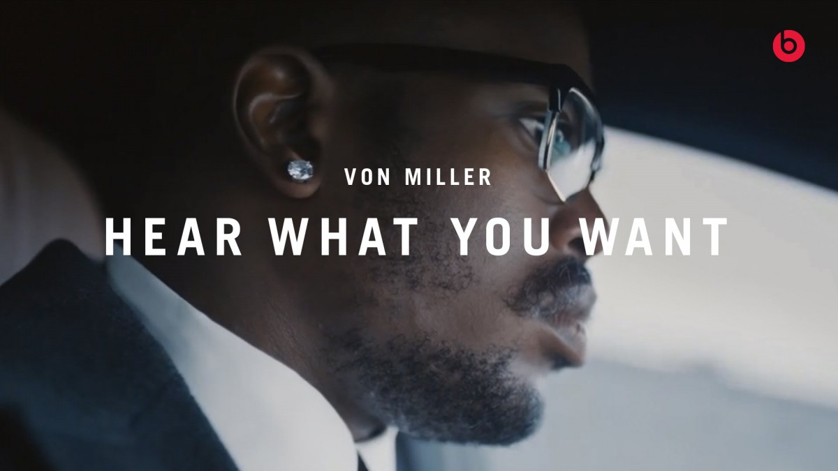
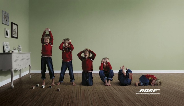
Both Beats and Bose have a different message and different ways of approaching there ads. Beats wants to focus more on the style of the headphones but letting people know that it’s something that you will keep wearing because of how loud it can get. Bose focuses more on the features and benefits of the brand/product using a kid, dog and a construction worker (who makes noise) and sorta has like a domino affect making it look like a volume control. Beats audiences focuses more on Adults, black consumers and people who generally love to listen to music with style. Bose target audience is the opposite which would be adults, audiences that want less noise and people who love tech who take there technology seriously. The Beats ads focuses more on profile focusing on the face with the product, while Bose focused on a mid-shot conceptual ad. Beats focuses on profile shots because it focuses on the product itself on the person’s ear making it look stylish and using celebrities to promote there products and to focus on there target audience which are black people. Bose focuses more on the conceptual photography to effectively communicate there features in real life situations.

Beats and Bose

Both Beats and Bose are headphone companies, but they are selling to different messages. In the Beat ad, There are three African American athletes which means their audience would be more for young african american teens or athletes. The slogan is “Hear what you want” which means that you can hear whatever you want without hearing the background, you can be focus. The models are actually focus and all in profile views. Also the ads also state that the headphones are wireless, so it will adapt to any environment. The photography style seems to be more serious and focus on the model. This supports the message of being focus on whatever is  important to the subject and not the outside.

While on the other hand Bose shows a conceptual view of their product. Their slogan is “Noise canceling headphones”. This is completely different message because the headphones will cancel any type of sound, even if your hearing music or not. The audience seem to be everyday people who just want peace and quiet. The photography style is quite interesting because every subject looks like volumes going down. The style supports the message  because once you put the headphones on you are completely listing to silence.

Vlad – Bose & Beats

The Bose and beats campaigns overall have a very different thought process behind them. I personally see the beats campaign as far less effective because it seems like their almost trying to stereotype who they want to sell it too. They chose black males who are most likely the inspiration to younger black males, whom the product is generally directed towards. All the shots are profile view and the 3 ads themselves are very different. Two of them have the product in it while one is in a car without the actual headphones. On one of them they have plenty of negative space while on another far less so. Now this part was thought out a bit more because their attempting to market different models of headphones such as wireless, studio, etc. Even though this is a good idea in concept, in reality there just isnt enough consistency between them to make it an effective campaign in my opinion, even if they do work as separate images.

The Bose campaign on the other hand has a very strong concept behind it but is just a little bit too subtle. All of their campaigns feature very diffused lighting and a clear representation of what their trying to show, which are volume bars and at the lowest bar they include the bose noise canceling headphones headline. They also use them to represent who their trying to market it towards, for example parents, dog owners, or anyone that may live near a place where construction happens often such as a city.

Bose VS. Beats

Bose and Beats are two of the most premium and leading headphone brands in the world, and with premium influence and quality comes a very specific consumer base.

To add some some emphasis on the term “specific consumer base”, we have to look at who exactly the companies really advertise and appeal to. Looking at the “Hear What You Want” campaign from Beats, it is mostly advertised towards people of color largely due to the fact that the campaign shows successful and influential black people. These black people could also in turn be idols and role-models for many fans and consumers of Beats headphones, which also may be sought after for the sound quality of the headphones. It also pushes the idea that anybody can listen to whatever they choose, regardless of what it is.

The Bose campaign, however, has a more… anti-music approach to their advertising. Their campaign focuses more on the noise-canceling technology of their headphones, as they are focusing on consumers who just really don’t like any kind of noise to begin with. Bluntly speaking, the consumer is mostly caucasian-based and more… privileged if you are catching my drift. 

beats and bose campaign

Both Beats by Dre and Bose came out with a campaign, that reflects a bit of their own identity. Judging the Beats campaign, they seem like they are going for more of a flashy, attentive approach. High contrast and more focus in specific spots of each frame. Bose on the other hand has a more neautral, flat and desaturated visuals. Probably hooking to a more suburban community rather than hip hop fanatics like Beats would be doing. Bose has a more a conceptual campaign while Beats is more of a in your face type of campaign probably because it is more than a fashion statement rather than just headphones.

Beats vs Bose

The Beats campaign use exclusive famous black athletic men in their ads. The audience that they are targeting is also black people in general. The photo used of all the athletes all profile view to show their ears and the headphones and the very recognizable logo on the headphones. The slogan “Hear What You Want” is focusing on how it it allows you to only to focus on the music itself and ignoring their surroundings. The use of the cropped portraits shows how it allows the user to block out everything but the music because the background is being ignored completely. The style of the photos are all focusing more on the fashion use of the headphones.

The Bose campaign have very similar ads where they are conveying their noise cancelation. The images represent the very familiar representation of the volume going down. The target audience is middled aged people that are more effected by annoying sounds. The use of different things such as the construction workers, dogs and children show the many things that people can relate to having a distraction while using headphones. The style of the photos use all diffused lighting on the darker side to give it a quieter feeling to enforce their slogan of noise cancelation. The composition of the photos make all of them very relatable and easier to recognize even though the location and people change throughout all of them.

Campaign analysis 4-Beats and Bose

Beats and Bose are two leading brands of premium headphones. Compare and contrast Beats “Hear What You Want” campaign with Bose’s Noise Canceling headphones campaign. What is the intended message of each? Who is the intended audience? Describe the style of the photography used for each one. How does the photographic style support the intended meaning and audience appeal of each campaign?

Beats

8 maxresdefault

maxresdefault-660x400

Bose

noise-cancelling-headphones-construction 1082046345 1082046331

Yelp/Foursquare Ad

Although both companies offer the same services, its obvious that Yelp is dominating over their rival, Foursquare, when it comes being the preferred business review site. Yelp makes it clear that their target audience is those people who want to make the best of an unfavorable situation. The strength in their ad campaign comes from not only being humorous but also the way the actors are asked to pose for the video. They’re engaging with the audience looking straight at them, almost as if they’re talking directly to them, and keeping their faces brightly lit even while they’re in a dark area.

The  Foursquare ad on the other hand aims their ads towards the general audience.Their ads feature two people, both with different ideas of what they want to see, do or eat. There is less humor and they try to use word play as their niche to keep the audience interested. I personally fin the campaign to be much weaker than Yelp’s since it fails to explain the importance of their service, and having a tagline that doesn’t resonate with the photography, or the people in it.

Foursquare and Yelp

Foursquare and Yelp are two competitive search engines that helps people specifically find a location or area of interest locally and its reviews.

Yelp is not only great for recommendations, but also provides helpful reviews. Yelp’s new TV commercials, portray a humorous and resourceful style of entertainment, where their characters are stuck in awkward situations. The “We Know Just The Place” campaign gives a fictional, over exaggerated response of how consumers may react to their experience. The company’s advertisement was featured to promote their platform, while expanding into new markets. Yelp is represented as a reliable problem solver to escape each individual’s catastrophes.

Foursquare’s outdoor print campaign portrays a stereotypical view of how their platform instantly connects with their consumers. The “Foursquare learns what you like and leads you to places you’ll love” campaign presents a realistic scenario, unlike Yelp. The photographer pairs two contrasting models with completely opposite, individual taste. Foursquare encourages exploration of cultural differences for all types of people. The company’s style gives an idea of knowing their customers needs with both local and accurate recommendations.


Campaign Analysis 3 – Foursquare and Yelp

The tone and audience vary for both Foursquare and Yelp. Yelp is known for their review feature; their users are invested and want to be heard while Foursquare’s social media platform allows you to check-in on location, post statuses and connect with friends. However, both apps do allow you to find attractions and leave reviews.

They’re form of advertising also differs. The Foursquare ads portray two individuals – in some cases they look like total opposites and in others, not so much – who have very different personalities. Whether or not you may be dressed totally different from someone else, the point is that we’re all different and have specific, individual tastes that. In the Yelp commercials, we see scenario after scenario where people come across a certain circumstance where they need a specific service to help them with their situation. Overall, I’d say the largest difference in the style of photography with the ads is the lighting. The Foursquare ads are very well lit while the Yelp commercial has a lot more darkness in it because a lot of the commercial is during the night time or in a darkly lit area, like a restaurant. Something else I noticed was the difference in eye contact between both the ads. The models in the Foursquare ads are not looking at the camera and are preoccupied with something else. In the Yelp commercial however, each individual is speaking to us and engaging us with their situations.