Author Archives: Vladimir Pinis

Final Project – Vlad

For my final project i’m going to base my photos from an article called Coffee addiction: Do people consume too much caffeine? . This article goes over one of the most consumed beverages in the world, coffee (more specifically caffeine). It mentions how people are starting to try and find any adverse effects in the things we most often consume; one of which is caffeine. The article goes on to say that the amount of people that have needed emergency treatment after consuming energy drinks has doubled to more than 20k in 2011 even though energy drink companies claim its safe. It also mentions that a study shows that up to six cups of coffee a day is still a very safe range to be in. It goes on to say that many of history’s greatest minds consumed ridiculous amounts of coffee. The article concludes by saying that ultimately caffeine will effect everyone differently and that you need to decide for yourself what levels are safe.

Final Concept

  1. The tone is rather serious as is mostly goes over various facts related to the topic.
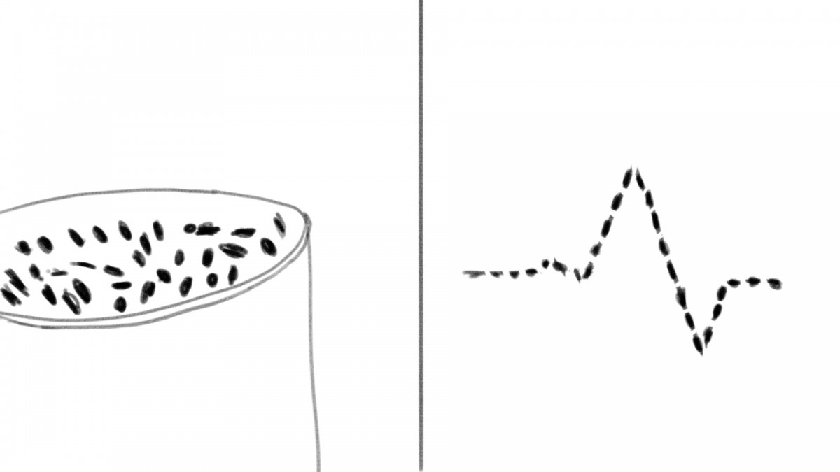
  2. My approach is going to be very literal since in both images I want the main focus point to be coffee beans.
  3. My approach is going to include only still life’s.
  4. My shoot will include coffee beans and a cup for the most part.
  5. For my first shoot i want my lighting to have a lot of contrast and i want the highlights to be very well in focus. For my second shoot i would opt for a flatter approach where the lighting is evenly spread out.
  6. For my first shoot i want it to be slightly dark but with shallow depth of field because i would prefer to have some of the coffee beans in focus while others are blurred out. This would require me to use a macro lens. For my second shoot i would like to try multiple techniques but my idea mainly centers on it being the typical food photography. I envision it being taken from a birds eye perspective but depending on the results i get from playing around with this i may reconsider.

Glass-Optimism

The article is basically about convincing you to be optimistic instead of pessimistic. It describes how optimists usually live fuller and wealthier lives. It also tells you that things like laughing, exercising, and the like will also help you lead a healthier and a more optimistic life.

Obviously the picture would have to be light and bright. My basic idea for this would be shooting the glass from the bottom and have it towering above you. This in my opinion would show the glass as optimistic and powerful as opposed to making it small and insignificant.

Another idea, if possible would be framing the image with 2 glasses, one of which is more full then the other, and having the fuller one seem like it is taller then the glass with less liquid.

Poem Response

The poem “she being Brand” has a very intense feeling. While reading, it feels like things change very quickly. It uses driving a car through the city as a description of a sexual experience. In contrast to that though, the poem “Coming Home, Detroit, 1968” uses driving through the city to describe what the Detroit riots are doing to the city. It also uses these features to create a visual depiction of how you would see all these things but then still ignore it all.

The only ideas i can come up with for cars are to use very harsh lighting to incorporate a sense of beauty, and perhaps some damaged looking props to depict detroit.

Potatos

To summarize this article, it basically states that Monsanto is aiming to control the agricultural industry. Currently farmers can plant only one generation of potatoes and not replant it because that would break the potato genes in production. Monsanto, instead of trying to go the organic route is going down the route of Genetic engineering and is trying to monopolize it by preventing anyone else from reproducing their method.

Certain image that come to mind would be a moldy potato that looks likes its dying. Another idea would be newborn plants in the foreground and the potato in the background.

Vlad – Bose & Beats

The Bose and beats campaigns overall have a very different thought process behind them. I personally see the beats campaign as far less effective because it seems like their almost trying to stereotype who they want to sell it too. They chose black males who are most likely the inspiration to younger black males, whom the product is generally directed towards. All the shots are profile view and the 3 ads themselves are very different. Two of them have the product in it while one is in a car without the actual headphones. On one of them they have plenty of negative space while on another far less so. Now this part was thought out a bit more because their attempting to market different models of headphones such as wireless, studio, etc. Even though this is a good idea in concept, in reality there just isnt enough consistency between them to make it an effective campaign in my opinion, even if they do work as separate images.

The Bose campaign on the other hand has a very strong concept behind it but is just a little bit too subtle. All of their campaigns feature very diffused lighting and a clear representation of what their trying to show, which are volume bars and at the lowest bar they include the bose noise canceling headphones headline. They also use them to represent who their trying to market it towards, for example parents, dog owners, or anyone that may live near a place where construction happens often such as a city.

FS_Yelp_Vlad

Both of these ad campaigns seem to rely strongly on the message of opposites al the while being massively different. The foursquare one seems to contrast the two interests of the characters. The yelp advertisement has the characters contrast what they already have to what they actually want. For example, the couple in the video wanted a restaurant with cooked food but instead got a live octopus.

In terms of differences, the foursquare campaign is very bright, seems to have been taken outside during a sunny day. The Yelp campaign seems to have been far darker but the models or characters in the video are lit up very well.

Vlad_Comparison

The two campaigns have quite a few differences between them. The gillette one has this clean shaven football jockey staring right at the camera while the schick ad has the person staring far off into the distance. Gillette has used short lighting while schick used broad lighting. The other main differences revolve around their message and audience. Gillette’s clean shaven campaign is geared more towards that football jockey personality whereas schick’s seems to be geared towards the hipster type of personality. It has a far less serious tone since it literally puts a squirrel on the face of a person. It also seems to say that you don’t need to rush and shave it off your face, having the model stand there with confidence. We can also see the differences in target audience based on the clothing that the models are wearing.

Vlad_Campaign Analysis 1

The first differences in the two campaigns include the first thing that jumps out, which is color. Another main difference is the fact that they both used dancers in different forms. The pantone campaign included the dancers working and blending with the forms, having the colors of the lighting reflect off of them. The Raymond Weil shot on the other hand has the dancers take the form of the watch, bringing them out and making them the main feature in the campaign. One of the main similarities is that they both heavily use the rule of thirds to enhance their campaign. The pantone one uses it to describe the transitions from their types of colors and to clearly define which objects belong in which area. The Weil campaign also uses it as but they use it to define movement throughout the image as a whole rather then purposely divide the campaign into different sections.