Author Archives: Natasha Khemraj

Final Project

For the final project, I would like to base my photographs off of the story, Birdie Num-Num by Lavanya Sankaran. This story is about Tara Srinivasan, her mother, and their very different point of views regarding Tara’s future. While Tara is visiting her parents in Bangalore, India, she is focused on completing her PhD. Her mother, however, has other plans for her. Tara is now 27 years old and she doesn’t even have a significant other in her life. Since Tara has no intention of fulfilling her mother’s wishes and getting married anytime soon, Mrs. Srinivasan takes matters into her own hands. Mrs. Srinivasan plans a cocktail party to market her daughter to potential buyers, which she refused to admit to Tara, claiming it was just a warm homecoming party in her honor. All of Mrs. Srinivasan’s friends had grandchildren, she was the only one without grandchildren and an unwed daughter. Whatever selfish reasons Tara had for not wanting to get married, she had to realize that none of that no longer mattered. More than enough time had passed, it was her duty and obligation as a daughter to give her mother what she wanted most – grandchildren. This was the way it had always been, it was all Mrs. Srinivasan knew – it was all part of the social contract.  

“Birdie Num-Num” is an ideal representation of parental expectations, traditional gender roles, and perhaps most importantly – societal pressures. For each photo shoot, I would like my subject to represent the point of views of both Tara and her mother.


Slack for iOS Upload (3)

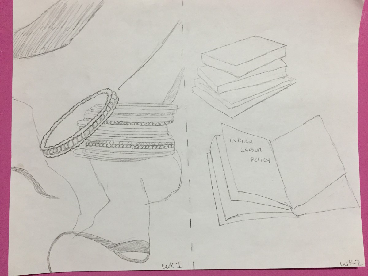
1) The mood of the first photo shoot is bright, happy, colorful, typical of a wedding. The second photo shoot is more serious since it represents Tara’s focus on completing her thesis for her PhD and what she would rather be doing.

2) Both of my approach is pretty literal instead of metaphorical because it is easy to interpret.

3) My approach will be a still life. I would prefer if my pictures had a sense of mystery to them. By not having models in my photographs, I think it makes viewers wonder whether not someone is getting married or whether or not someone is making use of these books and studying.

4) Not Applicable

5) For the first week, I plan on photographing bangles and a shawl, two very important items in an Indian wedding, in order to represent Mrs. Srinivasan’s point of view. The next week, in order to represent Tara, I would like to photograph a stack of books and maybe a wine glass.

6) I would prefer to use brighter, even lighting for the first shoot. For the second shoot, I would like the lighting to be a little more moody.

7) I’d like both photo shoots to be shallow depth of field.


Optimism

Margie Warrell’s article strongly encouraged her readers to have a “the glass is half full” outlook on life. Having an optimistic point of view benefits your health, wealth, and relationships. This is why it is important to get out of bed every morning and face the day with a positive mind set.

This photo shoot is all about portraying optimism and a lot of things signify happiness and positivity. Shooting against a light, bright background with even lighting and minimal or no shadows is going to be very important toward capturing the quality of optimism. The first thing I immediately thought of using as a prop were flowers in order to help reinforce the idea of happiness. Sunflowers are usually big, bold, and bright so I think that they will be the right match. Other possible props that would help to emphasize optimism are food dyes to  brightly color the liquid and maybe even fruit – the way healthy drinks usually are. After all, Warrell does conclude her article by saying that exercise is key for a happy, healthier lifestyle.

Poetry

The poems, “she being Brand” by E.E. Cummings and “Coming Home, Detroit, 1968” by Philip Levine are very different. It is true that each poet uses a car as a metaphor, but not in the same ways.

E.E Cummings uses a car to communicate the message that he lost his virginity. Cummings writes about the ways that you would control and maneuver a car to describe his first sexual experience. This is evident through the very first line, “she being Brand new; and you know consequently a little stiff I was careful of her” and later on at the end of the poem, “it was the first ride”.

Phillip Levine’s “Coming Home, Detroit, 1968” is graphic just like E.E. Cummings’s poem; not in a sexual manner but a violent one. Levine’s poem describes the race riot that broke out in Detroit during the late 60’s. Levine describes a scene where everyone is wreaking havoc around him and there is nothing he can do to help the situation, “One brown child stares and stares into our frozen eyes until the lights change and you go forward to work… We burn this city every day.”

I will use my pink toy Cadillac for our next shoot to help communicate the message of each poem. I think setting up the Cadillac against a black background with the car evenly lit as the main focus might be the way to go for “she being Brand”. Or maybe having one portion of the car lit instead of the entire thing making it look as if there is something occurring in one part of the car giving the feeling of privacy and mystery might also work. As for “Coming Home, Detroit, 1968”, I think that I will have the toy car back lit, facing away from the camera going towards an orange light. The orange will represent the burning city and the car inevitably being a part of it.


Michael Pollan’s Botany of Desire

In this excerpt from his book, Michael Pollan discusses the many struggles a farmer has when growing crops, while Monsanto, an agricultural company, experiments with genetic engineering, creating harmless crops that can magically protect them self.

For the photo shoot next class, I think that it would be a smart idea to show a significant contrast between an organically grown potato and a genetically modified one (or one that looks like it anyways).

Campaign Analysis 4 – Beats and Bose

Both Beats and Bose are two leading brands of premium headphones. Beats’ “Hear What You Want” campaign is geared toward the the very people that they display in their ads – stylish individuals who are more fashion forward. Much like the name of the campaign, Beats promotes the message that you will hear only what you want to hear – your music, of course – when you are wearing their headphones. As for Bose’s Noise Canceling headphones, they are promoting that their headphones will drown out all of the excess sounds and noise around you. Judging from their photography, Bose is targeting their products towards suburban, middle classed families.

The photographic styles for each brand significantly differs due to their target audiences. Beats portrays a higher quality, high end product which is why each of their models look so focused, concentrated, clean cut, and ultimately like a boss. Beats’ headphones are not high quality like they are made out to be, so it makes sense that their ads look high quality. Bose’s ads on the other hand are conceptual unlike those of Beats. Volume is being personified through dogs, jack hammering construction workers, and badly behaved children. Each one of these things is noisy all on their own so to use them to represent a volume bar is genius. As the volume bar gets louder and louder, each person/dog reacting to the sound also gets louder and noisier.

The difference in lighting and contrast is also very evident. The Beats ads are higher contrast, well lit, much like fashion ads. The ads for Bose are more muted, mono toned, and even a bit dreary. None of the Bose ads display their product, while, two of the Beats ads do.

Campaign Analysis 3 – Foursquare and Yelp

The tone and audience vary for both Foursquare and Yelp. Yelp is known for their review feature; their users are invested and want to be heard while Foursquare’s social media platform allows you to check-in on location, post statuses and connect with friends. However, both apps do allow you to find attractions and leave reviews.

They’re form of advertising also differs. The Foursquare ads portray two individuals – in some cases they look like total opposites and in others, not so much – who have very different personalities. Whether or not you may be dressed totally different from someone else, the point is that we’re all different and have specific, individual tastes that. In the Yelp commercials, we see scenario after scenario where people come across a certain circumstance where they need a specific service to help them with their situation. Overall, I’d say the largest difference in the style of photography with the ads is the lighting. The Foursquare ads are very well lit while the Yelp commercial has a lot more darkness in it because a lot of the commercial is during the night time or in a darkly lit area, like a restaurant. Something else I noticed was the difference in eye contact between both the ads. The models in the Foursquare ads are not looking at the camera and are preoccupied with something else. In the Yelp commercial however, each individual is speaking to us and engaging us with their situations.

Campaign Analysis 2 – Shaving Ads

Both the Schick and Gillette shaving ads convey a strong message to their respective audiences. The photograph taken by Troy Goodall for the Schick ad is pretty silly. It is a full frontal shot of an older looking gentleman with an outrageous beard, looking to his right with a broad light framing his face. His expression is relaxed and he is wearing a button down, patterned shirt. However, in the Gillette ad photographed by Tim Tadder, we can only see up to the shoulders of the man photographed where a short light is framing his face. He has a fierce look in his eyes, has a perfectly (almost too perfect) clean shaved face and is wearing a football uniform.

Gillette’s message is clear; they want athletes, athletes-to-be, and all sport players out there to know that they are the go to brand for a clean shaved face. Whereas the Schick ad is aimed at a totally different crowd, like hipsters in Williamsburg. Schick also portrays a very different message than Gillette does to their customers. This man has way more hair on his face than you’d ever expect someone in a razor ad to have. He basically has a slot hanging off his face! Whose attention wouldn’t that get? This ad is artistically eye catching. I feel that Schick is saying it is okay to experiment with your beard and try a variety of looks while Gillette on the other hand is saying in order to look your absolute best you should idolize to look like athletes who also strive to look impeccable.

Dance Photography in Advertising

The ad for Raymond Weil shot by Lois Greenfield and the ad for Pantone shot by Sarah Silver both exhibit distinct differences and similarities.

Aside from the obvious color difference, the formal elements of the photographs differ as well. For one thing, the tone and contrast is noticeably different. While, Greenfield’s photograph is full scale displaying many tones from black to white and very high contrast with very dark and and very light areas, Silver’s photograph is low contrast with mostly middle tones. The colors used are bright and have the same value. Both the composition in Greenfield’s and Silver’s photographs are very artistic; they contain dancers that draw the eye of the viewer. The photo taken by Greenfield clearly portrays the headline, “Precision Movements”. The dancers are all skillfully and accurately placed, so as to perfect the art form of precise movements. As for Silver’s photo, the dancers are all interacting with their background or props. They are all very involved with their surroundings unlike the other photo where the dancers are interacting with each other.

While the perspective and space of the photo taken by Greenfield is shallow and most of the dancers are closer together in depth, Silver’s photograph demonstrates deep space where the dancers are all at different spaces. Both of the photographs contain direct light, showing hard-edged, dark, shadows. I also feel that there is symmetrical balance within the photographs and an overall sharp focus. Furthermore, both photographs use dance and dancers to effectively communicate the concept and message of their campaign.

The photographs that Sarah Silver shot for Pantone’s Make It Brilliant Campaign and Lois Greenfield shot for Raymond Weil’s Precision Movements ad are similar in that they use the same technique of having dancers be in their ads. However, while the dancers are a primary focus, they convey different messages and moods. The ad for Raymond Weil is less modern and looks like it could be used for a ballet. I guess this is what makes it so different – the fact that this concept is not what you would expect for this specific product. Although, the ad for Pantone’s Make It Brilliant Campaign contains a pop of colors like you’d expect to see, the dancers are what make it unique. They symbolize a special way to ‘paint a world with light’.