

Three Compositions
1 Reply

I don’t consider myself to have a favorite color but for this project I decided to go with Blue-Green because for me it’s a pretty color and it resonates with my personality. Also when I think back to when i was a teen, given the choices of objects that came in different colors I would almost always choose this one.
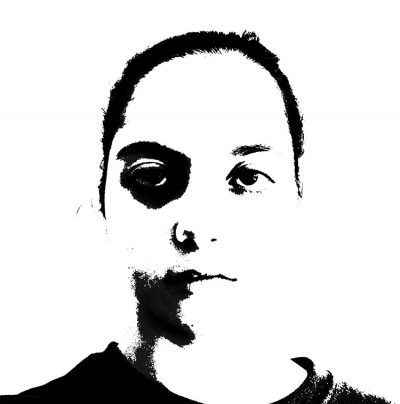
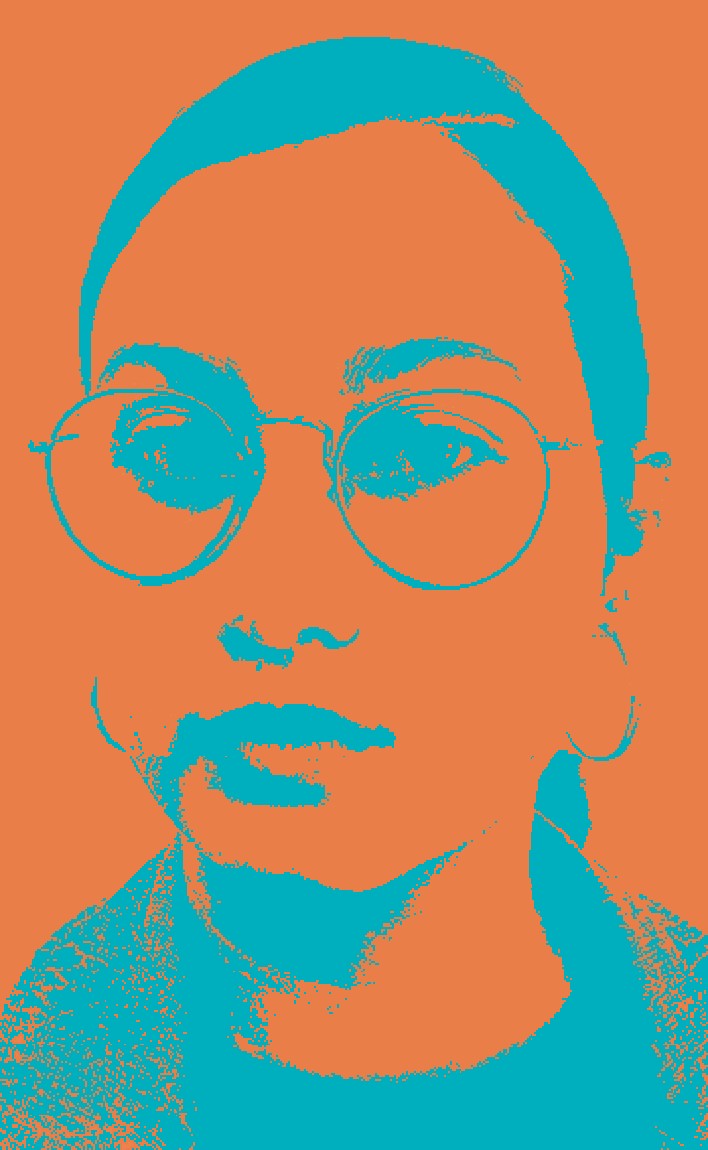
This is the black and white selfie that I’m working with:
And these are the color schemes that I used to make the complementary, triad and analogous compositions of my selfie. I used a color wheel to choose the corresponding colors in each kind of composition and searched for them and their CMYK numbers in a Pantone book to help me find them easily in photoshop and illustrator.
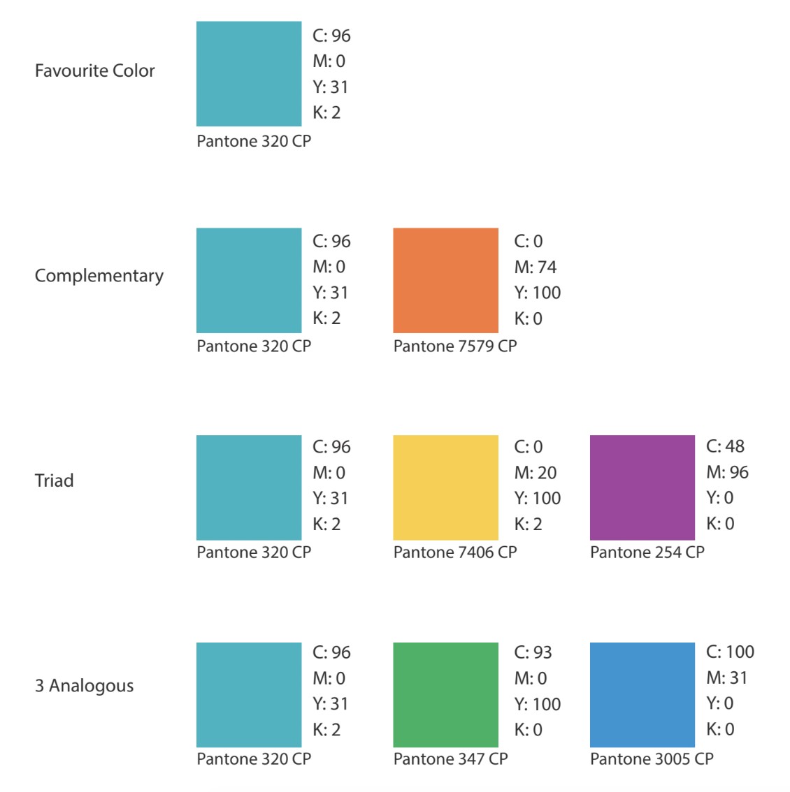
Blue-Green is a color that is used to symbolize water, tranquility, intuition, communication and wisdom. It is a mixture of Blue, which has calming properties, and Green, which has growth properties. I like that it is a mixture. I’ve never really liked straightforward primary colors. And I feel that being calm and at least trying to have good communication and trying to be smart is something that I always do. I also love the ocean and looking at it. Living on a island for a long period of time showed me the different kinds of blues the ocean could take on, and Blue-Green is the nicest. It’s just a color that gives me the most welcoming feeling.
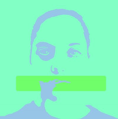
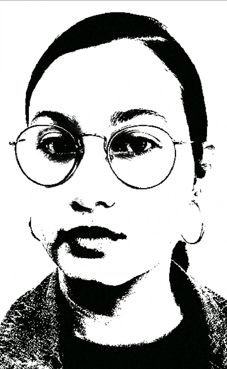
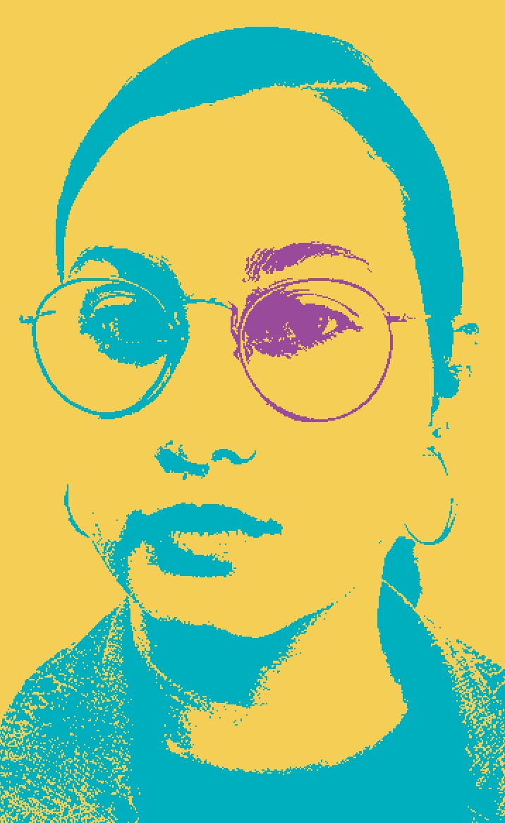
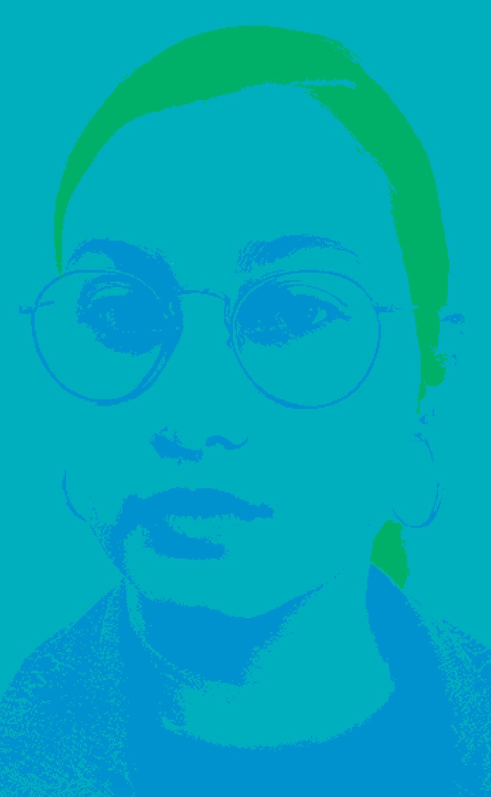
And using Blue-Green and its complementary, triad, and analogous colors, I chose to make my compositions like this:
This project wasn’t hard but in order for it to come out right you need to really follow the steps for it to come out right. I had to re-do my main contrasted black and white image many times until I was satisfied with it and until it had no more grays. And I had to switch my colors around in each composition until it felt right or until it was more visible. I also feel like I learned a lot about the use of color for designs. I now notice other designs in real life and think about how they use analogous or complementary colors for their work. Before I would think that people just chose whatever colors they wanted for their work but it makes sense that there is more meaning behind it.

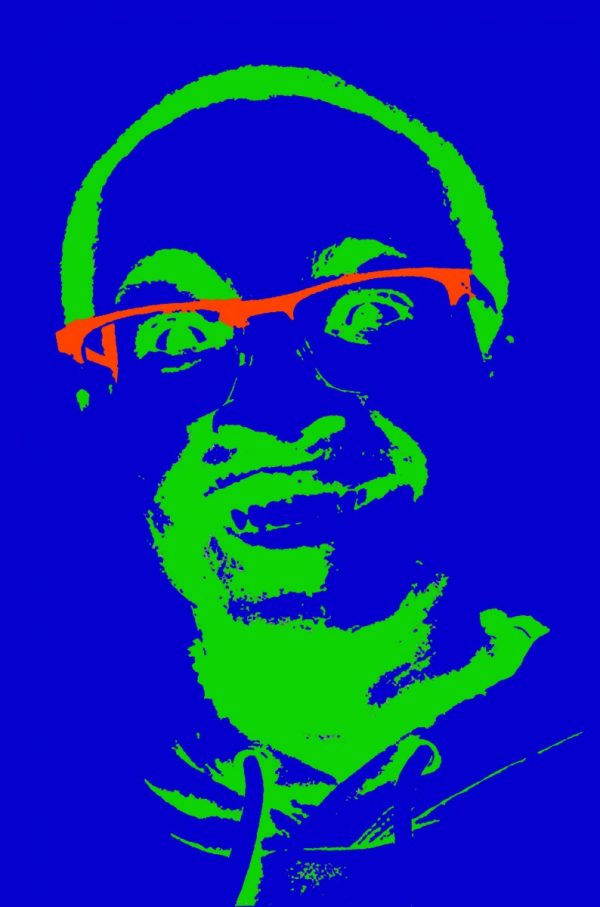

For my final compositions, I decided to keep my original experimentation of my colored selfie. The reason for this is that I like the way most of my color was portrayed throughout the pictures. For my first composition which is complementary, I liked the aesthetic of which the red showed throughout the image. I kept my facial features even when I implemented color throughout my image. My mood did not change for this one because we were only experimenting with two colors of my color wheel. For my triad image, I liked the way the image came out because it gives a negative mood toward my selfie. The different variation of colors I used was all dark colors in which completely changed the mood of my selfie. When I first started out with the triad image, the mood of the selfie represented happiness, but then when I implemented the colors the mood had changed sinister-like. Also for my triad image, the focal point I wanted to achieve was to make my glasses a different color than the rest of the image. Lastly for my analogous image, my image completely changed from the three colors I used from my color wheel. For this image I used three different hues of green, but the image came out too bright. What I wanted to achieve was to make my eye target something, but instead I decided to make the lower half a light hue of green. Overall from this project, I liked the way I was given the freedom to play around with colors in photoshop with my selfies. I also learned a lot about photoshop and if there is ever another project that involves coloring my pictures, I can know what to do and how to achieve different variations of color. What I can do better for the future is to achieve a better result of my analogous image.
This is my final work for the color selfie project. I chose the color blue and made a complementary, triad and analogous version of this work. I had a lot of fun doing this project because I enjoyed using Photoshop and experiment with colors. I learned how important color and contrast is when making any type of artwork. I also learned how useful the color wheel is for picking colors that go really well together. I use the color wheel a lot now ever since starting this project and I will be using everything I learned in future projects.
The OpenLab is an open-source, digital platform designed to support teaching and learning at City Tech (New York City College of Technology), and to promote student and faculty engagement in the intellectual and social life of the college community.

