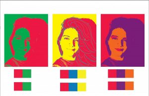
IsadoraMartinez-AnComposition
IsadoraMartinez-TriadComp
What I learned with this project is that colors have a psychological meaning on the viewer, and if the combination of colors is not balanced the composition will be spiky on the viewer’s eyes. For example, I selected red as my favorite color, while I was creating the complementary color composition I realized that adding green to it generated a clash in the image since they are both strong colors. To remediate this I decided to add the green in the background and red in the foreground and it toned down the intensity of the complimentary composition.


