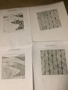
For my inked sketches I’ve decided to really change things up and decided to incorporate major detail into what I was doing. For the handmade twists on the top right I’ve decided to follow the shape of each twist and incorporate it into lowercase type. I didn’t just throw words into it to make it random, but this time I wanted to make it unique. For my line (sand dunes) bottom left, I wanted to add gradient in it to achieve the rich and smooth texture of the sand. On the top left for my type for the sand dunes I wanted the darker side of the dunes which represented the shade to look bigger so that when seen from far away people can see it. Lastly for the bottom right for the lines for my pattern image I kept that same feeling of my first line sketch so that it achieves a rough, itchy, but yet homemade feel. I kept the contortions too add a bit of that hand made feel. Subject to change for final.
https://openlab.citytech.cuny.edu/mpaularennis-despriciples1fall2019
A City Tech OpenLab Course Site


Those are very nice ink compositions for sure
Thanks man I’m not fully satisfied with it though.
I really liked your inked composition with the typefaces.