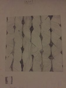
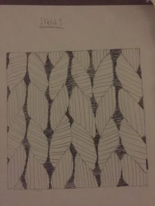
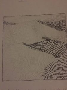
For my first line sketch for my pattern image I wanted to implement contortions and twists that made the feel homemade and the mood smooth. The image I’ve chose was hand crafted and not made by machine, so that meant some things were going to be loose and weird. If it was made to near perfection, then my image would’ve been perfect symmetrical wise.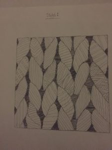
For my second line sketch of my pattern image I’ve felt that I lost the feel of the image I’ve chose. for my first line sketch I’ve added twists and contortions and that’s what I was aiming for, but I lost it for this one. I’v achieved the mood I saw which was a itchy, but calm mood, but I mad the feel of it too perfect. That wasn’t what I wanted. I’ve also implemented patterns of my own to give it a different feel, but again I didn’t think it achieved what the image portrayed. This is only a sketch and not final.
Again for this image I made the lines too perfect and added minor difference form my second sketch. I also didn’t like this image and though it was time to go forth a different path for my ink compositions. Once again this is a sketch and not final.
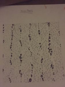
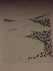
This is my first sketch of my type for my pattern image. I wanted to instead of adding the letters into the shapes of the image, I wanted them to vertically go down. The bold letters shows the dark spots within the image. This is a sketch and is not final.
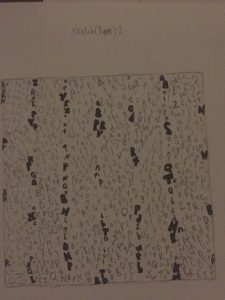
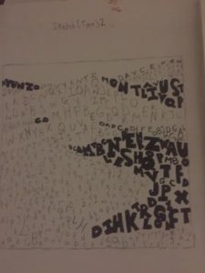
For my second sketch for type on my pattern image I’ve decided to enlarge it so the type can be more visibly seen. I’m not quite satisfied with my sketches, but as I get to some of my ink and final presentation drawings it turned out great for me. This is a sketch and is not final.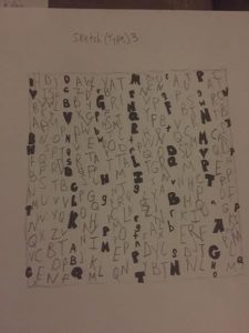
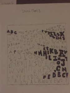
For my third sketch I wanted to enlarge my the type and when I took a look at it I thought this looked ugly. It’s as if I completely lost the feel of both the image and what I wanted. Although this is a sketch and not final I wanted to show people my process from beginning to end. For my refined ink compositions they get better.
For my first sketch for my type I wanted to add the letters in a somewhat horizontal motion so that it gives it the feel of smooth terrain which is also what I’ve described for my mood. I was quite satisfied with my first type sketch for my texture image and it gave me a sense of what I wanted to do. Not final.
For my second sketch for type for my texture image I wanted to make the letters look bigger. I wanted to show the clear contrast between regular sans serif type to ultra bold sans serif type. I liked this sketch I did, but I wanted to make it more clear and aesthetically pleasing. I was thinking about incorporating this sketch into my final ink one, but i had other ideas in mind.
For my third sketch I’ve also made the text appear bigger and for some reason I didn’t think I’ve achieved the mood I wanted. I wasn’t satisfied with the product and brainstormed other ideas to make it look more simple. This is a sketch and final.
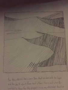
For my line sketch for my pattern image I’ve added smooth lines that shows a clear contrast between light and dark elements. One thing I thought I did wrong was by adding lines that separated from light and dark. This isn’t what I wanted and for the next sketch I’ve decided to go for a different approach.
For my second line sketch for my texture image I’ve decided to eliminate all divisible lines. For the bottom right side for the dark elements I think that some areas didn’t work because I’ve added squiggly lines and I thought that it quite didn’t match the mood i was aiming for. Not final.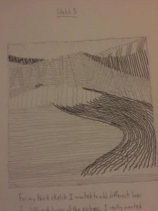
For my third type sketch for my texture image I did the same thing for my second sketch, but decided that I wanted to make the lines smaller. I also made various pattens for different areas of the sand dunes, but once I looked at from far way I didn’t like it. Not final.

