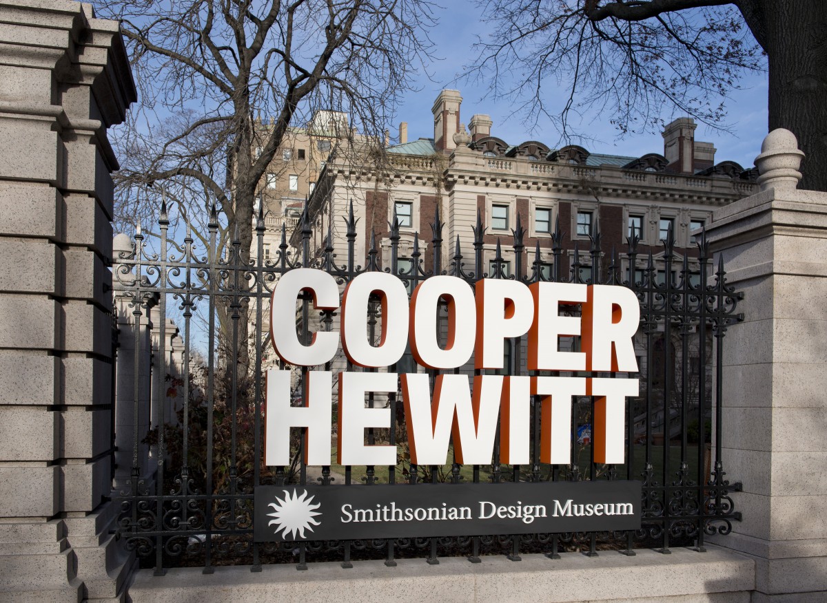
On April 24 I attended the Cooper-Hewitt museum for the very first time. I’ve always heard good things about the museum and always wanted to see it for myself. When I found out my class was going for a school trip, I was extremely excited. My experience at the Cooper-Hewitt was amazing. I love how many hands-on exhibits there were. When I first arrived at the museum I was given a pen, which gave me the ability to save any piece of art that caught my eye. Also with the pen, I was able to draw on screens and design my own art. With my pen, I was able to design my very own vase! Once I got home I referred back to the pen and retrieve everything I saved on it.
The first piece of art that stood out to me was this painting. When I first looked at it I couldn’t figure out what it was but I was automatically drawn to it because of the color choices. Overall the painting is full of blue and black where there is white in certain spots to show detail. The longer I looked at the picture the more I finally started to see that it was the Brooklyn Bridge. When you look at the painting as a whole you see how everything comes together. I then began to look in different areas of the painting and see very small details that helped the overall view of the painting. Each section of the
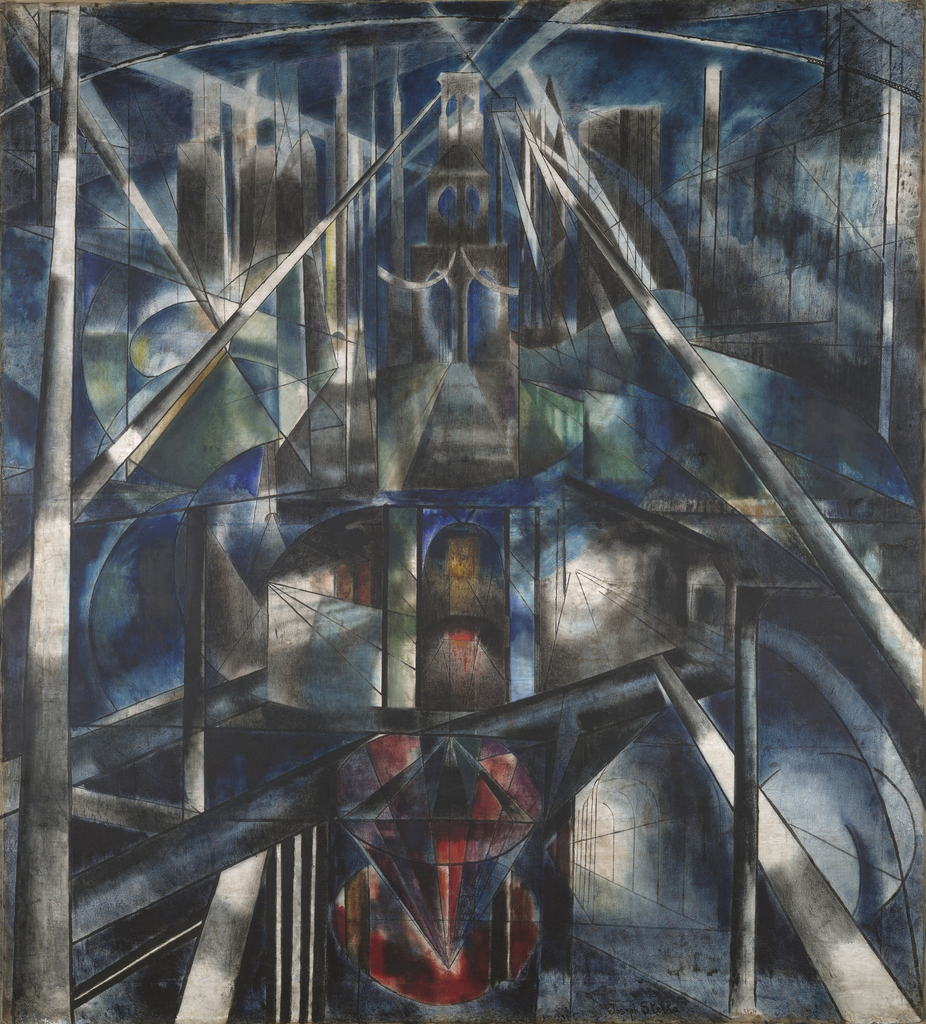
painting has details that are amazing. The section of the painting that has red I nothing that it comes together to be a diamond. I wonder if that was intentional or accidental. I mainly love for geometric the painting is, there’s nothing but simple shapes that came together to make an amazing Brooklyn bridge.
This is another piece of art that caught my eye. I love the white space that was used. I feel as though the white space evens out the entire picture. Another thing that caught my eye was the color choices. There are only two colors i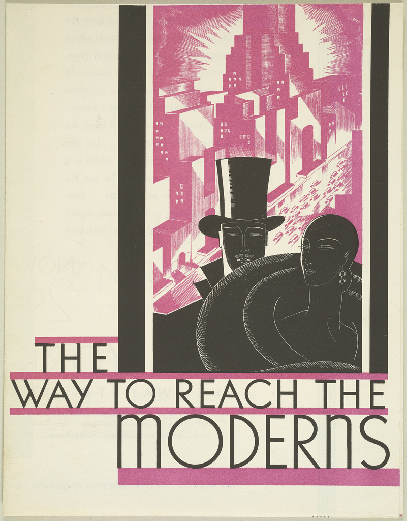 n the picture which is black and pink. I feel the dark puts a serious effect of the picture, whereas the pink brings in life to the picture. It almost reminds me of yin-yang, where the colors cause different effects to the picture but it seems to come together in a beautiful way. The picture has a great hierarchy as well, my eyes first notice the couple in the picture but then automatically goes to the type. In the type, I first read the words “Modern” because of the larger size font than the rest of the letters. Another reason why I saw the words “Modern” first is because the pink line under it has a big weight than the other pink lines. This picture looks very simple, but from the looks of it the structure was thought through thoroughly and I feel was a very genius advertisement.
Lastly, this Philips poster was unique to me. When I first looked at the poster I only noticed shapes. I saw semi-circles, squares, circles and obtuse triangles. The color choice reminds me of the night time, the blue of the night sky and the black of the objects that are too dark to see color because of the lack of li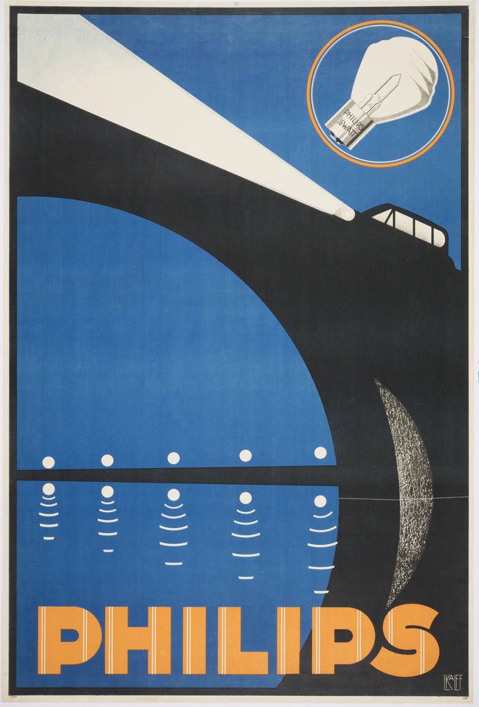 ght. When I gave the poster a longer look I noticed that the shapes I saw were actual objects. The semi-circles were for the water and sky and the black irregular shape is a bridge. The squares are the windows of a car and the obtuse triangle is the high beams from the car. I feel like the words “Philips” was picked to be yellow to represent the sun in the picture. It’s genius to me considering that the picture in a night and that Philips in a light company. The yellow shows up again in the circle around the lightbulb.

