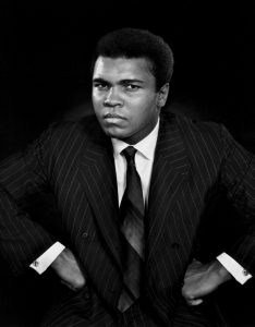
 – Front light Yousef Karash
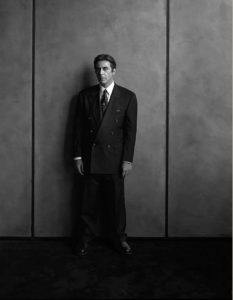
 –Split light Gregory Heisler
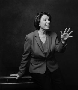
 . Broad light Celeste Sloman
My model cooperated very well while I tried the different angle distortions. I had to angle the camera differently to achieve each distortion which wasn’t very difficult to do. I think if you accidentally achieve a distortion such as with a hand in the way, or a paw, it would kind of ruin your overall photograph. Distortions like that usually want to be avoided by photographers.
Top left – fill (after)
Top right – fill (before)
Bottom left – no fill (before)
Bottom right – no fill (after)
Photograph: https://www.suzannesteinphoto.com/New-York/i-SMHSKz8/A
The name of the photograph is “R Train Platform, 59th and Central Park” by Suzanne Stein
This photograph depicts a couple kissing on the right side of the frame. I’m assuming they’re the main subject of the picture because the rest of the picture is a little blurred. While there are people on the left side of the frame sitting in a subway station. I think the purpose of this image is to illustrate a couple being affectionate in public, the woman is holding a big bouquet of flowers, while the other people are just minding their business. No one is paying attention to the couple, however one of the ladies is staring at the camera while the image was taken. I think the mood the photographer to capture is a somewhat “New York” feeling. New Yorkers are known to simply mind their business and that’s exactly what the photograph is portraying.
The three formal elements I think are the most important are Rule of thirds, leading lines, and fill the frame. The main focus in the photograph is the couple kissing. I think this picture is a good example of the rule of thirds since the couple is not exactly in the middle of the frame. For leading lines, I think the wall on the left is a good example of it because the shapes on the wall kind of lead you to the couple. Lastly, I chose fill the frame because the couple is relatively close to the camera compared to the others on the left in the background.
After reading the short biography of Dorothea Lange, when I first saw this photograph I felt hopelessness and just pain. The photograph which is in black and white, is mostly focused on one man, while the rest of the crowd have their backs turned against Lange. You can’t see his face clearly but the man seems to be exhausted and in despair. Since Lange was committed to social justice, she wanted her photographs to result in some kind of social change. The man, who was mostly likely unemployed, is seen to kind of distance himself mentally from the crowd which could show how hard life was at that time for him and many others. Also, the biography states, “Lange became increasingly confident in her ability to use photography to confront the urgent circumstances around her, and others”. (MOMA) I think Lange’s passion helped show the world the struggles people faced, she did not let them be invisible.
The photograph Migrant Mother depicts a mother, visually exhausted, looking in the distance with a tiring facial expression. While her two children are resting, or hiding their faces on her shoulders and a baby in her arms. Their clothes look torn and the woman does not look at the camera either. In terms of compositional principles, you can see the woman’s hand form a straight vertical line while she has her hand on her face, thus making the viewer look at her facial expression. The photograph is only focused on the woman and her kids, there’s no background. Also, the baby’s noticeable much paler than the older kids and the mother, showing how they were out in the sun working. I think Lange wanted to show another social issue that affected many families, poverty. She wanted people to feel for workers like this woman and see what they’re going through.
I think people interpret photographs differently, the photograph of Florence Thompson and her family depicts a time in America that can’t be erased. Lange had only zoomed in to the subjects and nothing else. While for the first photograph, you can see all the other men around the subject, but the old man is the focus of the photograph, while he is visually not with the crowd. When I look at these photographs I can’t compare them to what we’re going through right now during this pandemic. I feel like people had it worse unfortunately back during the Great Depression.