Inspiration Jill Keller

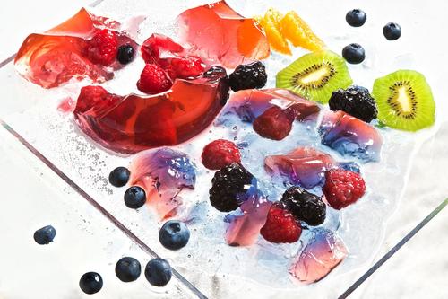
This photo by Jill Keller is from the section on her site called “Jello”. The photo just consists of a bunch of fruits, jello, ice etc. on a tray but the thing that makes it interesting is that they are all color coordinated and sectioned. The thing that makes the food in this photo look appetizing to me is the fact that there is a variety of shape, color and size of the fruit ice and jello. You can see the kiwi for example sliced open and seeing all of the inside parts of it and next to the broken up jello and fruit mixed in with each other. The overall look and composition of this photo looks very appetizing and refreshing. Some of the props for this photo like the ice and the tray for example add to the refreshing look of this photo. It makes the fruit and jello combined feel fresh and more appetizing and helps tells the story of the photo being appealing. I think the choice of color coordination of the fruits was a smart choice by the photographer and really brings out the composition and the feeling of it being appetizing. I feel like color coordination is very nice and flows well together rather than if the fruit was spread randomly without any coordination.

Jill Keller

From looking at Jill Keller’s page, I was fascinated with the great pictures she took. My favorite series from her website was the Burgers. From the series, this burger was my favorite from the rest.

From the looks of the picture, the picture tells a story. The story that I get from the picture is that this burger is possible from a restaurant. The clue that helps me see that is from the add on she placed in the pictures. When I say add ons, I mean the fries and drink. I give me a feel as if this is a combo or his burger works well with these add ons. The add ons works for the burger because they go well together and makes me want it even more.

What makes the food look so appetizing is how much detail was captured. Every ingredient is well caught in the picture, from how vibranT the lettuce and tomatoes are to how well the cheese is melting on the burger. The small details bring life to the bigger picture.

I also love the props that were used in this image. Keller used a lot of props that helped bring the burger alive. She used plates, napkins, sauces and even as something as a beer cap. The beer caps add to the story of being able to enjoy this burger with dinner. It helps build the burger.

Keller did a great job shooting the burger. Though it loaded with a lot of props I feel that it works well. It brings character to the burger.

Insperation #8 – Jill Keller

Pasta

Pasta

The photograph tells the story of someone’s hard work making different types of pasta that are ready to be cooked and served. In the photo you see black pasta, whole grain pasta, ravioli, farfalle, and more. While it is not technically cooked, it still looks appetizing because it simply looks freshly made. Like you want the person who’s making it to be done with it so you can eat some freshly made pasta. The props used are a molder and/or cutter, a paddle of sorts, flour and a rag. They contribute to the story because these would be items used to make and prepare the pasta. And to clean everything once the preparation is done. Similarly, the props in the photo make the pasta look like it was just finished and ready to be cooked, boiled or what ever. One thing that that the photographer added to make the photo a more of a success the lighter pasta pop out against the dark background. Even the black pasta stands out from the darker background because of the flour sprinkled on it. Also the top done view is a nice touch because you can everything laid out on the table. Additionally, this may be a bit of a stretch but it would appear that the photograph follows the rules of third, I say that because if you divide the photo the quadrant in the left side has the most thing going on, with the black pasta, whole grain pasta, the farfalle, the oval shaped pasta, and bits of flour are at. In most cases that is where the eye would go first.

Inspiration: Jill Keller

Jill Keller Photo

Jill Keller is a food photographer that deals with different kinds of cuisines. My favorite design on her website was the dumplings. For one she sets a wonderful serene ambiance, the lighting is dim, it’s natural lighting. The position she sets the dish and the sauces is very well put and there is a sharp contract to the object of importance, which in this case is the dumplings. I like this photo because the color scheme is constant with the brown, grey, black, etc. It’s perfect lighting because, many people like myself love to eat in on a cloudy, gloom day. This photo gives me a comforting feeling and makes me want to eat, I mean looking at those dumplings who wouldn’t? The overall composure of the photograph is beautiful and exquisite as she has focused into the dumplings with the chopsticks having a small amount of light gleaming through them and the background being blurred. Another tint of beauty that she added to touch with the overall traditional theme is the tablecloth and the wood. Polished wood always goes well with food photography as we had seen in previous examples with Quentin Bacon. The tablecloth of course added a more home like emotion, overall this photo gives me the feeling of an authentic asian household, beautiful, clean, and healthy.

Marcel Christ

Marcel Christ’s photograph of the red drink in a glass cup, we only see one third of the cup in a third-quarter view. Including visible ingredients such as a lemon on the left bottom, basil on the right bottom, ice, and a straw on the right. On either side there is a light pink, it makes the drink more appetizing. The success for this photograph is that you don’t really need the whole drink to know what’s in it. The frame is filled and the composition of each ingredient placed is cut off but doesn’t necessarily need to be shown whole because just a bit is cut off. As well as the lighting of this photograph, I think a three point lighting. I am sure that there is a main light and a filter light that makes the drink pop out more.

Marcel Christ

Looking through marcel Christ’s work. I am very impressed because he has some cool liquid pictures. As a photographer, I don’t like to take pictures of objects or liquid pictures because is not my thing, but Marcel just blew minds with his incredible work. All of his work is based on liquid and he made it so fun. For example, one that really caught my mind and got me thinking about the whole process was this one.

I wonder how he did it. How many tries he had to catch this action. What was his shutter speed?  I really like how it standing out with the black background. I think with a white background would be okay but with a black background it makes the tabasco bottle stand out with it red color. I also like how the lighting is hitting the side of the bottle. After all is a really good shot. That shutter speed must had been crazy and also the timing.

Marcel Christ

Wow! Marcel Christ has amazing pictures on liquid, it was hard for me to pick my favorite. In my opinion, I feel that liquid can be easy to look boring but Marcel Christ brings life out of liquid.

My favorite picture from Marcel Christ is this one, there are so many things working in this image.

The first thing that I noticed about the image is the vivid colors of the drink. I love how much the colors in the drink brings life to the photo. In the image, there are so many details showing from the tip of the glass. Something else that I love that he did with the photo is the image. This was the best angle to use because I feel that an overhead shoot wouldn’t have had the same results. this angle brings more height of the drink and is the true definition of a “Product as star” advertisement.


What I also like about the picture is the great number of details he brought out. If this was just a plain flat drink, the photo wouldnt be as appealing. The nice from being on top to being inside of the drink makes you want it even more, to the viewer the drink looks really refreshing. What makes this picture so perfect is how he was able to capture every little detail. I feel that it’s very important to get small details because drinks already have a small amount of depth to it.


Inspiration Marcel Christ

This photo by Marcel Christ is a non-commissioned work using the COCO Chanel perfume but with a corner of it exploding from the side. To me the thing that makes this a successful photo is because of the impressive use of the extremely fast shutter speed to capture the very second the bottle explodes at the perfect position. Also composition wise I think that this is a strong photo. The subject is bold in terms of its placement, color, contrast, and movement with the explosion. The bottle is a deep yellow color that stands out with the background nicely and is centered in the middle of the background. This photo also uses rule of thirds by having the explosion in the corner of the bottle which attracts the eye to that corner first which shows hierarchy. Overall all aspects of this photo are very strong and it is a well composed photo.

Inspiration Andrew Scrivani

In this photo that Scrivani took a close up of a pie, the lighting here is displayed from what appears to be natural window light. As if the pie is sitting by a kitchen window or something similar to cool down, which is fitting. The five points based on the handout are used here effectively. The first point is subject placement being whether the photo is centered or not, here Scrivani decided to fill the frame with the pie so the photo is being centered. The second point referrers to the rule of thirds which would divide the frame vertically or horizontally. Here, Scrivani applies the rule of thirds to a degree. In this photo the imaginary rule of thirds lines intersect at different edges of the pie where the circular parts show. So the rule of thirds is not obvious but it can be shown there. The third point being perspective which in this photo is an upward perspective or in other words it is flat because we are just seeing the top portion and no depth of the pie; which leads to point four of the photo being in an overhead view. Point five which is tonal variation between the subject and the background; there is a decent contrast in tonality between the pie and the background. While a majority of the pie is a light golden brown color and the background is a magenta like color; the pie filling is also very similar to the magenta like color shown in the background. However even tho it is similar it does not kill the photo or overpower it and there is still a nice contrast and tonal variation within the photo.

Inspiration Marcel Christ

Marcel Christ

Through looking at the works of Marcel Christ I noticed that he specifically works with liquid and motion. He uses liquid to his advantage to set the mood and the message of the advertised object. My favorite of his photographs was of this flower. I am a down to earth nature person I love the smell and the color nature provides us, flowers within itself are natures grace and beauty and the way he displays it here is a new perspective for me. I see a different image here, a different symbolism. Beauty comes and goes, or that something so beautiful can break in an instant. I understand that this is for Dior but the photos to this project he made is so powerful and stunning it really just grasped my attention. In his photos there is always attention to detail whether its these petals or the liquid behind the message for example his Hennessy Photo. He makes the liquid look so good, so light and beautiful, it makes me want to drink it because of how pleasing it looks even though the after effect of drinking that is not all too pleasant and everyone knows it ( for us 21+ folk haha ).


Marcel Christ

The same goes to this example, the attention to detail. I am so mesmerized about these shots he took with flowers. The beauty of a flower is momentary, it can be taken away so easily, from a simple breeze to a chaotic natural disaster. I think we can all relate to a simple flower. Overall I like the consistency in his designs and how he approaches them. He used a key light, a simple light to capture this image from the looks of it. He uses it from up top judging by the shadows within the photo. Truly a remarkable piece of art.