Author Archives: Alana Langyel

Final Project Proposal

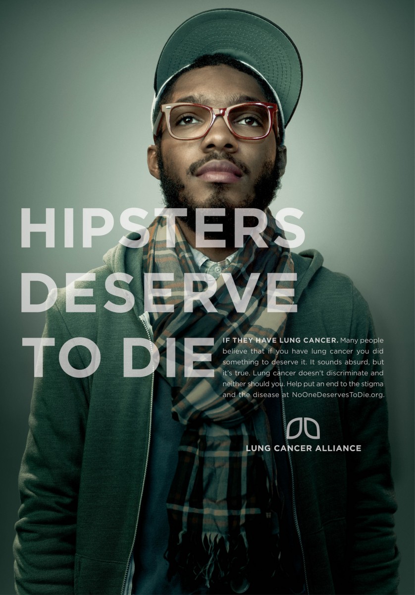
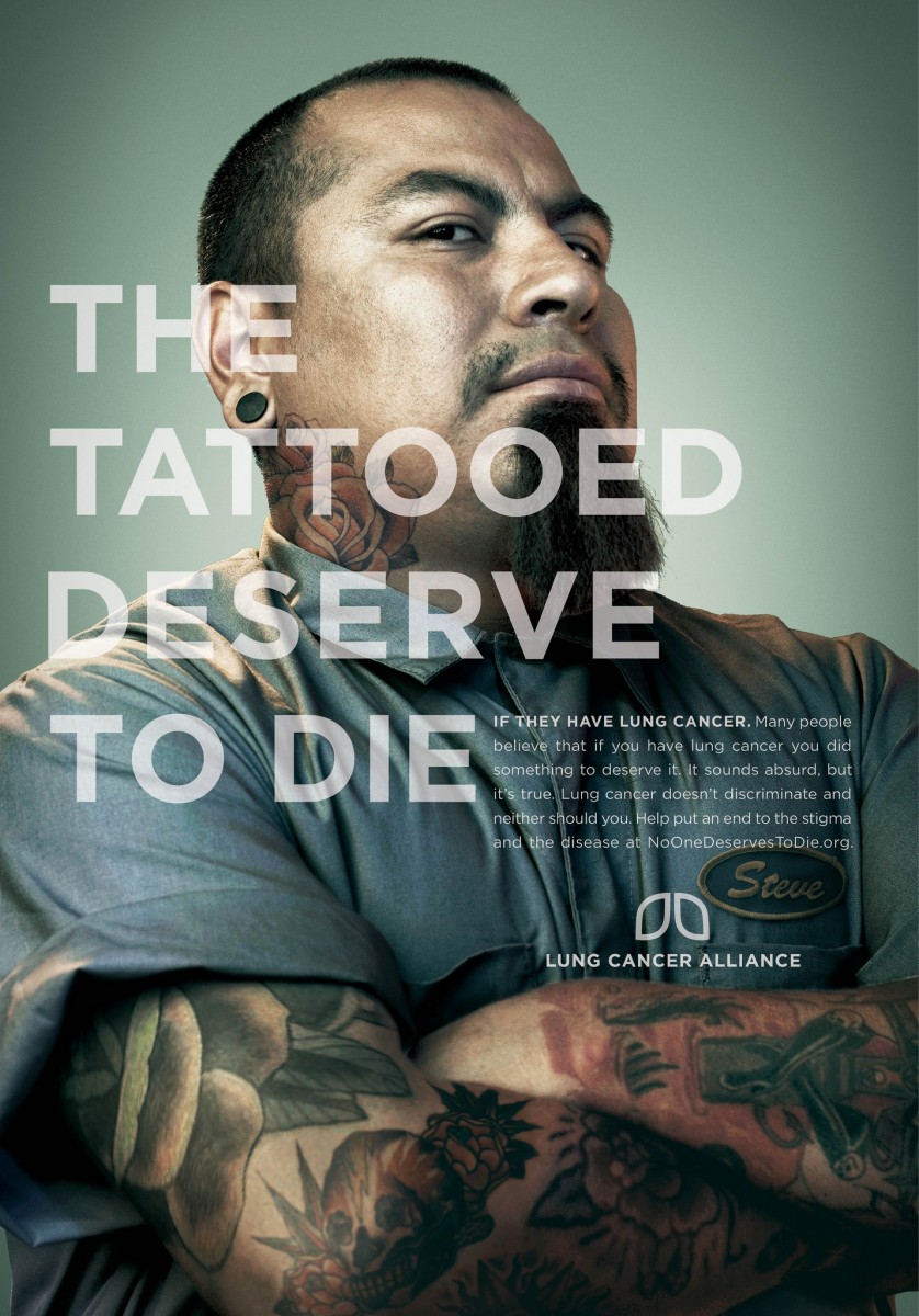
My final project prompt is going to be a hair campaign specifically based around women of color and how they are treated based on their hairstyle and discrimination they get for their hair in the workplace. Many women even in this day and age still receive discrimination or may not even be hired for a job based on the way they wear their hair. Many women of color have their natural hair in afros, dreads, braids, or just out loose and curly or even their hair colored or dyed and are comfortable with their hair and how they choose to wear it. I think that this subject needs more attention since discrimination like this still happens not just necessarily in the workplace but throughout society but it is noticeably prominent in the workplace. My idea for how to handle the shoot is to have at least 3 models that are women of color and have their hair in different styles; out loose, braids, etc. and have them dress up in workplace attire button shirt, slacks etc. and have them maybe contrasted standing next to someone who would be perceived as having ‘appropriate’ hair and attire etc. I would still have to illustrate thumbnails for the shoot but I have ideas. I was also thinking about the lighting and set up like having maybe a grey backdrop with dramatic lighting similar to some of the photography examples from our midterm quiz.

Inspiration Richard Foster

This photograph by by Foster is from one of his many perfume campaigns. Though I am unsure which this perfume from whichever campaign he shot. I think from looking throughout his work that this photo is definitely one of his strongest examples of a ‘hero’ shot. I think that this photo is really strong due to not only the prominent reflection shown here but also the colorful gradient shown on the bottle throughout the casted reflection. I don’t think this even has to show the brand of perfume necessarily since the strength of the photo speaks for itself. I think that the reflections on the sides of the bottle and the lid are also well done. They show a nice contrast of the shadow silhouette and the color gradient. I also like how the reflection from the sides of the bottle also cast down over the gradient that is casted down like a shadow from the bottle while it is just light going through the bottle to give off that effect.

Inspiration Brian Rodgers Jr.

This photo by Rodgers features a Sixth Glass beer front and center being lit on fire. This photo is very bold and strong and tells the story of the beer being ‘good’ or ‘strong’ or ‘impactful’ with the fire around it. The fire on the beer is what makes the statement of the beer being good and not just the beer itself. If the photo just featured the beer itself then I don’t think it would be as strong of a photo composition wise nor would it show the consumer how good and powerful the product really is. The hero product which is the beer shown in the photo also has a good visual look in terms of form and color. The color of the bottle matches well with the fire that was placed in the photo and the label also matches well with the rest of the photo. The black backdrop also allows the beer and fire to stand out more and is much stronger compared to if the backdrop was white or any other color.

Inspiration Jill Keller

This photo by Jill Keller is from the section on her site called “Jello”. The photo just consists of a bunch of fruits, jello, ice etc. on a tray but the thing that makes it interesting is that they are all color coordinated and sectioned. The thing that makes the food in this photo look appetizing to me is the fact that there is a variety of shape, color and size of the fruit ice and jello. You can see the kiwi for example sliced open and seeing all of the inside parts of it and next to the broken up jello and fruit mixed in with each other. The overall look and composition of this photo looks very appetizing and refreshing. Some of the props for this photo like the ice and the tray for example add to the refreshing look of this photo. It makes the fruit and jello combined feel fresh and more appetizing and helps tells the story of the photo being appealing. I think the choice of color coordination of the fruits was a smart choice by the photographer and really brings out the composition and the feeling of it being appetizing. I feel like color coordination is very nice and flows well together rather than if the fruit was spread randomly without any coordination.

Inspiration Marcel Christ

This photo by Marcel Christ is a non-commissioned work using the COCO Chanel perfume but with a corner of it exploding from the side. To me the thing that makes this a successful photo is because of the impressive use of the extremely fast shutter speed to capture the very second the bottle explodes at the perfect position. Also composition wise I think that this is a strong photo. The subject is bold in terms of its placement, color, contrast, and movement with the explosion. The bottle is a deep yellow color that stands out with the background nicely and is centered in the middle of the background. This photo also uses rule of thirds by having the explosion in the corner of the bottle which attracts the eye to that corner first which shows hierarchy. Overall all aspects of this photo are very strong and it is a well composed photo.

Inspiration Andrew Scrivani

In this photo that Scrivani took a close up of a pie, the lighting here is displayed from what appears to be natural window light. As if the pie is sitting by a kitchen window or something similar to cool down, which is fitting. The five points based on the handout are used here effectively. The first point is subject placement being whether the photo is centered or not, here Scrivani decided to fill the frame with the pie so the photo is being centered. The second point referrers to the rule of thirds which would divide the frame vertically or horizontally. Here, Scrivani applies the rule of thirds to a degree. In this photo the imaginary rule of thirds lines intersect at different edges of the pie where the circular parts show. So the rule of thirds is not obvious but it can be shown there. The third point being perspective which in this photo is an upward perspective or in other words it is flat because we are just seeing the top portion and no depth of the pie; which leads to point four of the photo being in an overhead view. Point five which is tonal variation between the subject and the background; there is a decent contrast in tonality between the pie and the background. While a majority of the pie is a light golden brown color and the background is a magenta like color; the pie filling is also very similar to the magenta like color shown in the background. However even tho it is similar it does not kill the photo or overpower it and there is still a nice contrast and tonal variation within the photo.

Inspiration: Quentin Bacon

Bacon’s style of food photography is very unique and appealing. The background in a lot of these photos are very simple backgrounds like a wooden table or a marble table, a tablecloth, there are even some photos where the background is someone holding the food either the person eating it or the chef. One of the things I notice stands out about these simple backgrounds is that it provides a nice contrast to the food that is the main subject of the photo. I feel like the simplistic backgrounds bring out the detail and color and texture of the food more since there is nothing too heavy in the background that is distracting, and if there is like a person for example Bacon uses shallow depth of field so they are not the main focus of the photo. This photo I have chosen from Bacon is one that I really enjoy a lot.  I love the detailing of the squeezed blood oranges as well as the detailing of the freshly cut ones. Also the simple table top background really allows the colors to pop out more even from the juice on the table to the knife to pop out more. I also love the juice in the cup and the deep purple red color that shows there along with the dark orange coloring on the skin of the oranges.

Inspiration- Celeste Sloman

This photo was the one I chose out of a series representing the Women of the 116th Congress by Celeste Sloman. This portrait of Kirsten Gillibrand caught my attention. What I really liked about this photo as soon as I saw it I was really pulled in my the lightness and softness of this photo. From the lighting to the color to the positioning, this photo gives off a really soft and light feeling. The lighting in this photo is soft broad lighting and it seems that there was also a diffuser used since the lighting is so soft. The composition in this photo is good as well because her head and shoulders fill the frame so it is laid out well. There also seems to be a good amount of emotion in this photo as well. Gillibrand’s eyes in the photo look to be ‘hopeful’ or ‘looking forward to the future’. Gillibrand’s eyes also are well composed with the backdrop of the photo. Gillibrand is also posed with her chin up and at a 3/4 view which allows her jawline to be extenuated and makes her look powerful and confident. Her facial expression as well makes her seem confident giving off the calming smile and also making her look confident.

Gregory Heisler Inspiration

This photo by Heisler was a part of one of his portfolio series called “Miners”, which is a photo series of portraits of miners. I was immediately attracted to this photo out of the photo series. The way Heisler composed this photo was well done and unique. Heisler fills the frame with the subjects face and appears to use a shallow depth of field which makes the subject stand out more. The lighting in the photo is also impressive. It looks like Heisler used the off camera flash in an outdoor environment. The lighting is lightly flashed over the subjects face, giving it a very soft and natural look. Due to the combining the factors of the nice and smooth lighting along with the way the photo was composed, the subject in this photo gives the subject a very soft and delicate feeling and look to him. Even though the subject who is a miner has a very scruffy and rigid appearance to him, the lighting makes him bring out emotion. The lighting that is reflected in his eyes even make him appear to be emotional and raw and the eyes are what stand out the most in this photo to me. Heisler does a good job not only in this portrait but in a majority of his portraits giving his subjects a raw emotional look but still being in their natural state. Heisler handles lighting and composition well to achieve this nice contrast.

Inspiration #2

Both Karsh’s and Kandar’s work have a deep,dark moodiness about them revolving their subjects. After looking at Karsh’s work I noticed that his style is exclusively black and white, but also have a lot of emotion held within them. The black and white effect is a nice contrast compared to his subjects who are energized and seem to have a positive aura surrounding them. Kandar’s work is similar, yet also quite different compared to the work of Karsh. Kandar’s work has sort of a cool monochromatic color scheme using a mix of blues, greys, blacks etc. And while Kandar’s work has some kind of color in it his subjects appear to be a lot more moody compared to Karsh. A majority of his subjects look deep in thought and emotional, also with a lot of them not looking at the camera. One tacit that I learned from looking at Karsh and Kandar is to maybe work on human emotion in my photos. Instead of the person looking stiff and emotionless maybe try to convey a little emotion from them in my photos. Not just with the subject but maybe with the background or any other photo effects etc.