Category Archives: Inspiration

Insperation # 10 – Richard Foster

Blue perfume bottle

Blue perfume bottle

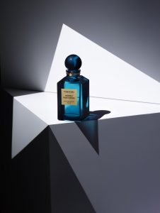
To me the Tom Ford perfume campaign is visually strong. It looks very smooth, as if it’s some sort of painting. Another thing that makes the image visually strong is the geometric shapes, you notice the image having several triangles and the different shades the shapes are in, black, white and different grays. I also like how the light brings into the epicenter, it’s the first thing that catches your eye. The bottle also looks nice with light going through, and with the bottle being transparent it creates different shades of blue. I also like how the shadow has a tint of blue.


Insperation # 9 – Brian Rodgers, Jr.

Controller 0n Fire

Game Controller on Fire

I chose this photo because it caught my eye, it stood out from the rest. The reason I think it works as a hero, and it being visually appealing is it’s minimalistic look. The background  is just entirely orange at one tone and the controller is orange. But another aspect that makes it visually appealing is how the controller does not blend in with the background. You have the black accents, the black, shadow, and fire making a clear outline. It’s distinct from the background, it just doesn’t get lost into the background. Another thing that makes it visually strong and interesting is the fire, it’s just a random fire  burning a controller floating in midair. The fire also matches with the aesthetic/color theme of the photo.

Insperation #8 – Jill Keller

Pasta

Pasta

The photograph tells the story of someone’s hard work making different types of pasta that are ready to be cooked and served. In the photo you see black pasta, whole grain pasta, ravioli, farfalle, and more. While it is not technically cooked, it still looks appetizing because it simply looks freshly made. Like you want the person who’s making it to be done with it so you can eat some freshly made pasta. The props used are a molder and/or cutter, a paddle of sorts, flour and a rag. They contribute to the story because these would be items used to make and prepare the pasta. And to clean everything once the preparation is done. Similarly, the props in the photo make the pasta look like it was just finished and ready to be cooked, boiled or what ever. One thing that that the photographer added to make the photo a more of a success the lighter pasta pop out against the dark background. Even the black pasta stands out from the darker background because of the flour sprinkled on it. Also the top done view is a nice touch because you can everything laid out on the table. Additionally, this may be a bit of a stretch but it would appear that the photograph follows the rules of third, I say that because if you divide the photo the quadrant in the left side has the most thing going on, with the black pasta, whole grain pasta, the farfalle, the oval shaped pasta, and bits of flour are at. In most cases that is where the eye would go first.

Inspiration #7 – Marcel Christ

Drink

Hennessy

In the hennessy photograph, it gives off this relaxed vibe. The background is a warm gradient color which again gives off a calm atmosphere. The drink itself is glowing due to the surreal sunset, displaying it as if the drink was a tropical beach of sorts. Like previously mentioned, this gives of a vibe of going to the beach, drinking and watching the sun set. What makes this image work is what I previously stated, it invites to people to have a drink. Like it’s saying this ‘the drink” you buy when you’re relaxing at the beach by yourself or with someone else. It’s simplistic and minimal, nothing too gaudy or over the top. Even with the inclusion of the sunset it doesn’t feel too much. Like mentioned before, it just presents itself as something you drink you’re chilling on a sunny day.

Insperation #5 – Quentin Bacon

Pancakes

Pancakes

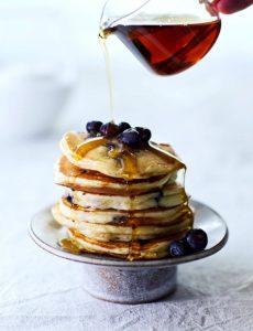
A lot of the backgrounds from Quentin Bacon give off the rustic and homestyle feel. For example a lot of the backgrounds are these aging table counters which gives that rustic look to the images. Other backgrounds give this vibe of it being made at home with the table cloths, plates and cooking accessories. And some background look like they were made in a restaurant or other setting like a bakery. The background in the image is a table with a white cloth. The props he uses in the image are a silver stand for the cupcakes and a jar containing maple syrup (or motor oil).  The angel of the view is like frontal eye level view of the pancakes but with a slight overhead view. A lot of his images contain depth of field, having a blurred background. It makes the main subject more noticeable. Another thing i notice in his images is that they are a mix of over head and three quarter view. Some of his images are also close up. The reason I chose this image is because it looks really appetizing. The pancakes stacked up nicely on each other (probably with cardboard), and each one is a golden-brown color. The blueberries also look plumped and juicy. Then the maple syrup runs down the pancakes like a water fall.

Insperation #6 – Andrew Scrivani

Food

Spaghetti and Meatballs

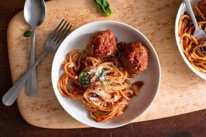
I chose this image because it looks the most appealing to me, plus I really enjoy spaghetti and meatballs. The placement of the plate with the spaghetti and meatballs is centered but not equally distant because the plate is more closer to the bottom edge of the photo. It is very clear that the main subject of the picture since different parts of the plate land on different intersections when the image is set in a rule of thirds grid. I’m not entirely sure of the perspective as the foods are not diminishing in size. Perhaps it has converging lines because the fork and spoon intersect but again I’m not really sure. So the angel of view is over head. There is tonal variations between the backgrounds and main subjects. For example the white plate pops out against the wooden cutting board. Then the spaghetti and meatballs are more visible in the white plate than they would be if they were on the wooden board (also that would be weird if they were on the board without a plate ). In the photo it appears the light in the photo is soft light, I say that because the shadows do not make a clear distinct figure/shape. It’s more vague the outlines and more conjoined instead of forming a distinct outline. The edges also look soft. I could be wrong but to me it also looks likes the light used is window light.


“PETER HURLEY”

Peter Hurley is a photographer who lives in New York City expert on headshot and portrait. “He’s best known for the genuine expressions he captures for his executive business portraits and actor’s headshots.”
I’m a big fan of studio shoots but more I looked up all this inspiration it makes me hate studio shoots because it’s so limited and every picture starting to look smiler and all use of light like front light or backlight or any other light accept nature light because it makes feel less connected to the photo.
I like this picture because this is a creative way of using light. this picture related me you can see it not night sun is not when down but is going to sleep that’s how life s you have to wake up early for the job and can’t get enough sleep. This picture show was the life of city people living in an apartment and alone because of city people is so busy with their job and this shows all of that.

“HEISLER”

“Gregory Heisler is a professional photographer known for his evocative portrait work often found on the cover of magazines, such as Time, for which he has produced a number of Man, Person, and People of the Year cover” So, I read this fist before I looked up his work because I wanted to know bit about photographer. Then I saw his portfolios all of his is work is just like what it said lots of portraits shoots.
When I looked in his portfolios I can not find something I like because it’s all looks just like other inspiration people we did before but the end of this portfolios there is a section called “Other” I looked up that and I loved it. In “other” all the picture is high speed photography and it had so much emotional even when its just place without any people in the picture. I liked this picture because it’s so simple, picture of a window but what makes this so great is the use of high speed. when you look at this picture you will feel insecure and scared because its look like someone is watching you or something is coming in your room. Also, the sky and the tree helps to make this photo feel more scared.

Celeste Sloman

Ms. Sloman is an incredible photographer with so much talent and dedication is her crafts. She has received various clients in her time in which include political personnel such as Ms. Cortez.

Alexandria Ocasio-Cortez

This portrait is by far my favorite due to the person of interest. As a representative of the United States, someone who fights for the rights of the minorities and does not give up until our voices our heard, she should be taken seriously and that is exactly what this portrait portrays. The essence of black and white photography captures sincerity and mannerisms, this photo of Ms. Cortez shows that she is intelligent, serious about her job and also calm, she is friendly, that half smile gives us so much intake about her. The lights, the key light is positioned directly in front of her to bring light to her face, it gives a nicer vibe to her photo rather than if her face wasn’t as lit up and dark it would give more of a sinister personality trait. I admire the shadows on her face and under her chin as well it brings a sense of balance and it shows the beautiful features of her face, sharp and agile just like her.

Insperation #4 – Celeste Sloman

Deb Haaland

Deb Haaland. Credit: Celeste Sloman for The New York Times

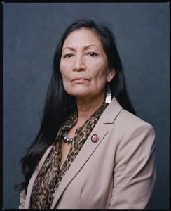
Out of all the photos from the women of the 116th congress taken by photographer Celeste Sloman, my absolute favorite is of congress woman Deb Haaland. The image gives off this presence of power, retaliation, and not taking no as an answer. Her facial expression and her posture being completely straight displays this sense of sternness and stoicism. Her stare demands that you give her your immediate attention. You also see her wrinkles which help demonstrate that she has been through a lot, fought a lot, that she knows what it is like to struggle. Overall she illustrates this feeling of intimidation. In portrait photo right off the bat you can tell she is separate from the background, you can identify her entire body nor does it begin to disappear further away the body gets from the source of light. This shows off her importance of being a congresswoman and law maker, a Native American one at that as well. Another thing that makes her stand out is her beige/khaki suit. The color is dull and mundane yet vibrate enough to make her pop against the background. Which is somewhat contradictory. Then we have lighting, which in my opinion it appears to be front light evident from the lack of shadows and the glare in her eyes. First off, the light makes her long hair look beautiful, as it looks silky smooth and glossy and it also makes her standout from the background. As previously stated, the light was probably in front of her, showing every single detail of Deb Haaland as possible, which again shows her importance. Due the lighting style, her image lacks contrast with light shadows. In a way the shadows are nonexistent, it’s only predominantly seen on the side of her face, her neck and wrinkles from the suit.