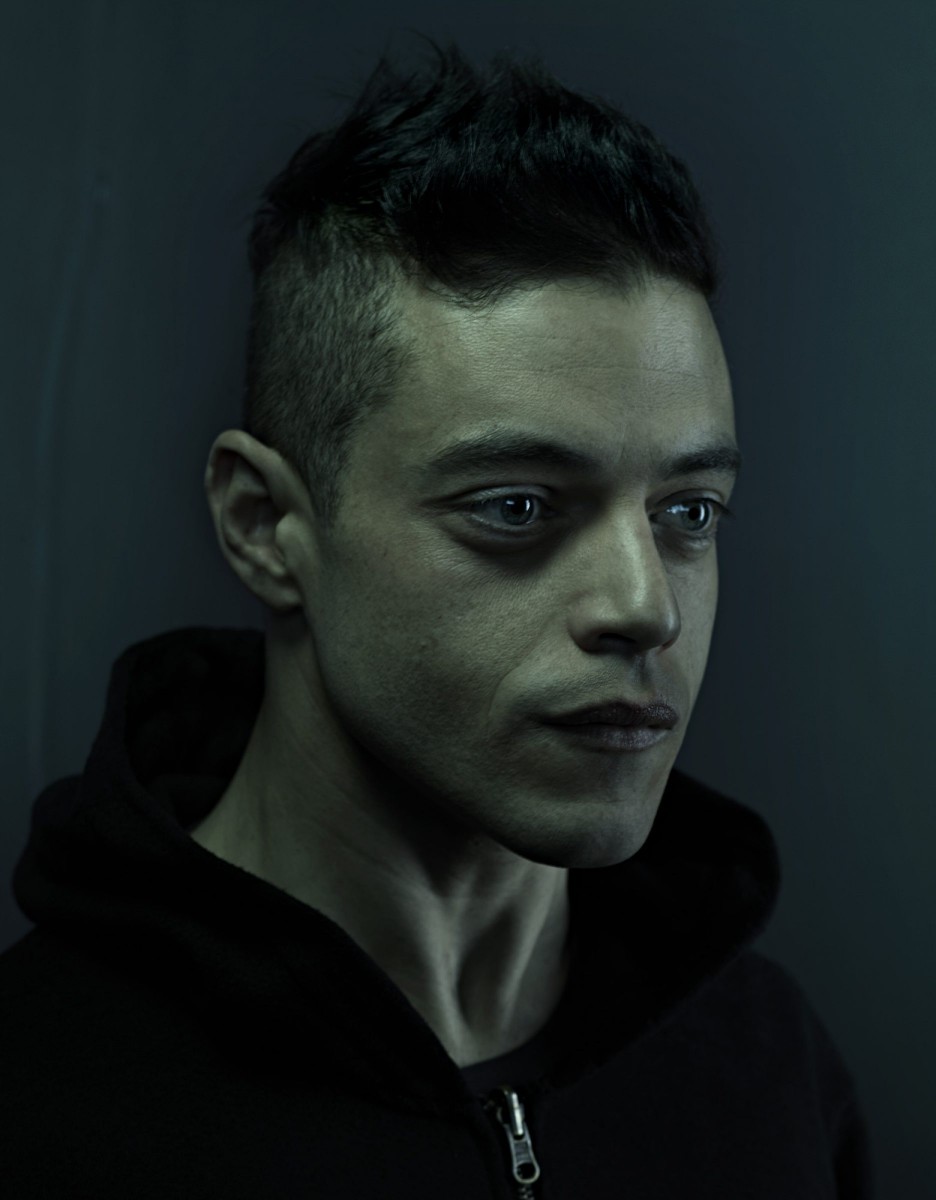
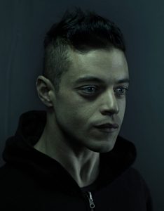
Author Archives: Christian

Final Proposal – Video Games

For my proposal, I want to create a campaign of games being fun because lately video games are being put in a negative light through media outlets. Originally I wanted to show how games are beneficial when it comes to cognitive development, motor skills, vision and then some. But that has proven difficult to translate into imagery. Instead I settled with trying to show games are meant to be fun. To be honest, there isn’t a lot of positive word of mouth for video games and that they’re meant to be harmless for photography and PSAs. So it’s kind of difficult trying to find campaigns similar to mine, most times like previously mentioned I’ve encountered negative PSAs. As for the audience, the campaign is meant to reach out to people who maybe unsure about video games.

Insperation # 10 – Richard Foster

Blue perfume bottle

Blue perfume bottle

To me the Tom Ford perfume campaign is visually strong. It looks very smooth, as if it’s some sort of painting. Another thing that makes the image visually strong is the geometric shapes, you notice the image having several triangles and the different shades the shapes are in, black, white and different grays. I also like how the light brings into the epicenter, it’s the first thing that catches your eye. The bottle also looks nice with light going through, and with the bottle being transparent it creates different shades of blue. I also like how the shadow has a tint of blue.


Insperation # 9 – Brian Rodgers, Jr.

Controller 0n Fire

Game Controller on Fire

I chose this photo because it caught my eye, it stood out from the rest. The reason I think it works as a hero, and it being visually appealing is it’s minimalistic look. The background  is just entirely orange at one tone and the controller is orange. But another aspect that makes it visually appealing is how the controller does not blend in with the background. You have the black accents, the black, shadow, and fire making a clear outline. It’s distinct from the background, it just doesn’t get lost into the background. Another thing that makes it visually strong and interesting is the fire, it’s just a random fire  burning a controller floating in midair. The fire also matches with the aesthetic/color theme of the photo.

Insperation #8 – Jill Keller

Pasta

Pasta

The photograph tells the story of someone’s hard work making different types of pasta that are ready to be cooked and served. In the photo you see black pasta, whole grain pasta, ravioli, farfalle, and more. While it is not technically cooked, it still looks appetizing because it simply looks freshly made. Like you want the person who’s making it to be done with it so you can eat some freshly made pasta. The props used are a molder and/or cutter, a paddle of sorts, flour and a rag. They contribute to the story because these would be items used to make and prepare the pasta. And to clean everything once the preparation is done. Similarly, the props in the photo make the pasta look like it was just finished and ready to be cooked, boiled or what ever. One thing that that the photographer added to make the photo a more of a success the lighter pasta pop out against the dark background. Even the black pasta stands out from the darker background because of the flour sprinkled on it. Also the top done view is a nice touch because you can everything laid out on the table. Additionally, this may be a bit of a stretch but it would appear that the photograph follows the rules of third, I say that because if you divide the photo the quadrant in the left side has the most thing going on, with the black pasta, whole grain pasta, the farfalle, the oval shaped pasta, and bits of flour are at. In most cases that is where the eye would go first.

Inspiration #7 – Marcel Christ

Drink

Hennessy

In the hennessy photograph, it gives off this relaxed vibe. The background is a warm gradient color which again gives off a calm atmosphere. The drink itself is glowing due to the surreal sunset, displaying it as if the drink was a tropical beach of sorts. Like previously mentioned, this gives of a vibe of going to the beach, drinking and watching the sun set. What makes this image work is what I previously stated, it invites to people to have a drink. Like it’s saying this ‘the drink” you buy when you’re relaxing at the beach by yourself or with someone else. It’s simplistic and minimal, nothing too gaudy or over the top. Even with the inclusion of the sunset it doesn’t feel too much. Like mentioned before, it just presents itself as something you drink you’re chilling on a sunny day.

Insperation #5 – Quentin Bacon

Pancakes

Pancakes

A lot of the backgrounds from Quentin Bacon give off the rustic and homestyle feel. For example a lot of the backgrounds are these aging table counters which gives that rustic look to the images. Other backgrounds give this vibe of it being made at home with the table cloths, plates and cooking accessories. And some background look like they were made in a restaurant or other setting like a bakery. The background in the image is a table with a white cloth. The props he uses in the image are a silver stand for the cupcakes and a jar containing maple syrup (or motor oil).  The angel of the view is like frontal eye level view of the pancakes but with a slight overhead view. A lot of his images contain depth of field, having a blurred background. It makes the main subject more noticeable. Another thing i notice in his images is that they are a mix of over head and three quarter view. Some of his images are also close up. The reason I chose this image is because it looks really appetizing. The pancakes stacked up nicely on each other (probably with cardboard), and each one is a golden-brown color. The blueberries also look plumped and juicy. Then the maple syrup runs down the pancakes like a water fall.

Insperation #6 – Andrew Scrivani

Food

Spaghetti and Meatballs

I chose this image because it looks the most appealing to me, plus I really enjoy spaghetti and meatballs. The placement of the plate with the spaghetti and meatballs is centered but not equally distant because the plate is more closer to the bottom edge of the photo. It is very clear that the main subject of the picture since different parts of the plate land on different intersections when the image is set in a rule of thirds grid. I’m not entirely sure of the perspective as the foods are not diminishing in size. Perhaps it has converging lines because the fork and spoon intersect but again I’m not really sure. So the angel of view is over head. There is tonal variations between the backgrounds and main subjects. For example the white plate pops out against the wooden cutting board. Then the spaghetti and meatballs are more visible in the white plate than they would be if they were on the wooden board (also that would be weird if they were on the board without a plate ). In the photo it appears the light in the photo is soft light, I say that because the shadows do not make a clear distinct figure/shape. It’s more vague the outlines and more conjoined instead of forming a distinct outline. The edges also look soft. I could be wrong but to me it also looks likes the light used is window light.


Insperation #4 – Celeste Sloman

Deb Haaland

Deb Haaland. Credit: Celeste Sloman for The New York Times

Out of all the photos from the women of the 116th congress taken by photographer Celeste Sloman, my absolute favorite is of congress woman Deb Haaland. The image gives off this presence of power, retaliation, and not taking no as an answer. Her facial expression and her posture being completely straight displays this sense of sternness and stoicism. Her stare demands that you give her your immediate attention. You also see her wrinkles which help demonstrate that she has been through a lot, fought a lot, that she knows what it is like to struggle. Overall she illustrates this feeling of intimidation. In portrait photo right off the bat you can tell she is separate from the background, you can identify her entire body nor does it begin to disappear further away the body gets from the source of light. This shows off her importance of being a congresswoman and law maker, a Native American one at that as well. Another thing that makes her stand out is her beige/khaki suit. The color is dull and mundane yet vibrate enough to make her pop against the background. Which is somewhat contradictory. Then we have lighting, which in my opinion it appears to be front light evident from the lack of shadows and the glare in her eyes. First off, the light makes her long hair look beautiful, as it looks silky smooth and glossy and it also makes her standout from the background. As previously stated, the light was probably in front of her, showing every single detail of Deb Haaland as possible, which again shows her importance. Due the lighting style, her image lacks contrast with light shadows. In a way the shadows are nonexistent, it’s only predominantly seen on the side of her face, her neck and wrinkles from the suit.

Insperation #3 – Gregory Heisler


Photo

While looking through Gregory Heisler’s website, out of the photos, this one caught my eye the most. I found it very vivid, it stands out a lot. When it comes to the lighting to the portrait it gives it a dramatic look to it as the light seems to be hitting him in the middle area of his face and body. You can see the furthest parts of the body have a bit more shadow than in the middle, again giving it that dramatic look and giving the face some more attention. Photo is very low contrast and I think it works well with it in color. Also, we get to see his upper body and the position he is in. It shows of someone who is important. This man could possibly a world leader from a country in Africa or a scholar of sorts. The position of his hand is also very interesting because it placed around his chest area. Another thing that makes him stand out is the fact the background is entirely black. It’s just him and nothing else. It makes him look very distinguished, like an “all eyes on me” sort of appearance. I also like the addition of the red hat, I think it brings the photo together and is not very distracting at all.

Insperation #2 -Yousef Karsh & Nadav Kandar

Rami Malek

Rami Malek, 2016

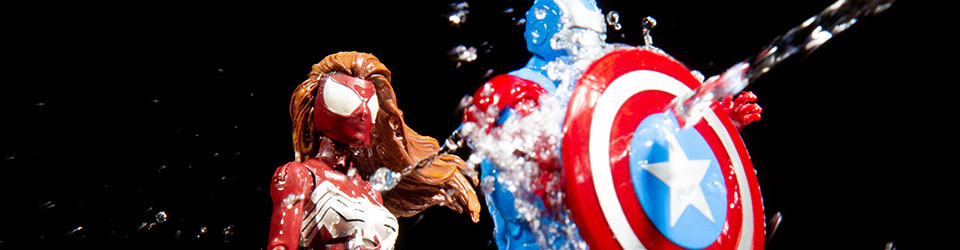
The photographs that Nadav Kandar has taken are really interesting. Most of his images are really artistic and conceptual. For example, in his National Portrait Gallery, majority of the people are simply floating in the air. But when it comes to the last four of the that gallery, are more serious close up portraits. They are black and white with 3/4 view giving us short light but with fills. In his Solitary Portraits Gallery it is mix of photos, ranging from conceptual, artistic. black and white, to split light, broad light, color and short light. Again, a lot of his photos has fills in them. A lot of his photos tend to be on the dramatic side but they’re some that are silly. The photo that drew me in the most was one with Rami Malek, while it’s somewhat hard to tell, for me. I think the photo has short light, you can tell because the side of the ear is darker with areas of more darker shade/shadows. It would seem that this photograph has a lot of fill on it. Perhaps I can emulate the way he uses fills in his photography in an upcoming portrait assignment. A lot of his photos are very fill heavy. And if possible I would also like to try out conceptual portraits because some of his photos in that category are really captivating.

Martin Luther King

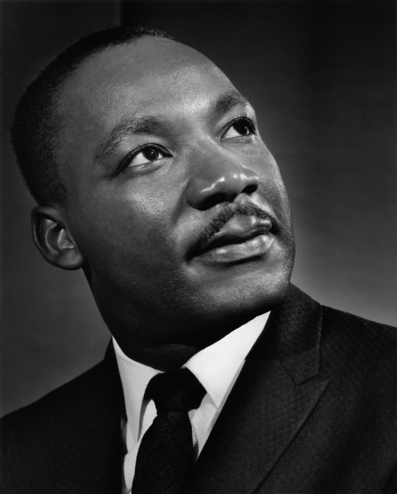
Martin Luther King Jr, 1962

When it comes to Yousuf Karsh, it is mainly portraits of famous figures. The gallery includes Winston Churchill, Martin Luther King Jr., Andy Warhol, Pope John Paul II, and many others. His photos have a mix of portrait lighting styles. In his gallery you can see some short light portraits, front light portraits, possibly butterfly light, and some split light. I’m not 100 percent sure on this but I do believe he is using fill in some of his photos. Another characteristic that I noticed in Karsh’s photos is that all of them are in black and white. No color in sight. Another characteristic is how the portraits convey a range of emotion, from delightful smiles, playfulness, to idealistic stares, and serious faces. The photo that grabbed my attention the most is Martin Luther King Jr., I like this portraits with the way he is somewhat starry-eyed, looking away from the camera. You can see his face is at 3/4 view giving off a short light portrait style. What I can try and emulate from Yousuf Karsh, I could try and bring the emotional range that he has in his photos.