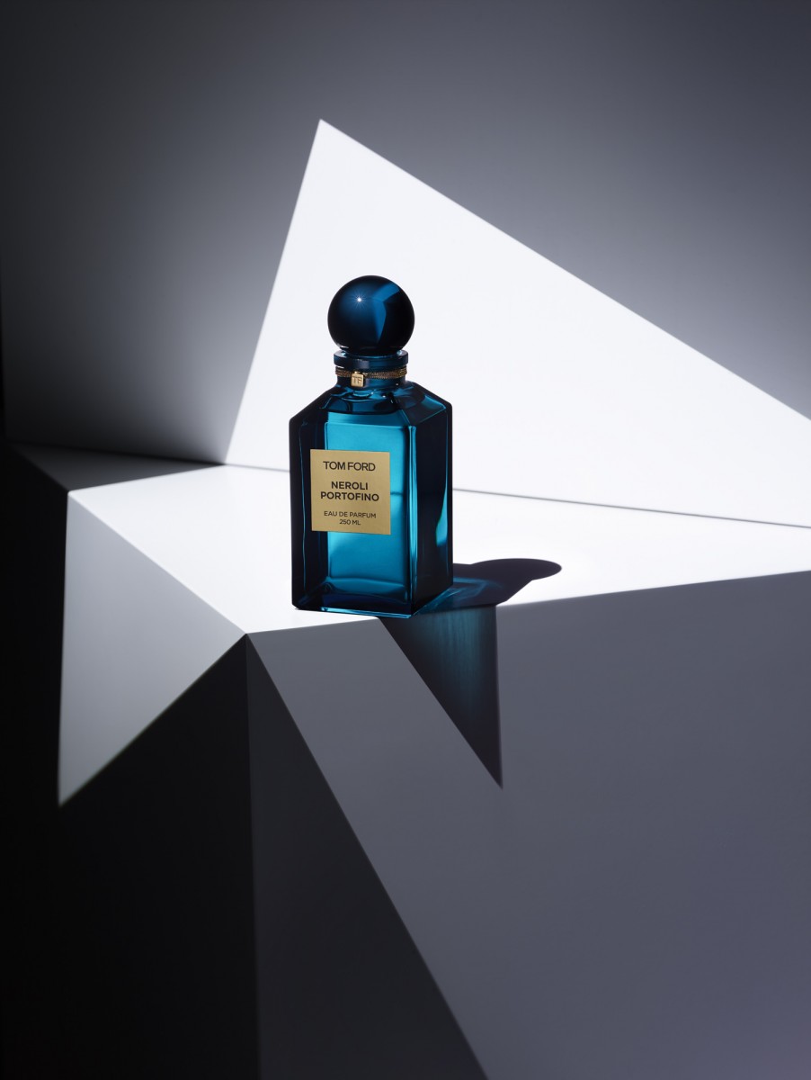
Blue perfume bottle
To me the Tom Ford perfume campaign is visually strong. It looks very smooth, as if it’s some sort of painting. Another thing that makes the image visually strong is the geometric shapes, you notice the image having several triangles and the different shades the shapes are in, black, white and different grays. I also like how the light brings into the epicenter, it’s the first thing that catches your eye. The bottle also looks nice with light going through, and with the bottle being transparent it creates different shades of blue. I also like how the shadow has a tint of blue.


As you state the geometry Foster makes with the light is phenomenal. It associates the perfume with elegance.