Author Archives: Janae Harrison

Final Project Proposal Redo

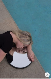
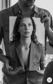
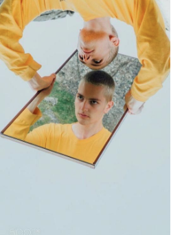
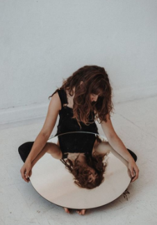
When I think of an important issue I think of self-love and self-worth. At times we don’t take a pause at life and stop to appreciate our selves. I attended a self-love workshop and one of the activities was to look in a mirror and give yourself compliments. Shockingly it was harder than expected. Doing this activity really opened my eyes and I want to combine that experience into my final project.

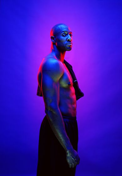
For my final project, I want my campaign to be self-love. I will have a series of different models, and in each picture, they will be looking into a mirror. I want to make sure to capture both of them and their reflection. I want my images to encourage people to love in the mirror and show love to themselves. Without self-love, it’s impossible to love anyone else. How can you love others when you don’t love yourself.

For the campaign I want it to have the text, “Self-Love starts with you” or “Self-Love starts with loving your reflection.” Another idea I was thinking is finding positive quotes from other people of things they’ll say to themselves in the mirror. I want my campaign to have a very serious feel, I want it to feel very powerful.

Final Project Proposal

For my final project, I want to do a campaign that promotes “Self Love.” Self Love is very important and I feel that a lot of people aren’t aware of how important it is.  I want my images to help people with low self-esteem and helping them build their self-image. When I attended a self-love class the first activity was to stand in front of a mirror and tell yourself what you love about yourself and shockingly it was hard for a lot of people couldn’t even look in the mirror.  I want to include this image in my project, with the goal of people embracing their reflection, their true selves.  

That being said I want to have different mirror sizes and shots of the models looking in the mirror and smiling.  Every shot I want to be able to catch their expression along with their reflection. My biggest challenge will be figuring out the best lighting because mirrors are hard to capture without the flash showing. I did a lot of researching and found a lot of inspiration on Pinterest. 


Brian Rodgers Jr.

Brian Rdogers Jr. has a lot of nice photos. One thing that I noticed that’s different from the other photographers I’ve written about is that he adds a lot of props, which may have been adding after the shoot. For example one of his pictures was of a drink but he added a fire texture, which brought life to the photograph. Another picture I saw was of an orange drink and around the drink were lemons, but the lemons were portraying movement.

From all of his photos, I feel like this one stood out to me the most. Both pictures are of the same product, yet were shoot differently. The first picture is of the bottle and what I love the most about it is how well lit the bottle is. I feel as if there was a backlight hitting the bottle because of how well lit the bottle looks. Another thing I love about the first picture is the details, the water sprayed on the bottle, helps the drink to be portrayed at cold and refreshing. Lastly, I love the details behind the bottle, It brings a great depth of field and makes nice colors. The colors are a good balance and aren’t taking away from the bottle.

Lastly on the other side, he captured the drink in a cup. What’s most successful about this image is the splash. The splash makes a great shape, it’s the most perfect splash I’ve ever seen. Another thing that’s most successful about the shoot is the lighting, everything is well lit, it’s hard to shoot glass in my opinion but he was able to perfectly get the glass to look super clear. The great detail of the ice being dropped makes the shot so interesting. One question I have is, in this picture is that a natural shadow, or what is possibly produced after the shoot?


Jill Keller

From looking at Jill Keller’s page, I was fascinated with the great pictures she took. My favorite series from her website was the Burgers. From the series, this burger was my favorite from the rest.

From the looks of the picture, the picture tells a story. The story that I get from the picture is that this burger is possible from a restaurant. The clue that helps me see that is from the add on she placed in the pictures. When I say add ons, I mean the fries and drink. I give me a feel as if this is a combo or his burger works well with these add ons. The add ons works for the burger because they go well together and makes me want it even more.

What makes the food look so appetizing is how much detail was captured. Every ingredient is well caught in the picture, from how vibranT the lettuce and tomatoes are to how well the cheese is melting on the burger. The small details bring life to the bigger picture.

I also love the props that were used in this image. Keller used a lot of props that helped bring the burger alive. She used plates, napkins, sauces and even as something as a beer cap. The beer caps add to the story of being able to enjoy this burger with dinner. It helps build the burger.

Keller did a great job shooting the burger. Though it loaded with a lot of props I feel that it works well. It brings character to the burger.

Marcel Christ

Wow! Marcel Christ has amazing pictures on liquid, it was hard for me to pick my favorite. In my opinion, I feel that liquid can be easy to look boring but Marcel Christ brings life out of liquid.

My favorite picture from Marcel Christ is this one, there are so many things working in this image.

The first thing that I noticed about the image is the vivid colors of the drink. I love how much the colors in the drink brings life to the photo. In the image, there are so many details showing from the tip of the glass. Something else that I love that he did with the photo is the image. This was the best angle to use because I feel that an overhead shoot wouldn’t have had the same results. this angle brings more height of the drink and is the true definition of a “Product as star” advertisement.


What I also like about the picture is the great number of details he brought out. If this was just a plain flat drink, the photo wouldnt be as appealing. The nice from being on top to being inside of the drink makes you want it even more, to the viewer the drink looks really refreshing. What makes this picture so perfect is how he was able to capture every little detail. I feel that it’s very important to get small details because drinks already have a small amount of depth to it.


Andrew Scrivani

After last week class, I view food photography so much different now. Andrew Scrivani has great pictures. When I went on his website, his website looked very yummy. All of the food pictures were nicely lit and looked so colorful.

My favorite picture on his page was this picture. It reminded me of the pictures I took of the tomatoes in class. This is an example of taking pictures of a lot of the same thing.There’s several clams all over the picture. The clams are placed all over,  giving  the  image  great  proportion.  Most  food  photography  is  either  shot overhead  or  at  45  degrees  to  the  food. Andrew  Scrivani shot it overhead,  and  it  works  perfectly  considering  it’s several  clams.  Another  thing  I love  it  how soft  the  lighting  is.  It  feels  never  natural  and  brings  out  the  details  in  the  shells.

Quentin Bacon

I feel that food photography is very important because it’s what will get people to go ahead and make the food purchase. The food has to look very delicious and Quentin Bacon does a wonderful job of showing food.

From looking at all of her photos, her pictures feel as if I’m at the table with the food as well. I love how she’s able to bring the food to life. My favorite picture on her page is the dish od Mac and cheese. This image shows how cheesy the meal is.

The Smith DC

I like how she was able to capture the moment. I feel that this brings it out more than just a regular close up of the dish. This was a smart image because it shows not only the outside of the dish but the inside and what to expect when they put their forks in the dish.  Another great thing about the image is the lighting, I think there’s only a key light because the dish is well lit and I don’t see any shadows. I feel broad lighting was used. The lighting makes the dish look really appealing and there’s a good amount of contrast or clarity which brings out the crispness on top of the dish.

Celeste Sloman

Celeste Sloman has a lot of great work. What I love most about Sloman’s work is how clean the shots are. As in clean I mean that the lighting is always perfect and the edits are not overbearing and works perfectly with the photo. The lightning in each picture always goes perfectly with the subjects expression.

From the Women of the 116th Congress album, this picture stood out to me the most. The first thing that I noticed about the photograph was the facial expression. I feel that the smile was genuine and was a candid shot. Her smile looks natural and it’s as if you can picture her laughing at that moment. Another observation that I subject isn’t looking in the camera, which makes the picture look even more candid.

The lighting that was used in this image was short light with a fill. I could tell it’s short light because the subject isn’t face directly at the camera and her one side of the face isn’t fully lit. Short light helped make the black and white look amazing. The side that isn’t lit helped bring more contrast in the black and white, making it feel more detailed.

Gregory Heisler

From looking through Gregory Heisler’s photographs I’ve noticed that he was a lot of different photography styles. I love how unique his pictures are. From looking on his website http://gregoryheisler.com/portfolios, I loved how unique each series was.

My favorite album was Vibrant, I loved the different lighting and colors he used. My favorite photograph out of the album was this image. From looking at the image he used three-four lights. I believe he put a color sheet in from of them each light as well. For the backlight, he used pink and the key light he used blue and the slide light he used blue as well. I noticed the pink light behind his ear and no his back and I think that was another light he used. I also think that the color of the backdrop is the same color at the blue lights on the model’s body. I feel that this was the best color option because it allowed the image to be more Vibrant. If the backdrop was black or white I feel it wouldn’t have the same effect.

Yousef Karsh & Nadav Kandar

Yousef Karsh and Nadav Kandar are both very talented photographers with similar yet different styles. They both specialized in portrait photography.

Yousef Karsh’s photographs were in black and white. What I liked about his photographs where the lighting. I love how he brought out the shadows which added texture to the black and white. Sometimes when I see a black and white picture feel it doesn’t go with the picture but Yousef Karsh made sure it makes the pictures work together with the black and white.

While Nadav Kandar also works with black and whites and also adds a different texture to some of his pictures. What I love about some of his black and whites is when he adds a tint of blue. It makes the picture feel very warm, this was a very unique technique. I feel that black and white photography can show a sense of seriousness and when he adds the blue it lightness up the mood.