Taglialatella Galleries and the High Line Field Trip
On last Wednesday, we had visited Taglialatella Galleries which was near the High Line, the one of most famous landscape in New York City. In the galleries, we saw many artworks of current graphic designers, which made us have deep understanding and experiences about the world of modern art, typography, and graphic design.
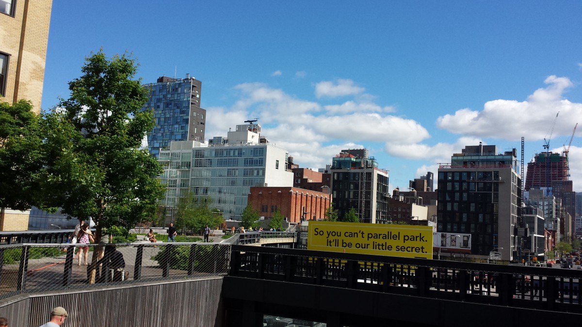
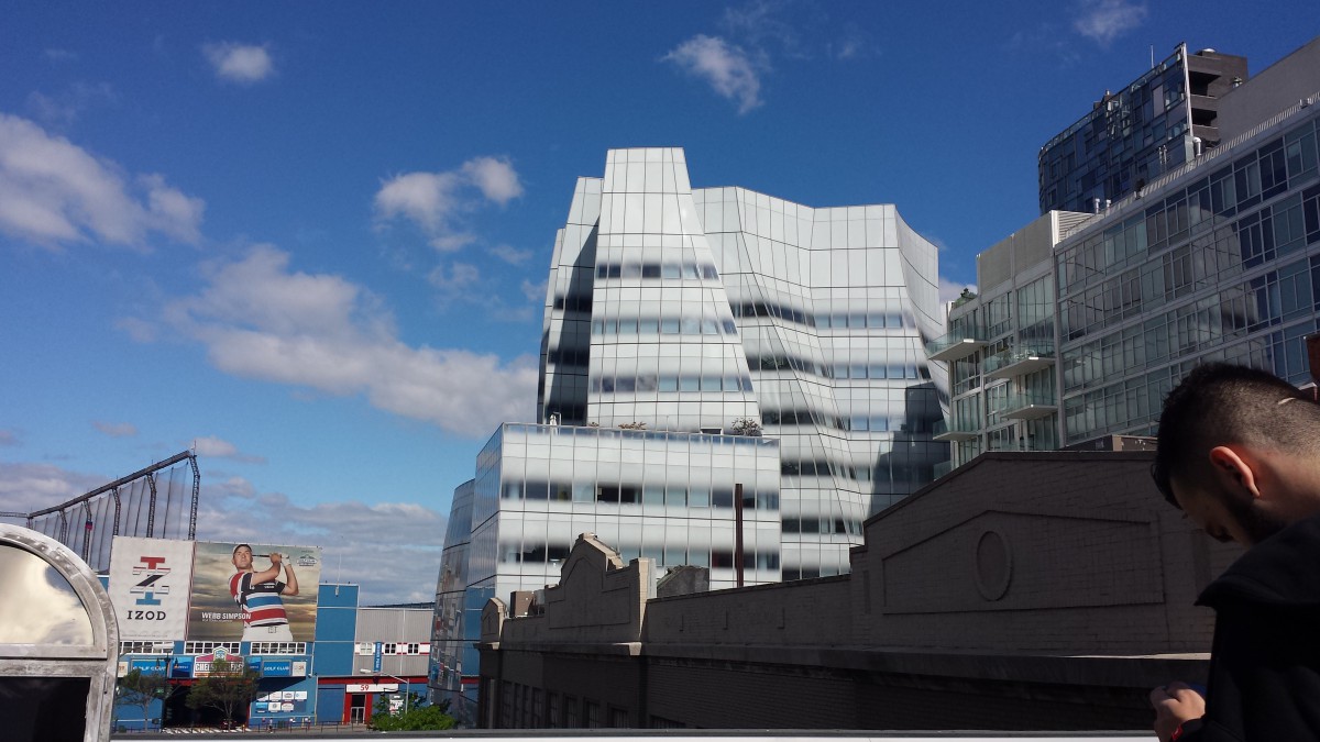
Before we went to Taglialatella Galleries, we had visited the High Line which was rebuilt from the track of high-speed rail. To me, the High Line was liked a hanging garden of New York City, and provided a place to people to far away the busy lifestyle of the city. At the same time, people also could enjoy the beautiful scenery of New York City as they looked down from the High Line and the beauty of nature by looking plants that cropped on the High Line. As the development of the High Line, there were lots of new buildings surrounded it including artistically designed building. For example, one of these building I saw was very attractive and surprise me because most parts of this building’s structure were not straight lines but curve lines. Besides that, the color between the windows and external wall was not pure color but the gradient ramp from white to gray, and the material of the windows was like mirror within the smooth reflective surface to black color. Therefore, it was hard to see the edge between that building’s windows and external wall.
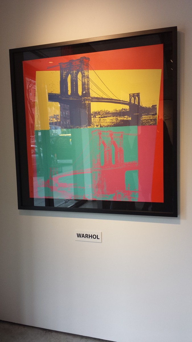
After we walked down from the High Line, there were many galleries around this area which showed greatest artists’ works in today’s world, and were usually public to people to visit. The gallery that we visited in this field trip was called Taglialatella Galleries, which was little different with other art galleries I visited. Because in this gallery, I saw many of artworks were related typography, photography, and graphic design. For example, the first artwork that got my attention was the photograph of Brooklyn Bridge, who was created by Andy Warhol, the one of famous modern artists in the world, and the key figure of the Pop Art movement. In this artwork, I could see the image was photo and printing technique that Warhol used was offset printing. Besides that, Warhol also uses complementary color like red & green, and yellow & violet to create high contrast in his work. So people always had strong impression from this visual impact.
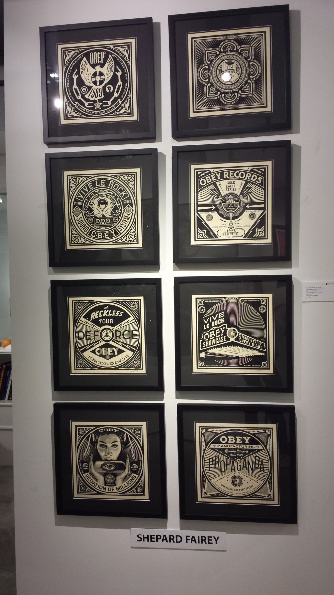
Secondly, I thought Shepard Fairey’s “50 shades of Black Box” was a great example to define the graphic design, the relationship between pattern and type. For instance, I saw Fairey used many gestalt principles in his works including similarity, emphasis/focal point, balance, and symmetry, and all patterns were illustration. Meanwhile, Fairey also likely used typefaces that were sans-serifs and slab-serifs in “50 shades of Black Box”. Because of that, the artwork of Shepard Fairey gave me many experiences of making graphic design without professors’ teaching, even though he only used black color in “50 shades of Black Box”.
In conclusion, I gained lots of information about today’s typography, photography, and graphic design through these greatest artists, which I never touched in my past of life. Therefore, I was enjoyed about this field trip either in the High Line or Taglialatella galleries.