Since for my first project, I am working on a wine label redesign, I decided to look at other wine labels on Pinterest to get inspired.
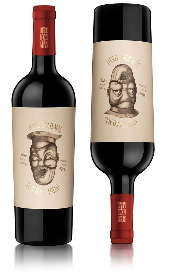
I really like this design because it’s humorous as well as interactive. Every time, the person pours wine into a glass, he will be able to enjoy this comical and creative illustration. This a great way to create a memorable design.
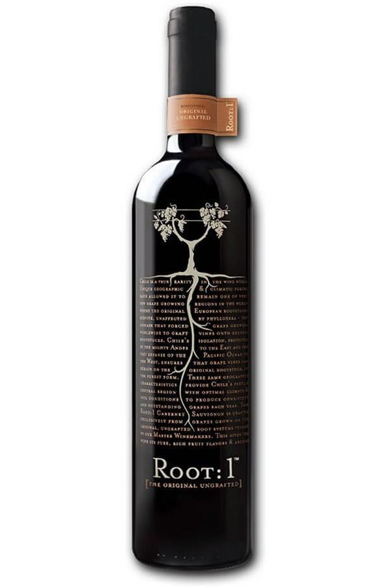
I also really like this design below as the visual is effectively communicating the name of the wine. Having a block of typography for the soil is creative and original.
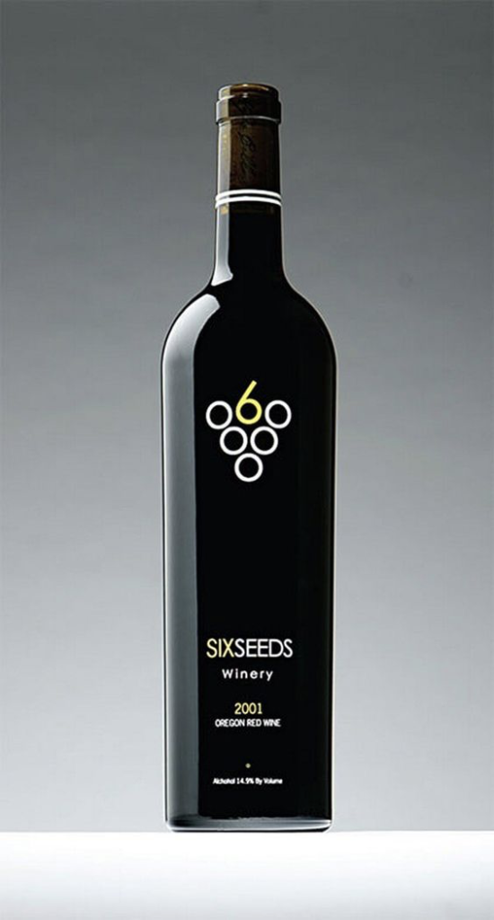
Lastly, I find the wine label design below interesting because of its simplistic and minimalistic design approach. Often times, I gravitate towards minimalistic designs since they are not overwhelming with ideas and imagery.


Leave a Reply