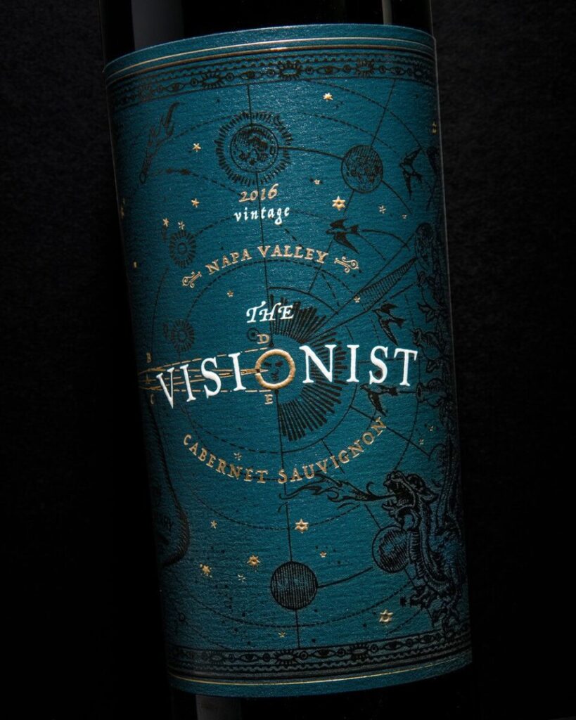
So I was looking on pinterest at many labels and I came across a lot of really nice labels that caught my attention. Out of the ones I liked, I ended up choosing this one called the The Visionist. Sterling Creativeworks designed it with many other conceptual wine labels. What I like about the design is that it has a classical and vintage look to it because of this old astronomy illustration. This concept in relation to the name and product works well because most wines age over time and with the name “The Visionist”, it is like telling the consumer that you need to see the vision that this wine will be great over time. Blue is my favorite color, so I was instantly attracted to the background with the golden stars. The ride side of the label has these classic illustrations you would see on old cartography. The left side has a person looking towards the brand with all of these words that are associated with the design.


Leave a Reply