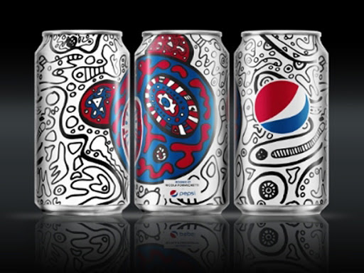
This is one of the Pepsi can designs from the Pepsi challenge. I chose this one because of how illustrative and trippie it looks. It’s like when I drink a can of Pepsi looking at this, it feels like I’m drinking a whole lot of inspiration. I’m sorry if it sounds cheesy but that’s just the way things are. However it is a bit too descriptive with its design. The Pepsi logo is still there, but most of the scribbles and other designs on the can are taken away from it at times. Of course the first thing you see when you open your eyes to see the can is the Pepsi logo of course which they succeeded in.
About This Course
This course is a practical introduction to the field of illustration. Focus will be placed on
process work and professional practices, presented within contemporary and historical
context. Course includes projects and lectures in a variety of illustration genres.
Professor Woolley
Office Hours: Tuesday 12 – 2pm email for appointment
SJWoolley@citytech.cuny.edu
Recent Comments
Member Portfolios
OpenLab Help
Acknowledgments
This course is based on the following course(s):
Sharing
Logged-in faculty members can clone this course. Learn More!


Leave a Reply