
Three visual quote concepts
In order to create three designs that would enhance it’s meaning, I choose the quotation “where is the love?” by Black Eyed Peas. This quote is appeals to me because it points out a problem to which almost everyone can relate. The song “Where is the love?” was released in June 2003 as the lead single from their third album, Elephunk. I hear this song in High School during my English class and since that day I’m always listening to it.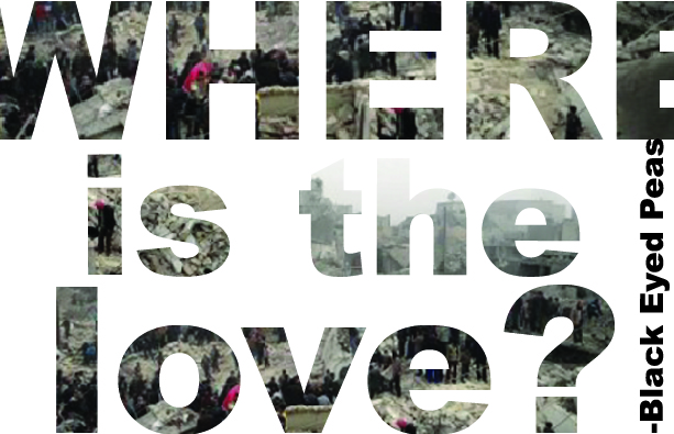
For my first concept, I focused on showing the meaning of the quote on it typeface. I used the typeface Arial Black and mask it with an image of Syria war. The image reveal the causes of Obama’s war in Syria as shown in the article Syria: Talking Peace, Waging War by Stephen Lendman. I choose this image because it paints the chaos in a broken world, inculcated with violence and hate. However, the greatest value that can overcome this world of pain is love which is the reason why I pick this quote. Throughout their song “Where is the love”, the Black Eyed Peas upholds love as the hope for straightening out society, they question if such love can be found.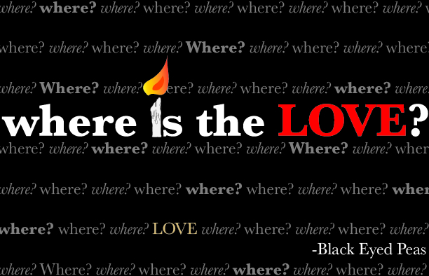
For my second concept, the design is primarily typographical. I wanted to play with color and the weight of the typeface Baskerville. Also, in a fun way illustrate the meaning of the quote. I emphasize the word “love” with red in uppercase so it pop out from the black background. In the quote, I replace the “i” by a lit candle that I did in Illustrator to show that we still looking for peace. The pattern of the word “where” in 50% black reflects despair result from the lack of love. However, the word “love” that is in light yellow almost turning cream within the pattern is the hope that love can be found. Besides That, Black Eyed Peas and the rest of the quote are in white, contrasting with the black background like being the light in the dark for love. While creating this design, I noticed that typefaces are equally important as images to convey a message. 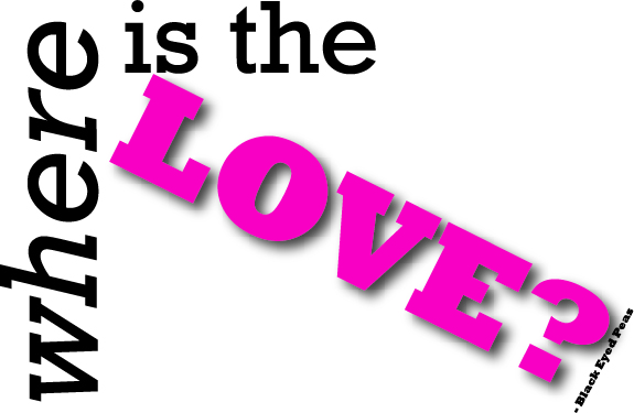
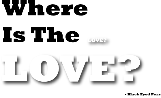
For this third design, I wanted to again to emphasize the words “where” and “love”. In other words, “where” is black in italic and “love” is bold uppercase in hot pink with shadow, so it pop out from the rest. I used the typeface Rockwell and make the quote look like an arrow with Black Eyed Peas as the nock, “love” as the shaft, and the rest of the quote as the head. I create this arrow to convey that the Black Eyed Peas is shooting this question to the world where love seen to be absent but still there.
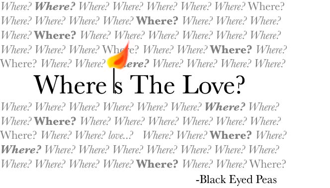
Here is one of the earlier drafts of the second and third design: Second & Third designs

