Monthly Archives: February 2016

FourSquare Vs Yelp Ad Campaigns

Well the Ad Campaigns used for both of these brands differ. Yelp chooses to go towards a whole video aspect but Foursquare chooses to promote their brand with an image.  Videos tend to catch your attention more often well at least in my opinion, I am a video person I’ve always been interested in watching and listening then actually paying close attention to text. Yelp actually will grow faster for the simple fact that people prefer to watch then to read.  Videos are entertaining and well photos are just blah… if you aren’t really interested in things like type or colors then an Ad campaign like the one foursquare introduced would not seem much appealing to you.

Promoting your brand is one thing but the way your promote your brand is another thing. The way you promote your brand is what will allow you to have a low amount of viewers vs a high amount of viewers.

Campaign Analysis 3 – Foursquare and Yelp

These campaigns focuses on an adult audience. But how it’s executed is a whole different story. In Foursquare, you have two individuals different from one another that shows bubbles of places of what they want. In Yelp, the way it’s done uses humor to get a more broader audience despite focusing on just adults. Yelp uses bad situations but makes them better if they used Yelp to get them to the places they want. While Foursquare focuses more on a more serious approach trying to show how convenient they are despite Yelp being far more superior in there message.

FS_Yelp_Vlad

Both of these ad campaigns seem to rely strongly on the message of opposites al the while being massively different. The foursquare one seems to contrast the two interests of the characters. The yelp advertisement has the characters contrast what they already have to what they actually want. For example, the couple in the video wanted a restaurant with cooked food but instead got a live octopus.

In terms of differences, the foursquare campaign is very bright, seems to have been taken outside during a sunny day. The Yelp campaign seems to have been far darker but the models or characters in the video are lit up very well.

Campaign Analysis 3-Foursquare and Yelp

Foursquare and Yelp are competitors even if Yelp is wildly more popular. Next week’s shoot will be a variation on foursquare’s first advertising campaign:

http://www.businessinsider.com/foursquare-launches-multi-million-dollar-ad-campaign-2014-10

Yelp too is advertising:

http://www.adweek.com/news/advertising-branding/ad-day-yelp-your-awesome-goofy-savior-its-first-national-tv-commercial-167100

Compare these two campaigns. What is similar and different in each one? Sepcifically, what is the tone and the intended audience of each. Then compare the style of photography (even if one is video) used in each. How does this style advance the intentions of the ad campaign?

Shaving Ad Comparison

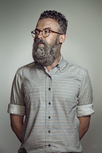
The Schick Free Your Skin ad is a half body shot. I would say that the lighting the photographer used was rembrandt lighting, we only see few shadows on the the side of the model’s face. It’s awesome how they incorporate an animal on the model’s face to feign the guy’s beard. This ad is not straight forward, the viewers cannot tell what the ad is about until they see the brand’s name. The ad to me seems to be targeting hipsters because of the way the model is dress. Also the lighting in the background makes the model look more clean and classy.

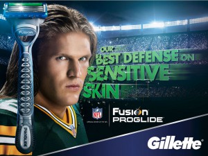
In the Gillette ad the player is looking straight at the camera making it seem like he is challenging the viewers. In the other ad, the model is looking away from the camera. The player looks tough because of the shadows on his face, the shadows make him look aggressive. The Schick ad is more busy, there is a lot of thing going on like the lettering. The ad goes straight to the point, we can tell what it is about and what they are trying to sell, we can tell this because they placed the razor, lettering and the brand in the ad. The ad is targeting not only hipsters but everyone that likes sports, the ones that feel tough just to mention a few.

Dance Photography

Lois Greenfield shot is black and white, which makes the ad look more clean and simple. In the shot from Sarah Silver compare to the other we see color and more shapes. In Panton we see colors, shapes such as squares, and more movement from the dancers. In Raymond Weil shot he has shallow space, all the dancers are close to each other. In compare to Panton were there is deep space, all the dancers are far from each other. There is a dancer close to the camera and there is another dancer far in the background.

Raymond Weil and Panton shot, both seems that they were taking from eye-level. Also both shots seem to use front lit, we can see the reflection of the light on the dancers. I think both ads work very well because each of them are targeting different audience, to me one is intended to people of high class such as rich people and the other one to artist and designers.

Shaving ad comparison

The difference between both photos is that the one on the left look more sophisticated and the one on the right is more straight forward. In the photo on the left you really don’t know that they are marketing a shaving company and the other one is obvious.   Even though there are a lot of differences between the two pictures, they share similarities.

Photographer Troy Goodall

Photographer Troy Goodall

Photographer Tim Tadder

Photographer Tim Tadder

Campaign Analysis 2 – Shaving Ads

Both the Schick and Gillette shaving ads convey a strong message to their respective audiences. The photograph taken by Troy Goodall for the Schick ad is pretty silly. It is a full frontal shot of an older looking gentleman with an outrageous beard, looking to his right with a broad light framing his face. His expression is relaxed and he is wearing a button down, patterned shirt. However, in the Gillette ad photographed by Tim Tadder, we can only see up to the shoulders of the man photographed where a short light is framing his face. He has a fierce look in his eyes, has a perfectly (almost too perfect) clean shaved face and is wearing a football uniform.

Gillette’s message is clear; they want athletes, athletes-to-be, and all sport players out there to know that they are the go to brand for a clean shaved face. Whereas the Schick ad is aimed at a totally different crowd, like hipsters in Williamsburg. Schick also portrays a very different message than Gillette does to their customers. This man has way more hair on his face than you’d ever expect someone in a razor ad to have. He basically has a slot hanging off his face! Whose attention wouldn’t that get? This ad is artistically eye catching. I feel that Schick is saying it is okay to experiment with your beard and try a variety of looks while Gillette on the other hand is saying in order to look your absolute best you should idolize to look like athletes who also strive to look impeccable.

Shaving Ad Comparison

Before the photographer, Tim Tadder, took the picture of the athlete he manipulated the lighting to set to mood for the audience. The use of short lighting along with the athlete’s expression creates is a very manly and aggressive atmosphere. The lighting also allows helps Gillette get the message across  to their audience by emphasizing the smoothness of his skin by using this lighting setup. The overall message I get is using Gillette’s razors can give you a close shave while still keeping a masculine appearance.

The Schick advertisement on the other hand is aimed  towards the more casual audience with a humorous message. Troy Goodall wanted to capture the image of an average man and used broad lighting to create a photo that resembles more of a profile picture. Thanks to the use of of the lighting, the details of the hair on their models face is able to standout more and become the focus of the ad. The message I get from it is, people with beards are seen are seen as having an animal on their face and their product will be able to “free their skin.”

Shaving Ads

Schick brand created an awesome Campaign called, Free Your Skin. The photographer Troy Goodall took half length portrait with using short light on the model. Since Schick is beard shaving for men , the photographer adds the wild animal as it seems like it’s models beard. The reason why they did this is because to tell the message how beard would smell and look disgusting. Also, Schick razors is capable of shaving mass of beard at once. Photographer also ads the background light so that model look stands out.

For Gillette ad, the photographer Tim Tadder shot the model in burst length portrait with broad light on model. The model’s photo taken in the studio then photoshopped it by adding 3D text, background and the giant shaver. The model have no facial hair to show to consumers how Gillette gives perfect results.