Author Archives: John De Santis
Class 15
Class Info
- Class Date: Tues. Oct. 20
- Class Time: 8:30AM-10:00AM
- Class Meeting Zoom https://zoom.us/j/6459468086
Meeting ID: 645 946 8086
Topic
Activities
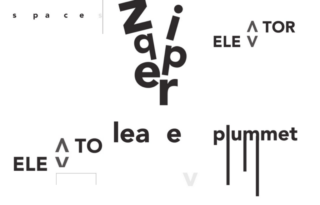
- Type Challenge – Expressive Typography
https://www.typeroom.eu/the-typographic-dante-to-hell-and-back-barrie-tullett-stunning-visual-project
- Discussions
- Project 1 Homework
- Found Alphabet post
- Type Talk Discussion – Rocco Piscatello Posters
- Expressive Type
To-Do After Class
- Refine Project 2 part 1 Expressive Type
- Bring ideas into the computer you can use InDesign or Illustrator
- Upload images into your project 2 post
- Categories Project 2, Student posts
- Named Lastname First name Project 2
- General Specs:
- 4 pages (one for each word)
- Size: 3.5” x 3.5” square
- Add a 1 pt outline (border around the square)
- Select one Sans Serif Typeface per word (with variations ok)
- Only use black and white.
- Finish Type Challenge from today
- Type Talk Discussion – Depero Futurista Due Oct 27
Expressive Type Documents
Depero Futurista Expressive Type
Class 14
Class Info
- Class Date: Thurs Oct. 15
- Class Time: 8:30AM-10:00AM
- Class Meeting Zoom https://zoom.us/j/6459468086
Meeting ID: 645 946 8086
Topic
- Continue Project 2 – Part 1 Expressive Typography: (four words):
- Bring Ideas into the computer
- Now it is time to interpret your sketches and determine which actual typeface to use. For this part of assignment you can use Indesign or Illustrator
- General Specs:
- 4 pages (one for each word)
- Size: 3.5” x 3.5” square
- Add a 1 pt outline (border around the square)
- Select one Sans Serif Typeface per word (with variations ok)
- Only use black and white.
- Remember that you already know about typeface selection, case (U & LC) and word spacing and must apply those concepts moving forward.
You can consider scale, repetition, overlap, removal of letters or parts of it to create a visual definition of your words. Do not add illustrations.
This PDF Shows the use of the PATHFINDER/DIVIDE tool in Illustrator:
This PDF shows how the Touch Tool in Illustrator might be useful if you need to quickly tilt letters
Objectives
- Students learn how to interpret their sketches to then make better selections of typeface and software to use once moving into digital environment.
Activities
Type Talk Discussion – Rocco Piscatello Posters
Type Challenge – Land of Punctuation.
To-Do After Class
- Found Alphabet post
- Type Talk Discussion – Rocco Piscatello Posters
- Expressive Type – Bring sketches into application continue to refine based on crit, at least one initial layout of each word.
• upload those layouts into your exiting project 2 post.
• Create a gallery
Create a Gallery In a Post
https://openlab.citytech.cuny.edu/blog/help/adding-an-image-gallery/
Edit a Gallery In a Post
https://wordpress.com/support/wordpress-editor/blocks/gallery-block/
Class 13
Class Info
- Class Date: Tues. Oct. 13
- Class Time: 8:30AM-10:00AM
- Class Meeting Zoom https://zoom.us/j/6459468086
Meeting ID: 645 946 8086
Topic
Project 2 – Part 1 Expressive Typography:
Introduction to Project 2: We will explore the use of type as expression by working on a multi part project that will include expressive type with an existing typeface and also lettering.
- Please see this Quick Reference PDF with Expressive Type/Lettering Basic Info
- then see these examples
Part 1 Type as Expression Using a Sans Serif Typeface:
- Choose Four of the following words :
puzzle, focus, confused, shrinking, unbalanced, sink, tired, separate, strong, cheer
fade, drip, destroy, create, mistake, run, walk, fast, slow, grow
- Find the definition of your selected words (even if you know the meaning, researching their definition can sometimes help you generate ideas.
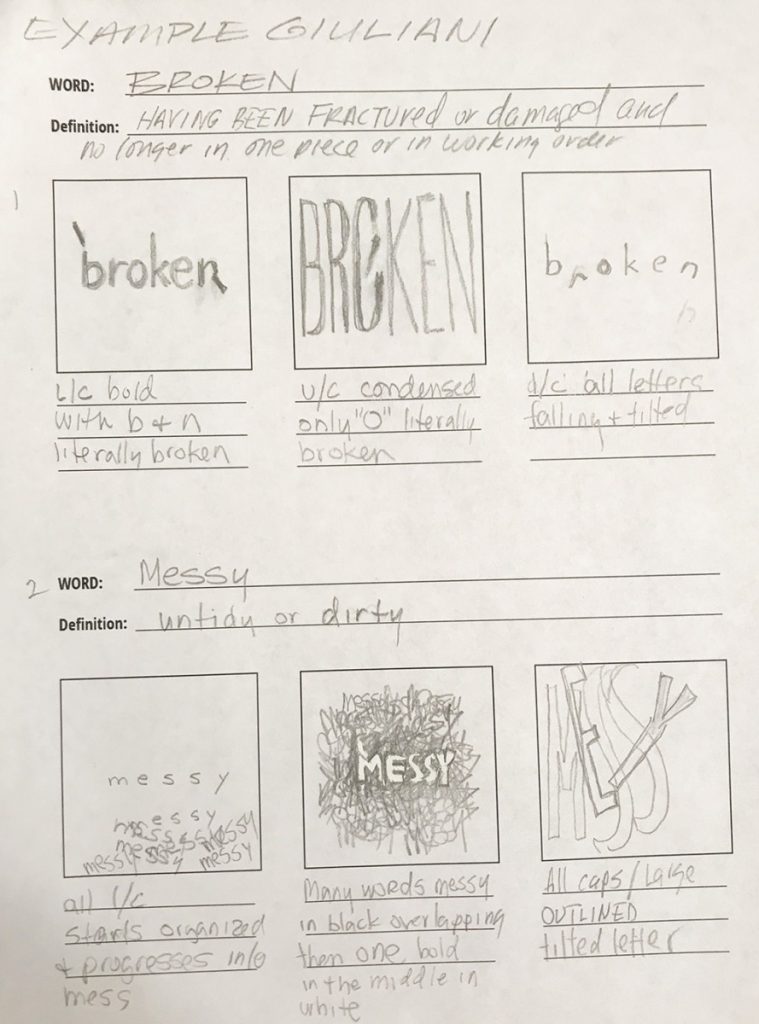
- Sketch your word in creatives way (Sans Serif typeface only). Use a square area to sketch your words. SKETCH WITH INTENTION and PURPOSE (not just placement).
- If it is to be lower case, then sketch it that way.
If it is to be outlined, then sketch it that way.
If it is to be condensed or bold, then sketch it that way
- If it is to be lower case, then sketch it that way.
- Consider:scale, repetition, overlapping, removal, uppercase, lowercase, etc. to create a visual definition of the word.
- Do not add illustrations.
Objectives
Explore how the use of an existing classic typeface combined with traditional elements of design allow designers to convey the meaning of a word:
- TYPEFACE (and their families & variations)
- SIZE
- SCALE
- POSTURE
- CASE
- PLACEMENT
- COLOR
Activities
- “One of you words” Type Challenge initial layout one of your selected word upload today jpg to media library “lastname first name TC-ET
Expressive Type Documents
To-Do After Class
- Sketch one concept for each of your four words uploaded into to a new post in openlab
Named Last name first name Project 2 part 1 - You can insert more than one option fo reach word if you would like
Sketch template
Class 12
Class Info
- Class Date: Thurs. Oct. 8
- Class Time: 8:30AM-10:00AM
- Class Meeting Zoom https://zoom.us/j/6459468086
Meeting ID: 645 946 8086
Topic
- Book Due today.
submit file TWO WAYS
- Submitted via Dropbox class drive
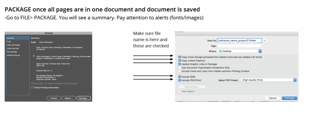
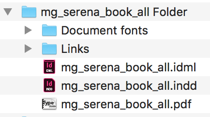
Package your Indesign file
Upload folder of packaged’ file of your InDesign Named ‘lastname firstnname_Typebook’ into: Dropbox - Create a post on OpenLab named lastname firstnname_Typebook
Categories “Student work” and Project 1
Upload a PDF version of your Type Book named lastname firstnname_Typebook
- Book Presentation and critique
Objectives
Activities PROJECT 2
Start Discussion: Expressive Typography
Part 1 . Expressive Typography:
Communicating the meaning of a word via typography
ONLY FUTURA BOLD, NO IMAGE
- Type Challenge – Expressive Typography
https://www.typeroom.eu/the-typographic-dante-to-hell-and-back-barrie-tullett-stunning-visual-project
Expressive Type Documents
To-Do After Class
2. Project 2: Review project page,
Part 1 . Expressive Typography:
Communicating the meaning of a word via typography
ONLY FUTURA BOLD, NO IMAGE
3. Find One Expressive Type
example and post into the media library
4. Choose Four of the following words :
puzzle, focus, confused, shrinking, unbalanced, sink, tired, separate, strong, cheer
fade, drip, destroy, create, mistake, run, walk, fast, slow, grow
5. Find the definition of your selected words (even if you know the meaning, researching their definition can sometimes help you generate ideas.
Class 11
Class Info
- Class Date: Tues. Oct. 6
- Class Time: 8:30AM-10:00AM
- Class Meeting Zoom https://zoom.us/j/6459468086
Meeting ID: 645 946 8086
Topic
- Review content of book for submission and presentation due next class
- Design Continuity (uniformity of headings, margins, color, etc)
- Packaging a file
Example of a completed book
Pages to include: 15 Pages Total including the cover
Project 1: Type Book COVER
Project 1: Type Book_02a – Anatomy of Letterform Diagram with labels for parts of each letter.
Project 1: TypeBook_03 – 5 found type five photos Anatomy of Letterforms
Project 1: TypeBook_04 – Kerning and Tracking
Project 1: TypeBook_04a – Variations
Project 1: TypeBook_05a Leading
Project 1: TypeBook_05b Alignment (Two Pages)
Project 1: TypeBook_05c Classification of Type Styles Alignment Typesetting (Five Pages)
Poject 1: TypeBook_06a – Drop cap (Two Pages)
Project 1: TypeBook_06 Type on a path
Objectives
- Make sure all elements above (assignments) of book are included
- Understanding design uniformity and continuity throughout a multiple page publication such as a book (for example: keeping headings the same)
Activities
- Type Talk Activity – Found Alphabet
- Cover Design Challenge
To-Do After Class
Type Talk Books are due NEXT class.
submit file TWO WAYS
- Submitted via Dropbox class drive
Package your Indesign file
Upload folder of packaged’ file of your InDesign Named ‘lastname firstnname_Typebook’ into: Dropbox - google drive if you have problem
- Create a post on OpenLab named lastname firstnname_Typebook
Categories “Student work” and Project 1
Upload a PDF version of your Type Book named lastname firstnname_Typebook
NOVA- Video A to Z: The First Alphabet
PBS Two Part Special
A to Z: The First Alphabet
Discover how writing—and eventually printing—revolutionized the spread of information.
Premiered September 23, 2020 AT 9PM on PBS
https://www.pbs.org/wgbh/nova/video/a-to-z-the-first-alphabet/

Where would we be without the world’s alphabets? Writing has played a vital role in the expansion and domination of cultures throughout history. But researchers are only now uncovering the origin story to our own alphabet, which may have gotten its beginnings in a turquoise mine 4,000 years ago. From the shape of the letter A to the role of writing in trade and storytelling, discover how the written word shaped civilization itself.
Next Week:
A to Z: How Writing Changed the World
https://www.pbs.org/video/a-to-z-how-writing-changed-the-world-ehsuvs/
Discover how writing—and eventually printing—revolutionized the spread of information.
Promo
https://www.pbs.org/wgbh/nova/video/a-to-z-how-writing-changed-the-world/
Video Permissions
Students who participate in this class with their camera on or use a profile image are agreeing to have their video or image recorded solely for the purpose of creating a record for students enrolled in the class to refer to, including those enrolled students who are unable to attend live. If you are unwilling to consent to have your profile or video image recorded, be sure to keep your camera off and do not use a profile image. Likewise, students who un-mute during class and participate orally are agreeing to have their voices recorded. If you are not willing to consent to have your voice recorded during class, you will need to keep your mute button activated and communicate exclusively using the “chat” feature, which allows students to type questions and comments live.
Working with and Editing Images in OpenLab
How to create an image for web usage
Most digital cameras and phones are likely to be set to take images that are vastly larger than a user of a computer screen is likely to need
- Optimize a JPEg. A JPEG is the standard format for compressing photographs.
- Open an image and choose File > Save For Web.
- Choose JPEG from the optimization format menu.
- Specify the compression level: Choose quality option medium from the pop‑up menu under the optimization format menu. The higher the Quality setting, the more detail is preserved in the optimized image, but the larger the file size.
- View the optimized image at several quality settings to determine the best balance between quality and file size.
- Select Progressive to display the image progressively in a web browser; that is, to display it first at a low resolution, and then at progressively higher resolutions as downloading proceeds.
- To save your optimized image, click OK. In the Save Optimized As dialog box, type a filename, and click Save.
How to add images to OpenLab
- From your mobile device
- “Image Size” app Google Play
- “Image Size” IOS App Store
Resize Images in OpenLab
Video Demo OpenLab Image Edit
https://openlab.citytech.cuny.edu/openroad/image-resizing
Type Talk – Poetry Logos Discussion
Instructions
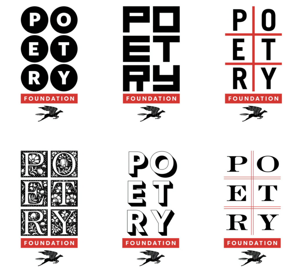
Logos done by Pentagram’s
Michael Bierut. for Poetry Magazine.
- Do you think the overall concept works?
- Which one or ones of these do you think works the best and why?
- Comment below
- Observe the variety way in which the typography is the concept, illustration,
Resources
http://www.typeroom.eu/article/pentagram-s-michael-bierut-poetry-foundation-s-new-typography
Open Q&A and Comments
Post a question or discuss anything related to class here
last Name first name Openlab Set
bodoni
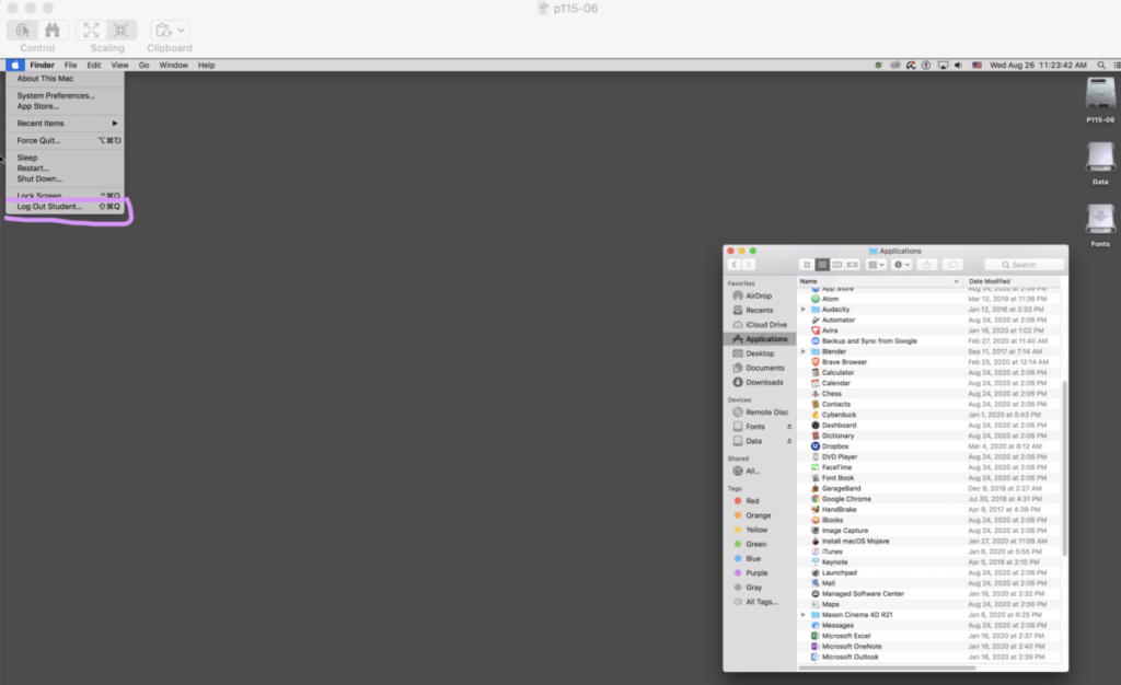
Remote Login to COMD C0mpters
Remote Desktop Client on
COMD Computers on campus
Remote login to utilize department onsite computers as a remote workspace, will have all Adobe applications
They require a special user login ID
For students who own a computer, Chromebook, or otherwise
but no Adobe and need the apps.
Remote login into classroom computers 24/7 and use them.
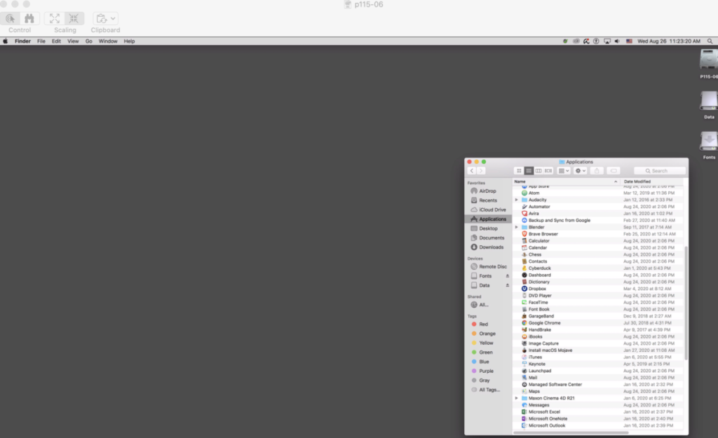
Students MUST MUST save all work on a cloud solution
Microsoft One Drive (1TB per student), Google Drive, or DropBox.
Student must NEVER NEVER shut down the computer Only LOG OUT
Instructions by device
Downloading and Installing GlobalProtect on a Mac Computer
GlobalProtect is the VPN application that must be installed on you home-based device to connect to a campus-based computer.
- Visit https://gpnet.citytech.cuny.edu to download and install GlobalProtect
- Login using your City Tech AD credentials to gain access to the site
- Select “Download MAC 32/64-bit GlobalProtect.pkg agent
- Go to the “Downloads” folder and select “GlobalProtect.pkg” and install the application
- At the Introduction page click Continue
- Ensure that GlobalProtect is selected on the Custom Install Macintosh HD page then click Continue
- Enter the password if prompted to proceed with the installation
- Once complete, GlobalProtect opens to setup connection details page
- Enter (gpnet.citytech.cuny.edu) for the Portal
- Enter your City Tech AD credentials (City tech email)
- Click Connect
- Status should now show Connected

You have now successfully connected and created a secure connection to your campus networkMinimize the window and continue to connect to a campus computer
After installation, to access GlobalProtect, go to the top-right menu and select “Global Protect” Click to “Connect or Click to “Disconnect”
Remote Desktop Lab Computer labs
ON MAC OS Firefox might not work use Chrome or Safari
http://www.citytech.cuny.edu/virtual-lab/
Select Academic Department Labs Tab
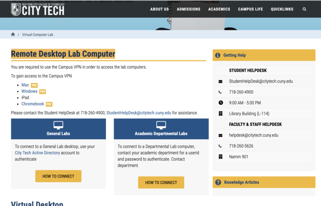
Select any COMD lab P100 P121 etc
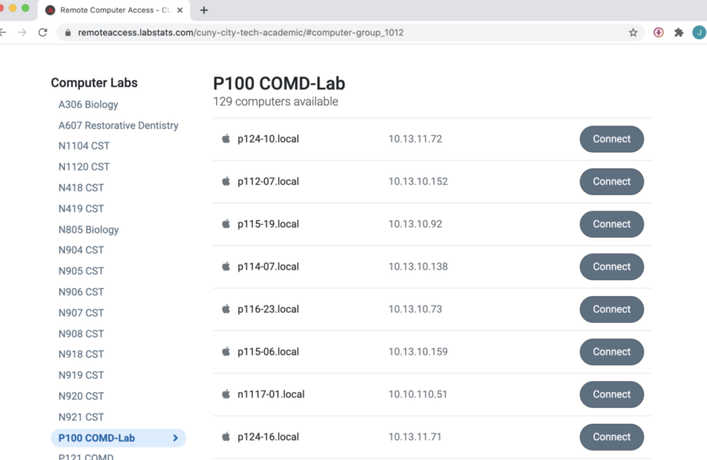
Select a computer
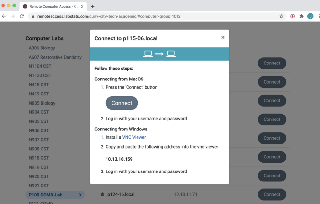
Enter Student
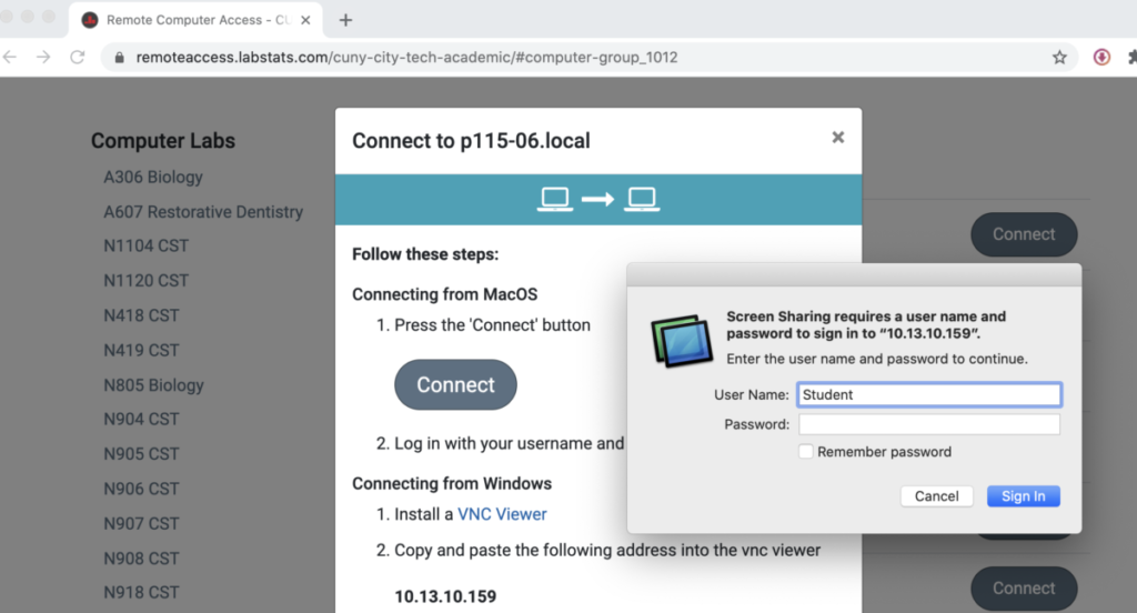
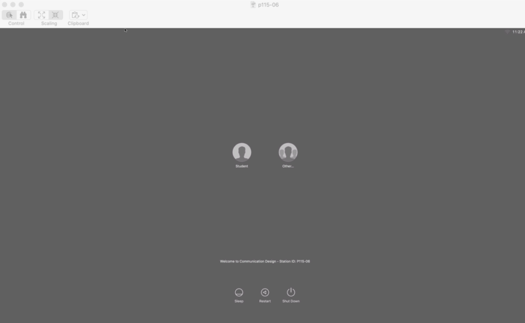
Select Student
Work and save your work REMOTELY under Applications links to Dropbox, Google Drive Microsoft Drive
When Done Student must NEVER NEVER shut down the computer Only LOG OUT
Help
COMD CLT comdclt@gmail.com
Technology Resources
http://it.citytech.cuny.edu/search-catalog.aspx?searchKeyword=CityTech%20Active%20Directory%20(AD)
Class 08
Class Info
- Class Date: Tues Sep. 22
- Class Time: 8:30AM-10:00AM
- Class Meeting Zoom https://zoom.us/j/6459468086
Meeting ID: 645 946 8086
Topic
Project 1: Continue Type Book
Objectives
- Learn about type arrangement and legibility through alignment:
- Flush or Align Left
- Flush or Align Right
- Center
- Justify
- Justify all lines (Forced justification)
- Understanding the different scenarios of their uses
- Continue page setup InDesign
Activities
Add the information covered in this class (class activities, readings, videos, slides, notes, recordings of class meetings conducted via web conference)
- Type Challenge – Kerning
Type Talk Discussion – Zara Logo - Discussion Found Alphabet
To-Do After Class
Start Type Book 5c
Some Typefaces for Typebook 5c
Assignments are always due the day before next class by 11:30pm, and must be posted to OpenLab or uploaded as instructed
Type Book Text to Use
_____
Leading EXERCISE TEXT:
Helvetica 12/12
Sans-serifs do not have “serifs” at the end of strokes. They have simpler letterforms with relatively uniform stroke weight, lacking significant contrast, often geometric.. They convey simplicity and modernity or minimalism. Helvetica is a widely used sans-serif typeface by typeface designer Max Miedinger. One of the most popular typefaces in the world; features of Helvetica: high x-height, termination of strokes on horizontal or vertical lines, tight spacing between letters.
________
ALIGNMENT EXERCISE TEXT:
Old Style category typefaces include the first Roman types, originally created between the late 15th and mid 18th centuries, as well as typefaces patterned after those designed in this earlier period. Old Style typefaces are considered to be the best type for large amounts of body text on paper. They re used heavily in newspapers, magazines and books. Garamond is an old style serif typeface. Claude Garamond, who died in 1561, was originally credited with the design of this elegant French typeface; however, it has recently been discovered that the face was designed by Jean Jannon in 1615. This is a typical Old Style face, having little contrast between thick and thins, heavily bracketed serifs, and oblique stress. The letterforms are open and round, making the face extremely readable. The capital letters are shorter than the ascenders of the lowercase letters.
______
Classification of Type Styles Alignment Typesetting Text
Old Style
This category includes the first Roman types, originally created between the late 15th and mid 18th centuries, as well as typefaces patterned after those designed in this earlier period. The axis of curved strokes is normally inclined to the left in these designs, so that weight stress is at approximately 8:00 and 2:00 o’clock. The contrast in character stroke weight is not dramatic, and hairlines tend to be on the heavy side. Serifs are almost always bracketed in old style designs and head serifs are often angled. Some versions, like the earlier Venetian old style designs, are distinguished by the diagonal cross stroke of the lowercase e.
Old Style typefaces are considered to be the best type for large amounts of body text on paper. That’s why you’ll find them used heavily in newspapers, magazines and books. Garamond is an old style serif typeface. Claude Garamond, who died in 1561, was originally credited with the design of this elegant French typeface; however, it has recently been discovered that the face was designed by Jean Jannon in 1615. Many present day versions of this typeface are based on Jannon’s designs, although they are all called Garamond. This is a typical Old Style face, having little contrast between thick and thins, heavily bracketed serifs, and oblique stress. The letterforms are open and round, making the face extremely readable. The capital letters are shorter than the ascenders of the lowercase letters.
Transitional
Transitional typefaces are so called because they form a bridge between the Old Style and the Modern faces. Compared to the Old Style, transitional typefaces shows a greater contrast between the thicks and thins, serifs are less heavily bracketed, and the stress is almost vertical. The letters are very wide for their x-height, are closely fitted, and are of excellent proportions.
Most notable representative fonts of the Transitional Age were Baskerville and Fournier. The distinguishing features of transitional typefaces include vertical stress and slightly higher contrast than old style typefaces, combined with horizontal serifs. Baskerville one of the most pleasant and readable fonts, designed by the English John Baskerville in 1757, it is an excellent example of a Transitional typeface. Baskerville’s work with calendered paper and improved printing methods (both developed by him) allowed much finer character strokes to be reproduced and subtler character shapes to be maintained. Additional examples of transitional typefaces include: Times New Roman and Palatino Linotype.
Modern (also referred to as Neoclassical and Didone)
Modern typefaces are distinguishable by their sudden-onset vertical stress and strong contrast. Modern serifs and horizontals are very thin, almost hairlines. Although they are very striking, these typefaces are sometimes criticized as cold or harsh, and may not be quite as readable for very extensive text work, such as books.
Modern typefaces enjoyed great popularity from the late 18th through the 19th centuries. The term Didone is a melding of Didot and Bodoni, the two most characteristic typeface designs of this era. Didones are characterized by extreme weight contrast between thicks and thins, vertical stress, and serifs with little or no bracketing.
Bodoni is a Modern typeface, designed in the late 1700’s by the Italian typographer, Giambattista Bodoni. All older faces became known as Old Style, while the more recent faces – just prior to the change – were referred to as Transitional. Although Bodoni has a small x-height, it appears very wide and black. Because of the strong vertical stress, accentuated by its heavy thicks and hairline thins, the horizontal flow necessary for comfortable reading is impaired. Bodoni, therefore, must be well-leaded.
Slab Serif (often called square serif or Egyptian)
Slab serif typefaces became popular in the 19th century for advertising display. These typefaces have very heavy serifs with minimal or no bracketing. Generally, changes in stroke weight are imperceptible. To many readers, slab serif type styles look like sans serif designs with the simple addition of heavy (stroke weight) serifs. This style was called Egyptian.
Century Expanded is an excellent example of a refined Egyptian typeface. It is based on a type called Century, designed in 1894 by L.B. Benton and T.L.Devinne for the Century Magazine. After Bodoni, the type designers began to search for new forms of typographic expression. Around 1815 a type style appeared that was characterized by thick slab serifs and thick main strokes with little contrast between thicks and thins. Century Expanded has a large x-height and should be leaded. The large letters and simple letterforms combine to make it very legible and especially popular for children’s books. Like most members of the Egyptian family of Typefaces, Century Expanded makes a good display type because of its boldness. Rockwell and Clarendon are also examples of Slab Serifs.
You can’t go far, typographically speaking, without seeing a slab serif. Whether in a magazine article or an advertisement, on a book cover or signage, slab serif designs, with their geometric, block-like appenditures, project solidity, style and confidence.
Sans Serif (a.k.a. Gothic or Grotesque)
In typography and lettering, a sans-serif, sans serif, gothic, or simply sans letterform is one that does not have extending features called “serifs” at the end of strokes. Sans Serif type forms made their first appearances around 1815-1817 and are marked by simpler letterforms with (usually) relatively uniform stroke weight, lacking significant contrast, often geometric in their underlying design. In most print, they are often used for headings rather than for body text. They are often used to convey simplicity and modernity or minimalism. Sans-serif fonts have become most prevalent for display of text on computer screens.
Helvetica or Neue Haas Grotesk is a widely used sans-serif typeface developed in 1957 by Swiss typeface designer Max Miedinger with input from Eduard Hoffmann. Helvetica is a neo-grotesque or realist design, one influenced by the famous 19th century typeface Akzidenz-Grotesk created by Berthold around 1898. Today Helvetica is one of the most popular typefaces in the world. Its use became a hallmark of Swiss designers in the 1950s and 60s, becoming one of the most popular typefaces of the 20th century. Over the years, a wide range of variants have been released in different weights, widths and sizes, as well as matching designs for a range of non-Latin alphabets. Notable features of Helvetica as originally designed include a high x-height, the termination of strokes on horizontal or vertical lines and an unusually tight spacing between letters, which combine to give it a dense, compact appearance.
______________________________
Drop cap page
<<HEADLINE>>
Modern Typefaces
<< body copy>>
All modern typefaces are distinguishable by their sudden-onset vertical stress and strong contrast. Modern serifs and horizontals are very thin, almost hairlines. Although they are very striking, these typefaces are sometimes criticized as cold or harsh, and may not be quite as readable for very extensive text work, such as books.
Modern typefaces enjoyed great popularity from the late 18th through the 19th centuries. The term Didone is a melding of Didot and Bodoni, the two most characteristic typeface designs of this era. Didones are characterized by extreme weight contrast between thicks and thins, vertical stress, and serifs with little or no bracketing.
Bodoni is a Modern typeface, designed in the late 1700’s by the Italian typographer, Giambattista Bodoni. All older faces became known as Old Style, while the more recent faces – just prior to the change – were referred to as Transitional. Although Bodoni has a small x-height, it appears very wide and black. Because of the strong vertical stress, accentuated by its heavy thicks and hairline thins, the horizontal flow necessary for comfortable reading is impaired. Bodoni, therefore, must be well-leaded.
<<Pull quote>>
sometimes criticized as cold or harsh!
InDesign Master Pages
InDesign Master pages
Step 1: open your Type book page
Save as “lastname first name _master”
We will work to create a master pages in InDesign
2. Add a footer to bottom left of your page from last week
text First name last name Type book
3. we will add a folio ( page number) in text box bottom right
Create new text box box
top menu.type>Insert Special Character>Marker> Current Page Number
This will automatically add page number to any document
4. select your page icon in pages window, drag it up to master page window
This creates a new master page.
Try it out drag it back down in pages to see what happens
Create New Master pages
1: Double Click On The Master Page To Activate It.
Now that you’ve selected your master pages, you can adjust and create grid vertical columns by going to your menu and selecting (Layout > Margins and Columns).
2 Now that you have your vertical columns set, it’s time to create your horizontal modules for your grid.
Add horizontal guides to create a modular grid by going back to menu select (Layout > Create Guides).
3 Insert new pages into your document with your new master pages. Select master page icons for pages menu and drag them in pages layout window
4 Export you document as a PDF select the
“Visible Guides and Grids” option to show your grid in PDF name it “lastname first name _grid _master .pdf
Upload to Openlab media library
Classification of Type
Classifications of type you will need to become familiar with for this class.
The typographic form has evolved and in order to effectively analyze this typographic evolution, the design of type characters over the last five and a half centuries is most often broken down into classifications of common visual Characteristics, called families of type:
Old Style
(15th-17th century)
Example Typefaces: Bembo • Garamond • Caslon • Jenson
Transitional (Neoclassical)
(mid 18th century)
Example Typefaces: Baskerville • Cheltenham • Bookman • Romain du Roi
Modern (Didon)
(late 18th century)
Example Typefaces:: Bodoni • Didot • ITC Fenice
Slab Serif (Egyptian)
(19th century)
Example Typefaces: Clarendon • Memphis • Rockwell • Century
Sans Serif
(19th-20th century)
Example Typefaces: Futura • Helvetica • Universe • Akzidenz Grotesk • Frutiger
Cursive
Example Typefaces: Bickham • Edwardian Script ITC • Choc • Brush Script
Display
(19th-20th century)
Example Typefaces: Leafy Glade • Plexifont • Chausson • Phosphate
Old Style
(15th-17th century)
Example Typefaces: Bembo • Garamond • Caslon • Jenson
Oldstyle Characteristics
• Designed in a time when inks and paper were coarse and type technology was still rather rough
• Relatively thick strokes and heavily bracketed or curved serifs
• Emulated classical calligraphy
• Minimal variation of thick and thin strokes
• Small, coarse serifs, often with slightly concave bases
• Small x-heights.
• In the round strokes, the stress is diagonal, or oblique, as their designs mimic the hand-held angle of the pen nibs of the scribes.
• Tops of lowercase ascenders often exceed the height of the capital characters.
• Numerals, called old style figures, vary in size and have ascenders and descenders.
Transitional (Neoclassical)
(mid 18th century)
The typefaces of this period represent the initial departure from centuries of Old Style tradition and immediately predate the Modern period.
Example Typefaces: Baskerville • Caslon • Cheltenham • Bookman • Romain du Roi
Transitional Characteristics
• Designed in a time when inks and paper were considerably smoother and type technology was refined
• Strokes and the serifs are more sculpted
• Sharper serifs and more vertical axis
• Greater contrast between thick and thin stokes.
• Wider, gracefully bracketed serifs with flat bases.
• Larger x-height
• Vertical stress in rounded strokes
• The height of capitals matches that of ascenders.
• Numerals are cap-height and consistent in size.
Modern (Didon)
(late 18th century)
Example Typefaces:: Bodoni • Didot • ITC Fenice
Modern Characteristics
• Designed in a time when printing technology was refined by leaps and bounds
• Extreme contrast between stokes and hairlines
• Brackets virtually eliminated
• Hairline serifs without bracketing
• Small x-height
• Vertical stress in rounded strokes
Slab Serif (Egyptian)
(19th century)
Example Typefaces: Clarendon • Memphis • Rockwell • Century
Slab Serif Characteristics
• Type design, freed from technical constraints, became eclectic
• Very little contrast between thin and thick strokes
• Heavy serifs with squared-off ends
• Large x-heights.
• Vertical stress in rounded strokes
Sans Serif
(19th-20th century)
Example Typefaces: Futura • Helvetica • Universe • Akzidenz Grotesk • Frutiger
The families of type represent more than 500 years of development and each family displays distinct visual Characteristics. These Characteristics are basic to visual communication with type.
Sans Serif Characteristics
• Little or no variation between thick and thin strokes
• Lack of serifs
• Larger x-height
• No stress in rounded strokes\
Cursive
Example Typefaces: Bickham • Edwardian Script ITC • Choc • Brush Script
Also known as script, among other name, is any style where some characters are written joined together in a flowing manner in contrast to block letters.
Cursive Characteristics
• Formal cursive is generally joined, but casual cursive is a combination of joins and pen lifts. Can be further divided as “looped”, “italic” or “connected”.
Display
(19th-20th century)
Example Typefaces: Leafy Glade • Plexifont • Chausson • Phosphate
The families of type are intended for use at large sizes for headings, logotypes, posters, headings on websites, magazines, or book covers rather than for extended passages of body text
Display Characteristics
• Often have more eccentric and variable designs.
• May take inspiration from handpainted signs, calligraphy., ornamented, exotic, abstracted. • • Can be a serif font, slab serif, script, sans serif, etc.
Color
https://color.adobe.com/create/color-wheel
Fundamentals of understanding color theory
https://99designs.com/blog/tips/the-7-step-guide-to-understanding-color-theory
Color Matching Game
http://color.method.ac/
Color Relativity
http://colorisrelative.com/bwbox.html
Color IQ test
http://xritephoto.com/color-iq-test
http://qz.com/571947/video-this-is-the-factory-where-colorcomes-from
https://www.youtube.com/watch?v=hkqMzLR8kS8
(Color and legibility/ Foreground-Background relationship)
https://inkbotdesign.com/colors-and-typography
https://color.adobe.com/create
The Elements of Color
by Johannes Itten
https://www.goodreads.com/author/show/243696.Johannes_Itten
Interaction of Color: 50th Anniversary Edition
by Josef Albers
https://www.amazon.com/Interaction-Color-Anniversary-Josef-Albers/dp/0300179359/ref=pd_lpo_sbs_14_t_0?_encoding=UTF8&psc=1&refRID=YQVYZJYH289BYQ327WD4
https://apps.apple.com/us/app/interaction-of-color-trial/id664296461

