Category Archives: Project 1
Williams_Kayla_Typebook
Rojas Jesus_Typebook
De La Cruz Tommy Final Type Book
Chin Nadia_Typebook
Barshtein Andrew_Typebook
Jiang Hailey_Type Book
Wu Chailin_typebook
Hernandez-Garcia Yamileth_Typebook
Domena Jasmine_Typebook
Cortes Martinez_Eduardo TypeBook
Ni Wei_TypeBook
De La Cruz Tommy Drop Cap
Legibility: Leading by De La Cruz Tommy
ConsuegraPamela_Project1
Project 1 pages 1-5
Type Vocabulary, Classifications, Kering, Variations, Legibility
Type Book Text to Use
_____
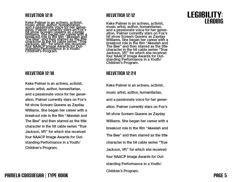
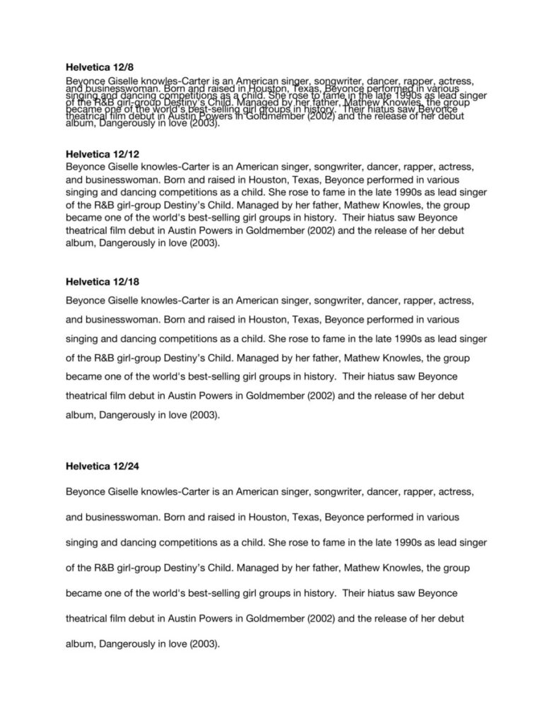
Leading EXERCISE TEXT:
Helvetica 12/12
Sans-serifs do not have “serifs” at the end of strokes. They have simpler letterforms with relatively uniform stroke weight, lacking significant contrast, often geometric.. They convey simplicity and modernity or minimalism. Helvetica is a widely used sans-serif typeface by typeface designer Max Miedinger. One of the most popular typefaces in the world; features of Helvetica: high x-height, termination of strokes on horizontal or vertical lines, tight spacing between letters.
________
ALIGNMENT EXERCISE TEXT:
Old Style category typefaces include the first Roman types, originally created between the late 15th and mid 18th centuries, as well as typefaces patterned after those designed in this earlier period. Old Style typefaces are considered to be the best type for large amounts of body text on paper. They re used heavily in newspapers, magazines and books. Garamond is an old style serif typeface. Claude Garamond, who died in 1561, was originally credited with the design of this elegant French typeface; however, it has recently been discovered that the face was designed by Jean Jannon in 1615. This is a typical Old Style face, having little contrast between thick and thins, heavily bracketed serifs, and oblique stress. The letterforms are open and round, making the face extremely readable. The capital letters are shorter than the ascenders of the lowercase letters.
______
Classification of Type Styles Alignment Typesetting Text
Old Style
This category includes the first Roman types, originally created between the late 15th and mid 18th centuries, as well as typefaces patterned after those designed in this earlier period. The axis of curved strokes is normally inclined to the left in these designs, so that weight stress is at approximately 8:00 and 2:00 o’clock. The contrast in character stroke weight is not dramatic, and hairlines tend to be on the heavy side. Serifs are almost always bracketed in old style designs and head serifs are often angled. Some versions, like the earlier Venetian old style designs, are distinguished by the diagonal cross stroke of the lowercase e.
Old Style typefaces are considered to be the best type for large amounts of body text on paper. That’s why you’ll find them used heavily in newspapers, magazines and books. Garamond is an old style serif typeface. Claude Garamond, who died in 1561, was originally credited with the design of this elegant French typeface; however, it has recently been discovered that the face was designed by Jean Jannon in 1615. Many present day versions of this typeface are based on Jannon’s designs, although they are all called Garamond. This is a typical Old Style face, having little contrast between thick and thins, heavily bracketed serifs, and oblique stress. The letterforms are open and round, making the face extremely readable. The capital letters are shorter than the ascenders of the lowercase letters.
Transitional
Transitional typefaces are so called because they form a bridge between the Old Style and the Modern faces. Compared to the Old Style, transitional typefaces shows a greater contrast between the thicks and thins, serifs are less heavily bracketed, and the stress is almost vertical. The letters are very wide for their x-height, are closely fitted, and are of excellent proportions.
Most notable representative fonts of the Transitional Age were Baskerville and Fournier. The distinguishing features of transitional typefaces include vertical stress and slightly higher contrast than old style typefaces, combined with horizontal serifs. Baskerville one of the most pleasant and readable fonts, designed by the English John Baskerville in 1757, it is an excellent example of a Transitional typeface. Baskerville’s work with calendered paper and improved printing methods (both developed by him) allowed much finer character strokes to be reproduced and subtler character shapes to be maintained. Additional examples of transitional typefaces include: Times New Roman and Palatino Linotype.
Modern (also referred to as Neoclassical and Didone)
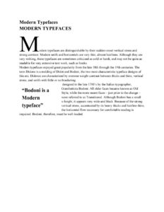
Modern typefaces are distinguishable by their sudden-onset vertical stress and strong contrast. Modern serifs and horizontals are very thin, almost hairlines. Although they are very striking, these typefaces are sometimes criticized as cold or harsh, and may not be quite as readable for very extensive text work, such as books.
Modern typefaces enjoyed great popularity from the late 18th through the 19th centuries. The term Didone is a melding of Didot and Bodoni, the two most characteristic typeface designs of this era. Didones are characterized by extreme weight contrast between thicks and thins, vertical stress, and serifs with little or no bracketing.
Bodoni is a Modern typeface, designed in the late 1700’s by the Italian typographer, Giambattista Bodoni. All older faces became known as Old Style, while the more recent faces – just prior to the change – were referred to as Transitional. Although Bodoni has a small x-height, it appears very wide and black. Because of the strong vertical stress, accentuated by its heavy thicks and hairline thins, the horizontal flow necessary for comfortable reading is impaired. Bodoni, therefore, must be well-leaded.
Slab Serif (often called square serif or Egyptian)
Slab serif typefaces became popular in the 19th century for advertising display. These typefaces have very heavy serifs with minimal or no bracketing. Generally, changes in stroke weight are imperceptible. To many readers, slab serif type styles look like sans serif designs with the simple addition of heavy (stroke weight) serifs. This style was called Egyptian.
Century Expanded is an excellent example of a refined Egyptian typeface. It is based on a type called Century, designed in 1894 by L.B. Benton and T.L.Devinne for the Century Magazine. After Bodoni, the type designers began to search for new forms of typographic expression. Around 1815 a type style appeared that was characterized by thick slab serifs and thick main strokes with little contrast between thicks and thins. Century Expanded has a large x-height and should be leaded. The large letters and simple letterforms combine to make it very legible and especially popular for children’s books. Like most members of the Egyptian family of Typefaces, Century Expanded makes a good display type because of its boldness. Rockwell and Clarendon are also examples of Slab Serifs.
You can’t go far, typographically speaking, without seeing a slab serif. Whether in a magazine article or an advertisement, on a book cover or signage, slab serif designs, with their geometric, block-like appenditures, project solidity, style and confidence.
Sans Serif (a.k.a. Gothic or Grotesque)
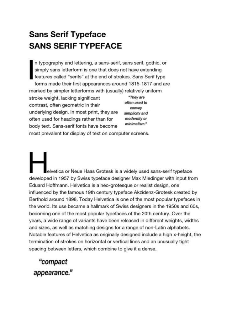
In typography and lettering, a sans-serif, sans serif, gothic, or simply sans letterform is one that does not have extending features called “serifs” at the end of strokes. Sans Serif type forms made their first appearances around 1815-1817 and are marked by simpler letterforms with (usually) relatively uniform stroke weight, lacking significant contrast, often geometric in their underlying design. In most print, they are often used for headings rather than for body text. They are often used to convey simplicity and modernity or minimalism. Sans-serif fonts have become most prevalent for display of text on computer screens.
Helvetica or Neue Haas Grotesk is a widely used sans-serif typeface developed in 1957 by Swiss typeface designer Max Miedinger with input from Eduard Hoffmann. Helvetica is a neo-grotesque or realist design, one influenced by the famous 19th century typeface Akzidenz-Grotesk created by Berthold around 1898. Today Helvetica is one of the most popular typefaces in the world. Its use became a hallmark of Swiss designers in the 1950s and 60s, becoming one of the most popular typefaces of the 20th century. Over the years, a wide range of variants have been released in different weights, widths and sizes, as well as matching designs for a range of non-Latin alphabets. Notable features of Helvetica as originally designed include a high x-height, the termination of strokes on horizontal or vertical lines and an unusually tight spacing between letters, which combine to give it a dense, compact appearance.
______________________________
Drop cap page
<<HEADLINE>>
Modern Typefaces
<< body copy>>
All modern typefaces are distinguishable by their sudden-onset vertical stress and strong contrast. Modern serifs and horizontals are very thin, almost hairlines. Although they are very striking, these typefaces are sometimes criticized as cold or harsh, and may not be quite as readable for very extensive text work, such as books.
Modern typefaces enjoyed great popularity from the late 18th through the 19th centuries. The term Didone is a melding of Didot and Bodoni, the two most characteristic typeface designs of this era. Didones are characterized by extreme weight contrast between thicks and thins, vertical stress, and serifs with little or no bracketing.
Bodoni is a Modern typeface, designed in the late 1700’s by the Italian typographer, Giambattista Bodoni. All older faces became known as Old Style, while the more recent faces – just prior to the change – were referred to as Transitional. Although Bodoni has a small x-height, it appears very wide and black. Because of the strong vertical stress, accentuated by its heavy thicks and hairline thins, the horizontal flow necessary for comfortable reading is impaired. Bodoni, therefore, must be well-leaded.
<<Pull quote>>
sometimes criticized as cold or harsh!
Type Book Exercises
Type Book Exercises
Project 1
Overview
TYPE BOOK
Book using InDesign.
Project 1 introduces common type vocabulary: Anatomy of type, variations, arrangement and spacing, as well as the basic page composition of industry standard publication software (InDesign)
This project contains multiple assignments:
- Create multiple page InDesign Booklet:
- Designing a cover, anatomy of type, variations, alignment, line space, word space, type on a path.
Example of a completed book
Deliverables
Submitted via Dropbox class drive
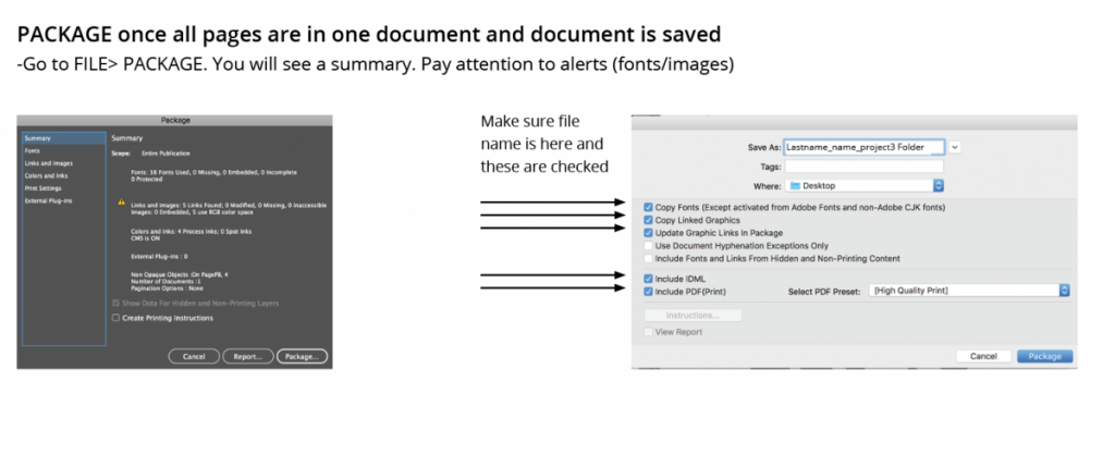
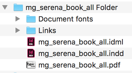
Package your Indesign file
Upload folder of packaged’ file of your InDesign Named ‘lastname firstnname_Typebook’ into: Dropbox
Create a post on OpenLab named lastname firstnname_Typebook
Categories “Student work” and Project 1
Upload a PDF version of your Type Book named lastname firstnname_Typebook
Pages to include: 15 Pages Total including the cover
Project 1: Type Book COVER
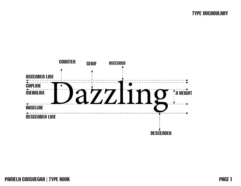
Project 1: Type Book_02a – Anatomy of Letterform Diagram with labels for parts of each letter.
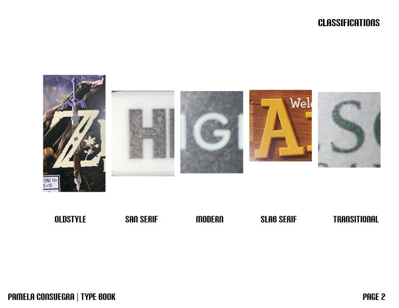
Project 1: TypeBook_03 – 5 found type five photos Anatomy of Letterforms
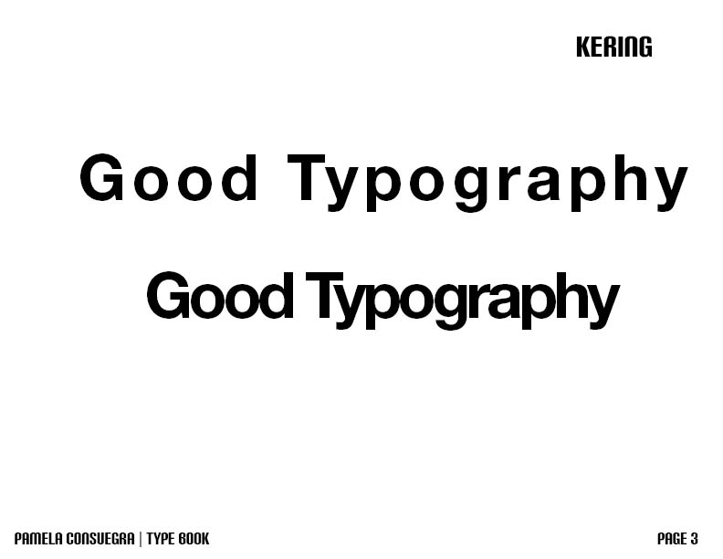
Project 1: TypeBook_04 – Kerning and Tracking
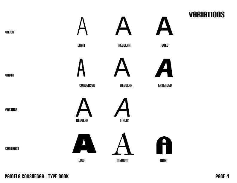
Project 1: TypeBook_04a – Variations
Project 1: TypeBook_05a Leading
Project 1: TypeBook_05b Alignment (Two Pages)
Project 1: TypeBook_05c Classification of Type Styles Alignment Typesetting (Five Pages)
Poject 1: TypeBook_06a – Drop cap (Two Pages)
Project 1: TypeBook_06 Type on a path
Reference
Class Pinterest Pages
http://pin.it/JuuDSwi
Book Design
http://pin.it/UNyJBlG
Saddle Stitch Mockups
http://pin.it/oP8pFXA
Page Layout And Grid
http://pin.it/IPT_ihg
Page Layout And Grid
Page Design Layout
Page Layout/Harmony
Thinking With Type: GRID
Books on Ipad
Typography Proportion Online
InDesign Multi page Doc Set Up
InDesign Change Doc Set Up
InDesign Page Numbering
InDesign Style Sheet Resources
Set Existing Text to Style Sheet
Printing /Page Set Up/ Imposition
Prepress
https://helpx.adobe.com/indesign/using/preflighting-files-handoff.html
Preflight 1
Preflight 2
Basic Guide to Prepress
Package files
Preflight Prepress
