Hernandez-Garcia Yamileth Project 3 Final
Leave a reply
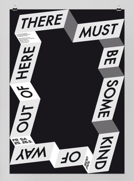


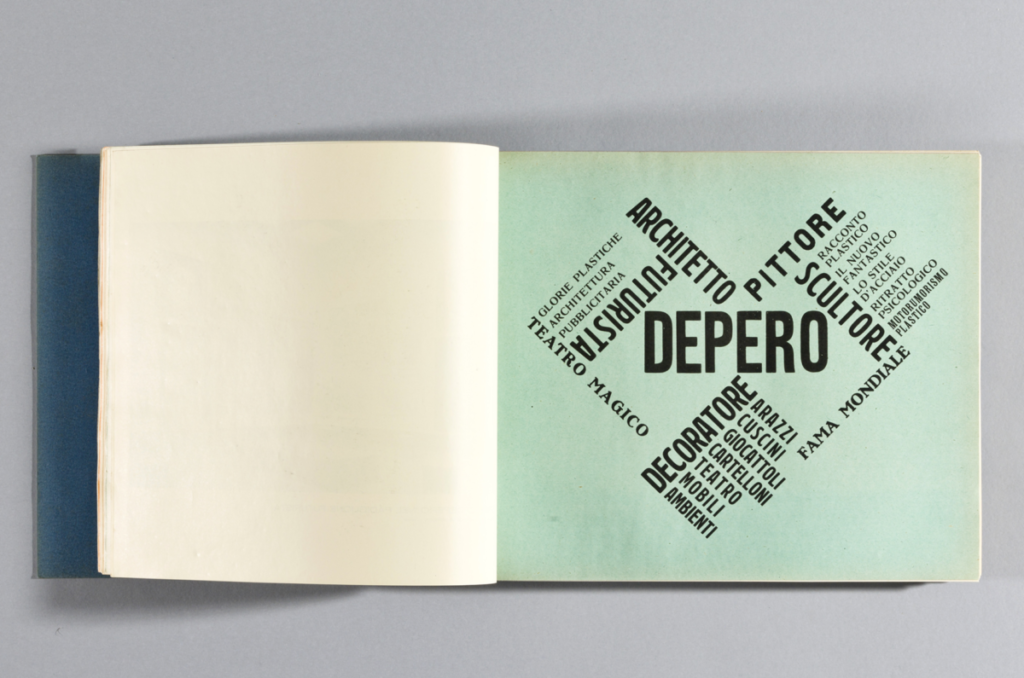

The one that has the most dynamic usage of font and layout would be the one on the left because there’s a usage of space being used and the words being demonstrated are visible to read and are not hard to comprehend. The color overall is really bright and catches attention more than the one on the right.


From both of these posters, the one that did not work for me was the one with the letter h blended in the colors of black and white and grey. The small words being expressed diagonally across the h are too small and the colors within the sentence are too light to read. Overall, with small size font and long sentence with a light grey color does not fit well with the overall design.


The OpenLab is an open-source, digital platform designed to support teaching and learning at City Tech (New York City College of Technology), and to promote student and faculty engagement in the intellectual and social life of the college community.

