Overview
Project 2: TYPOGRAPHY as EXPRESSION
Exposes the student to the creative and sometimes more playful aspect of type and lettering.
What are the differences between creating lettering and using existing typefaces?
How can we achieve a message with the use of a existing typeface or how we can in contrast, experiment with material and resources to create playful lettering.
Project 2 material and assignments are are covered in classes 13 to 19
This project contains multiple assignments:
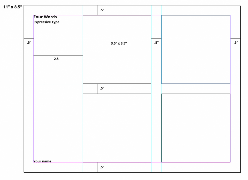
- Expressive Word with Typeface (with process). From list provided, students will choose 4 words and express their meaning with Sans Serif Typeface and design elements such as scale, placement and character repetition or omission.
- Lettering (Favorite Food or Pastime)
Project 2
Project: Expressive Typography and Lettering
Clever designers love to use typography to explore the interaction between the look of type and what type actually says. In communicating a message, a balance has to be achieved between the visual and the verbal aspects of a design. Sometimes, however, designers explore the visual aspect of type to a much greater extent than the verbal. In these cases, the visual language does all the talking.
Project Background:
The beginning of any good logo or wordmark is the ability to convey meaning in the simplest form possible. For this project you are going to express the meaning of the given words in 2 forms.
One using the letters of each word to help to establish meaning, and then the other as an artistic expression of the words.
This means one will be based on type and the other with be based on meaning.
PART 1 A. Expressive Typography:
Communicating the meaning of a word via typography
ONLY FUTURA BOLD, NO IMAGE
PART 2 B. Expressive Lettering:
An illustrative solution WITHOUT using a typeface
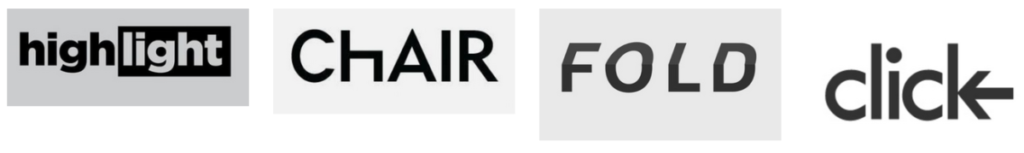
A. Expressive Typography:
Communicating the meaning of a word via FUTURA BOLD driven solution
You are only using Futura Bold.
Do not add illustrations, punctuation, or other visual elements. Use only the letters needed to spell the word.
FUTURA BOLD DOWNLOAD
https://drive.google.com/open?id=1DCoqaCuHhsCXtZ-0vTBmETDWpbDjsQr7
- Sketch template
- Words to choose from:
puzzle, focus, confused, shrinking, unbalanced, sink, tired, separate, strong, cheer
fade, drip, destroy, create, mistake, run, walk, fast, slow, grow
Process:
– Select 4 words from the list above.
– Carefully consider the words that allow you the most creative exploration.
– Use only the letters used to spell the word as part of your visual elements. You may choose to repeat or omit letter if appropriate.
– Consider the layout of you page and how the use of negative space and positioning can help with the meaning of the word.
– Consider scale, repetition, overlapping, uppercase, lowercase, etc. to create a visual definition of the word.
– Do not use drop shadows or horizontal/vertical scaling (distortion). Consider the entire space of the square.
– You may crop or “remove” parts of a letter as long as the letter is distinguishable.

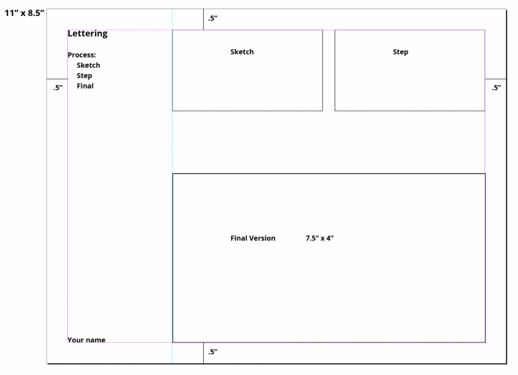
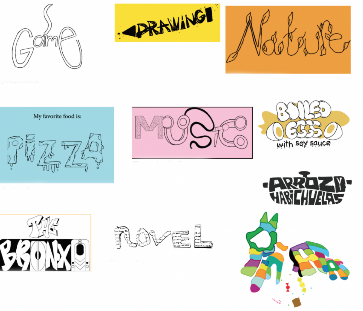
PART B. Expressive Lettering
An illustrative solution WITHOUT using a font or typeface
SELECT ANY ONE WORD YOU WOULD LIKE
….Not from list for Part A
you are allowed to create meaning by adding, subtracting, elements to help define the word. Also, you are asked to NOT think of a typeface, but rather as an artistic expression of the word.
Sketches: Sketch template
– Research the word to discover what the words actually mean. Consider the story telling of your word, are there other ways to define the word visually.
– We are more interested in create concepts over visually stunning sketches.
– Can you communicate you concept clearly via your sketch?
– It is recommended that you sketch a minimum of 3 ideas per words, for both visual solutions:
The type driven and the Illustrative for a total of 24 ideas.
– You may repeat, omit, slice, block, or overlap words or letters.
– All sketches should be hand-drawn (not computer-generated) in black ink on white paper.
– Aim for 3 sketches per 8.5×11 page. 3” inch squares laid out vertically, with concept explanation on the side.
If you DO NOT have all of the sketches you CANNOT move on the the next phase of the project.

A. Expressive Type Examples
http://www.typeroom.eu/article/young-blood-memes-moving-posters-talk-millennial-type-designer-jules-durand
https://pin.it/2WnWh5D
https://dia.tv/
https://www.creativebloq.com/news/expressive-type-designs
https://www.instagram.com/mustafaomerli/
https://www.boltedbook.com/
http://www.typeroom.eu/article/powerhouse-typographic-poster-design-named-felix
https://www.pinterest.com/daxarupal/word-art/?lp=true
https://99designs.com/blog/creative-inspiration/text-logos-wordmarks/
https://www.smashingmagazine.com/2012/04/when-typography-speaks-louder-than-words
https://1stwebdesigner.com/logo-inspiration/
B. Expressive Lettering Examples
http://artnaos.net/eclass/Typography/ExpressTypeExamples.html
http://www.typeroom.eu/article/powerhouse-typographic-poster-design-named-felix
http://www.typeroom.eu/article/ficciones-typografikas-stunning-tome-typographic-nerve-yours-own
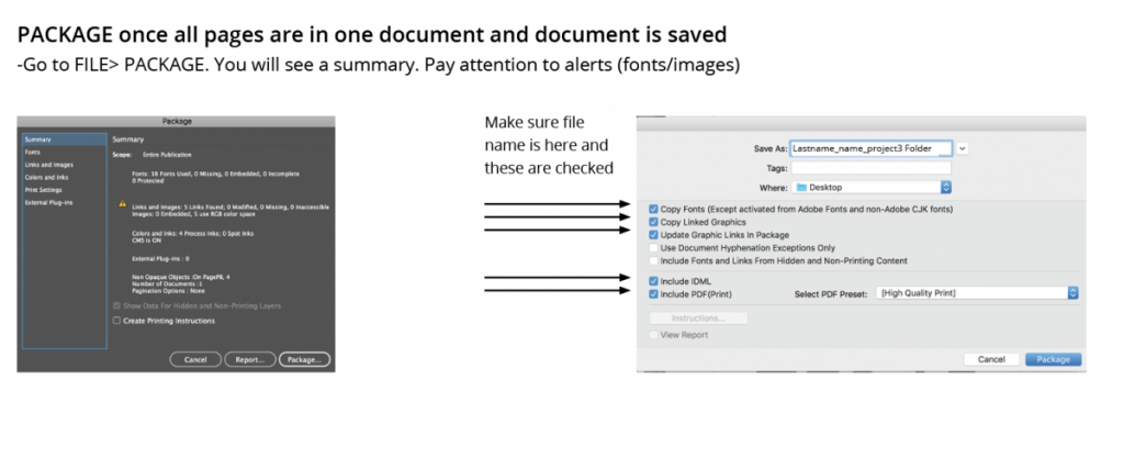
Project 2 – Part 1,2 – FINAL Deliverables
- A post on OpenLab named
- last Name_firstname Project 2 final
- give categories, Project 2, Student Post
- Create Indesign page in fomat below placed your finals into file.
- export as Both JPG and one multipage PDFPDF named last Name_firstname Project 2 final
- insert into your post