Jiang Hailey Project 3 Final
Leave a reply
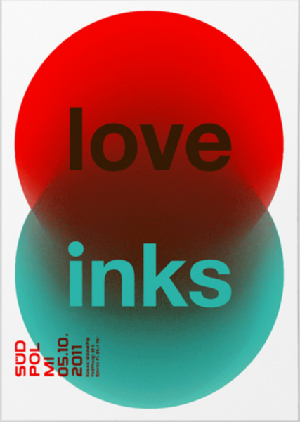
In this poster, Felix builds a strong hierarchy with scale and arrangement. ‘love’ and ‘inks’ are the largest and was placed in the center of this poster which drags viewers’ attentions. All the informational texts are legible in its size and style.
Colors also play a important role here. By using complementary primary colors like green and red, black and white. It creates a high contrast and a lot of visual vibration. Which is visually appealing to the viewers.

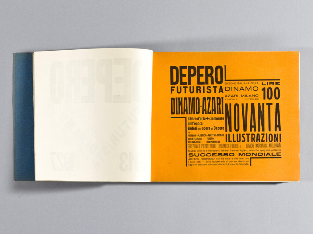
I like these two pages because they both show a great hierarchy and also dynamic. Depero used different scales and type families to show hierarchy. And, he worked with the grid and arrangement to create a movement and so the viewers follow it. Depero also likes to use bright colors to drag viewers’ attention to what he wants the viewers to see.

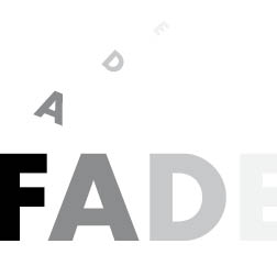

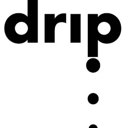
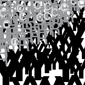

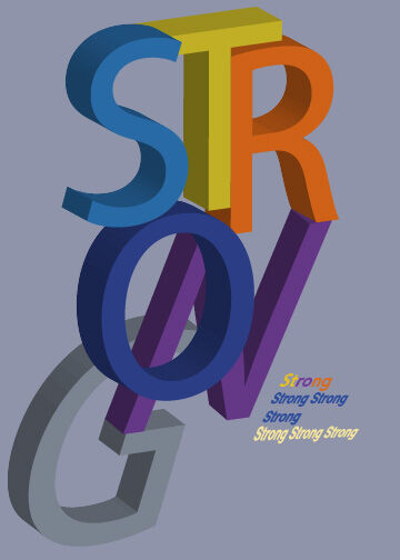
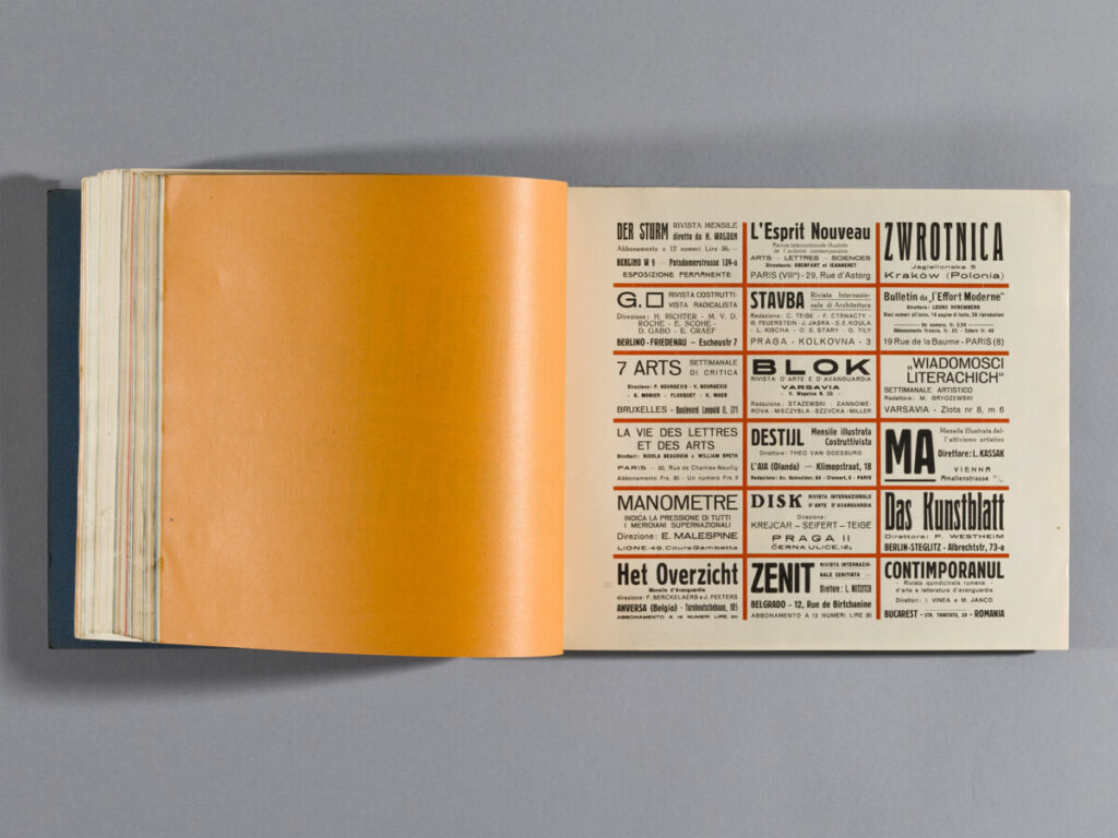
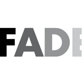
The one on the left works the least to me because the tracking between words and letters makes it hard to read. My eyes were tired to identify the meaning of the poster.
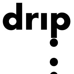
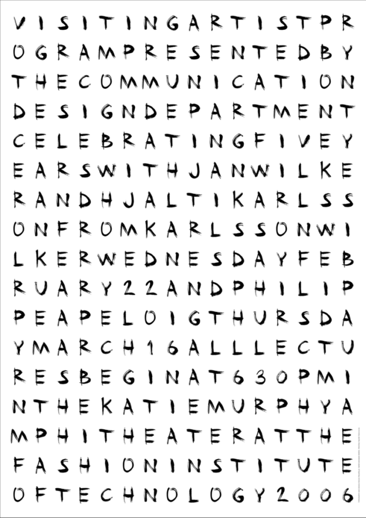
The one on the right works best to me because of the scale contrast between text form, it drags my attention. The information is also legible.


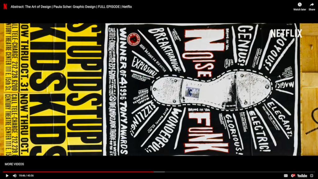
This design became a new moment for public theater. These posters are filled with words, it is urban, aggressive, and crazy, just like New York. Her works are powerful and influential, it became the standard in two to three years. What’s even more amazing about Paula Scher is that after the paradigm shift she keeps exploring a new style of design.
The OpenLab is an open-source, digital platform designed to support teaching and learning at City Tech (New York City College of Technology), and to promote student and faculty engagement in the intellectual and social life of the college community.