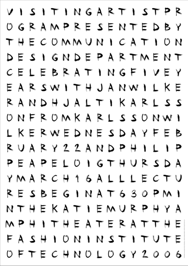

The one on the left works the least to me because the tracking between words and letters makes it hard to read. My eyes were tired to identify the meaning of the poster.
The one on the right works best to me because of the scale contrast between text form, it drags my attention. The information is also legible.

