Category Archives: Type Challenge Activities
Type Challenge color
Instructions
- Take your color poster from the homework
- Create three color studies with Adobe Color tool HTTPS://COLOR.ADOBE.COM/CREATE/COLOR-WHEEL/

- Make a new master with that layout
Insert three pages in InDesign with that new master - 1. Utilize complementary colors from color wheel of you existing layout if it is black make it white if it is red make green etc.
- 2. explore Tint = lightened color (increase brightness, add white)
- 3. one = desaturated color (reduce opacity of you colors in InDesign
- Export = jpg “last name_Firstname_designC1a.jpg”
- upload to course site
- Create a new post named “Last Name_First_Name_ TC_ “ADDNAME”
- Give it categories “Student Post Type Challenge” “Type Challenge -….”
- Save your work as jpg named: “Last Name_First_Name_ TC_ “ADDNAME” .jpg”. Insert jpg INTO your post.
- Comment on at least one other students work. Try to give your assessment in terms of what is working or not clear. “loving or “liking” or “being blown away” by work is OK but not helpful. What and why the work is successful and what is not working is key in refining and improving work
Due Date(s)
- Specified time or 11:30PM the night before next class
Resources
- Add assignment resources or readings
Type challenge grid 11/17
Upload by time specified during class
Create new
Indesign. file 11×17
Facing pages. ON
“ 0” NO MARGINS
Insert 10 pages
You will create
3 master guides pages per demo live.
- Golden ratio 11×17 box 0x0 coordinates. Divide width and height by 1.62 snap guides to box edges per demo
- Van de Graf cannon as per demo
- 9×9 grid page
Place your Pet Peeve text using grid in each layout create 3 layouts
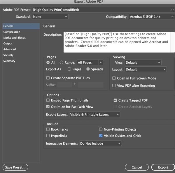
Export as PDF
SELECT VISIBLE GUIDES AND GRIDS
upload to media library
Be sure to name your file
Last-name first name gold ratio grid-1-2-3
Consuegra Pamela TC Li Xu
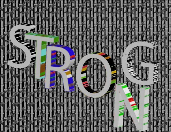
Type Challenge 11/5
Type Challenge Li Xu
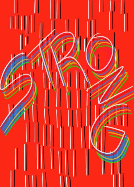
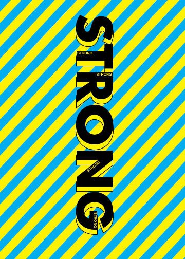
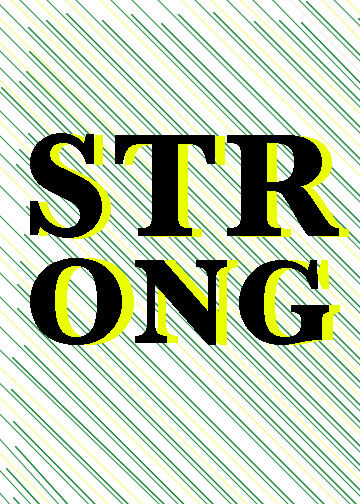
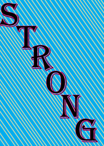
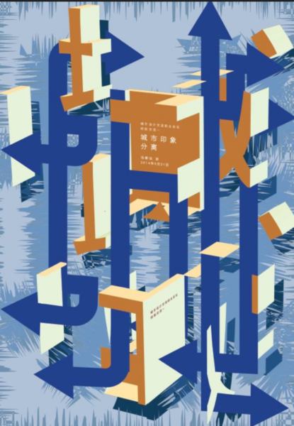
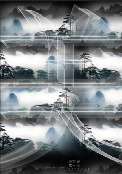
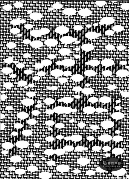
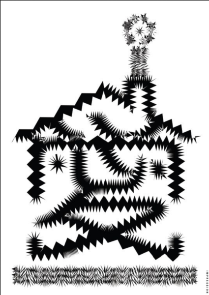
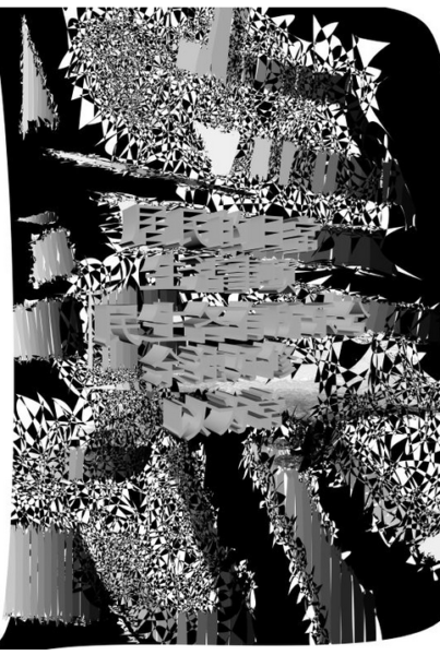
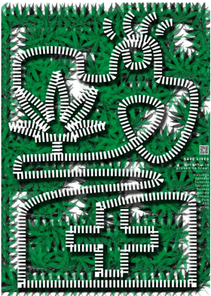
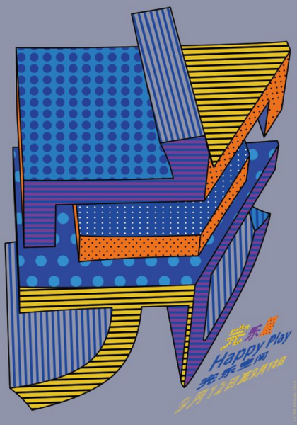
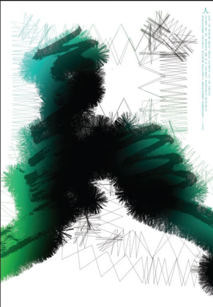
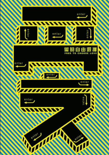
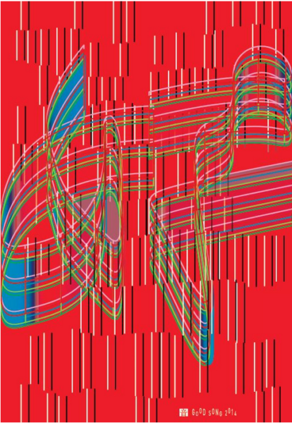
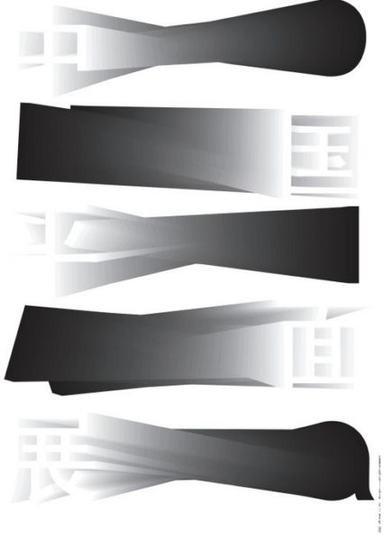
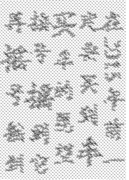
Select one of designer Li Xu’s posters below
Use it as your design guide render the word below in the style of the poster you selected
“Strong”
Try to capture the distinct layout and typographic style and elements of the works you choose.
Think of this as sketching from life and art at a museum where you would sketch the works of art
Here you are using typography, that is the only difference
5″x7″
Work 30 minutes time.
Upload one jpg to Openlab Lastname first name TC Li Xu
Finish for next class
More here designer Li Xu’s posters from Typeroom.edu
Consuegra_Pamela_ TC_CT
Consuegra_Pamela_ TC_LP

Consuegra_Pamela_ TC_ET
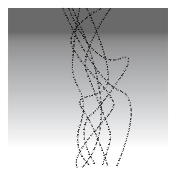
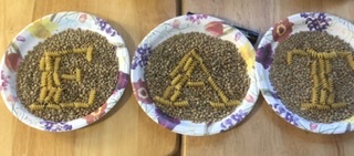
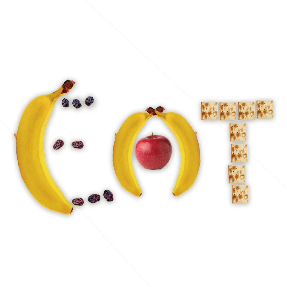
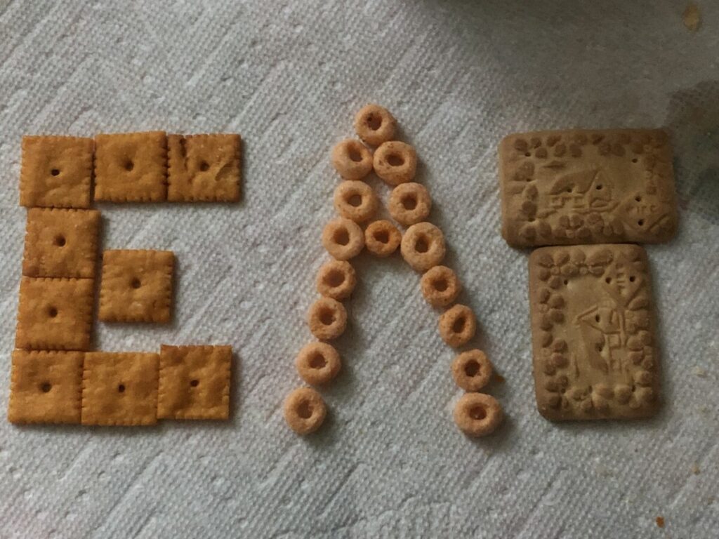
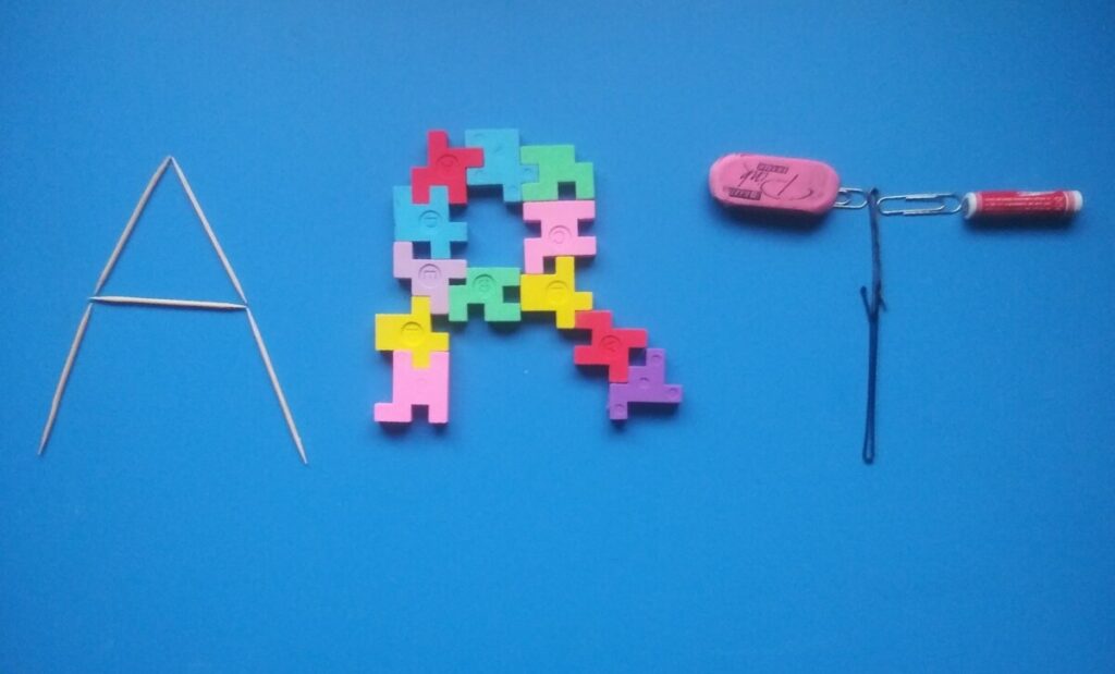
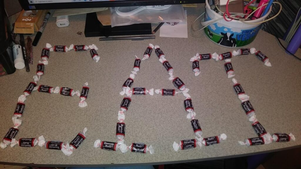
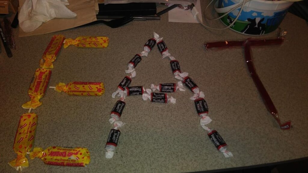
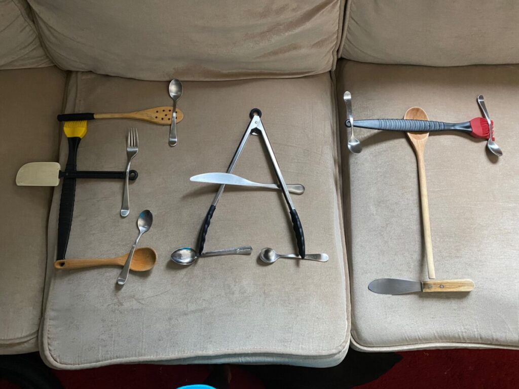
Type Challenge Expressive Lettering
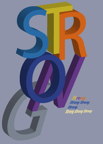
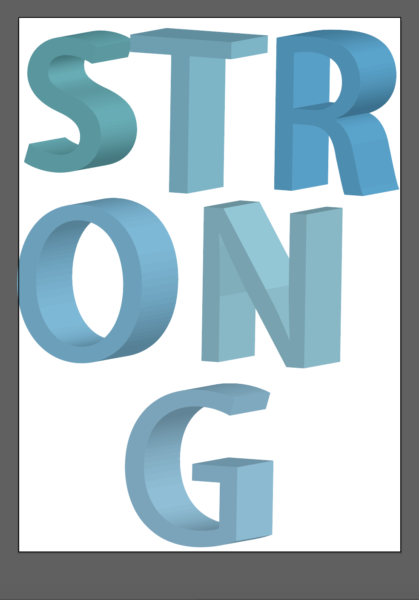
Pamela_Consuegra_TC_3d

3d Type
Jesus Rojas_TC_3D
Domena_Jasmine_ TC_3d
Wu_Chailin_TC_3d
De La Cruz Tommy Expressive Type
grant_deasia_ TC_ET
