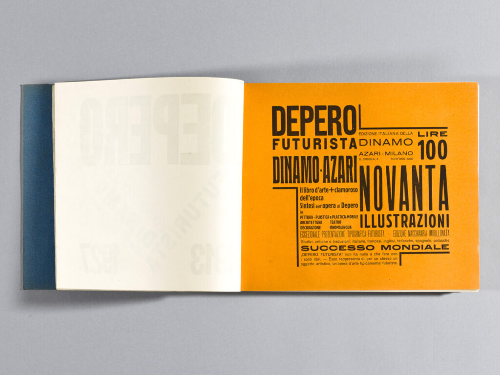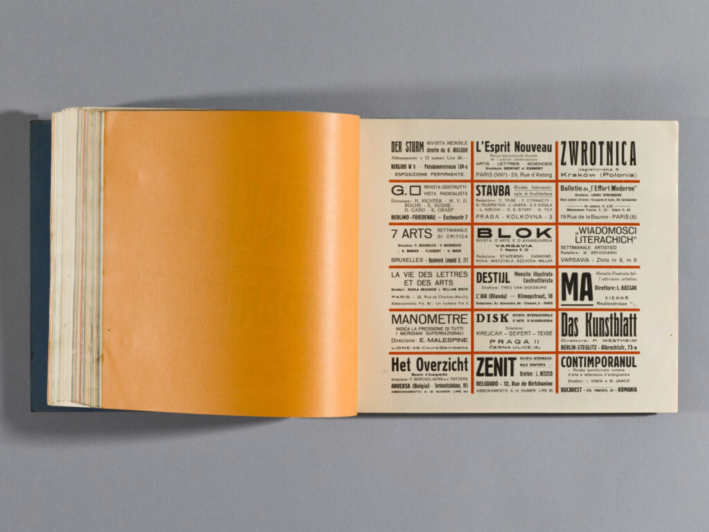

I like these two pages because they both show a great hierarchy and also dynamic. Depero used different scales and type families to show hierarchy. And, he worked with the grid and arrangement to create a movement and so the viewers follow it. Depero also likes to use bright colors to drag viewers’ attention to what he wants the viewers to see.


