Overview
A place where we talk about type
Discussion, comments, critiques, opinions on type Throughout the semester typographic works related to projects and assignments will be posted. Students will comment in live synchronous class discussions to try and identify or answer questions related to posted content. Can also be assigned as homework assignments. This is part of class participation grade.
Learning Outcomes
- Students will reinforce the typographic principles of the course through observation and critiques of current work examples in typographic industry.
- Students will develop a sense of current typography trends and be able to discus them with relevant terminology
Instructions
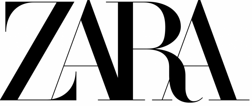
- Comment to this post below:
- Does this logo work?
- Yes or No
- Why or why not
Due Date(s)
- Due during class sessions or by class meeting time as indicated.
Resources
From Didot all you wanted to know
https://www.typeroom.eu/firmin-didot-10-things-to-know-about


Pingback: Class 08 | COMD1127 Type and Media OL39
Comment to this post below:
Does this logo work? No, its so mashed up together and it’s hard to read
Why or why not: In my opinion, Zara’s old logo worked much better and it’s more easily readable.
This logo might work, but if the goal of wanting to catch customers attention, then it would be difficult to read the logo ZARA causing this to not work.
The way it is being shown with a Modern Typeface (Serif) makes it difficult to visually see because the A’s are very hidden and the Counter spaces from the letter R and A can make it hard to see from a far away distance, causing the overall word ZARA hard to see and work.
i personally like the new logo as it is a lot more then before.i feel like its very stylish and a good change.the modern serif still allows it to be readable while still revamping the logo
Does the logo work? Yes, personally I think the zara logo is easy to read and there isn’t too much details making the simplicity very modern and bold, the new logo is definitely keeping up with the times.
After looking at Zara’s logo, I can say that it works though there are some details that don’t. For example, the spacing between each letter is a bit confusing. The Z and the first A are touching though you cannot necessarily tell which letter overlaps the other. Though you can tell with the R and second A that the R is in the front.