Professor Woolley | COMD3313 OL74| FA20

Category: Assignment 2 (Page 2 of 9)

Assignment 2, Part 1

Articles –
Humans Right Watch: https://www.hrw.org/news/2020/11/06/why-popes-endorsement-same-sex-unions-matters
America Magazine: https://www.americamagazine.org/faith/2020/10/23/pope-francis-homosexuality-illegal-lgbt-catholics

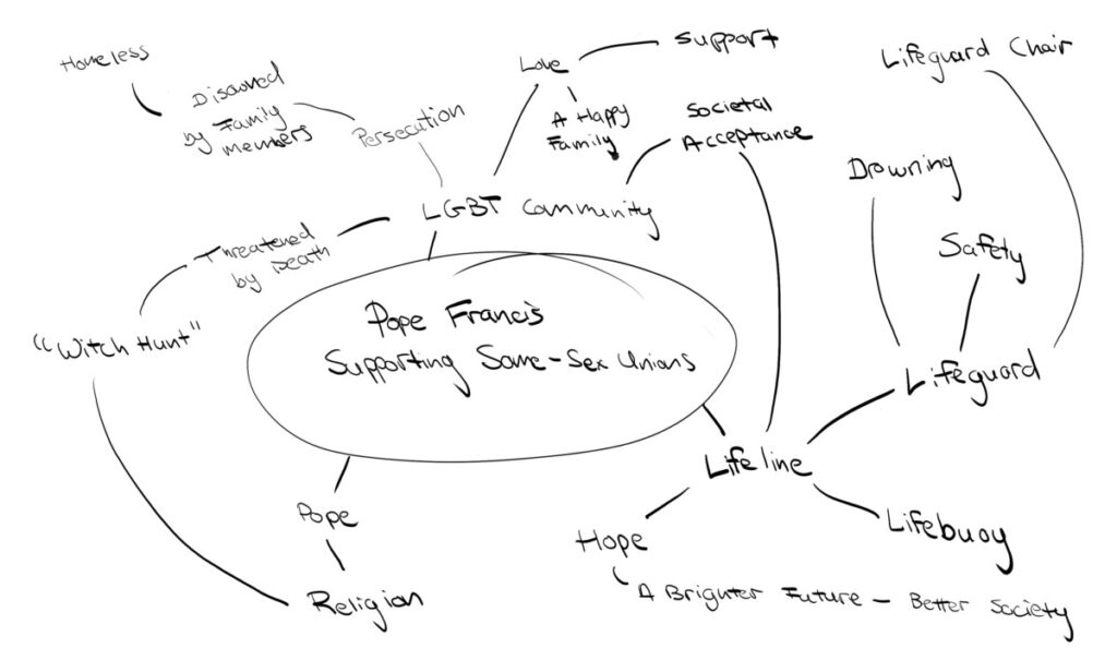
Both of these articles talk about a recent statement by Pope Francis, from a 2019 interview where he is in support of same-sex unions. They also talk about how this statement matters to those of the LGBT community and the second article compares it to a lifeline. In the Humans Right Watch article, the pope acknowledges that gay and lesbian people are “children of God and have a right to a family.” This becomes a message that will lead to healing for a number of LGBT youth who find themselves banished from their families and homeless. Both articles also talk about how the LGBT community is treated in different countries, and in over 70 countries it is illegal and punishable by death. The Pope’s endorsement of civil unions is a step in the right direction for the acceptance of LGBT people.

Brainstorm

Final Editorial Illustration and Process – Shylin Ferrera

Link to article:

https://www.hrw.org/news/2020/10/29/bangladesh-pivotal-moment-stop-violence-against-women#
Link to Pinterest:
https://pin.it/7vVsPGN

Tight sketch:

Cleaned up piece, fixes need to be made in: the neck, feet, and points in which the “smoke” connects to the figure.

Final Fixed Art:

Fixes made to the feet, orientation of the hand, the smoke, and neck 🙂

Color Comps:

For my color comps I knew early on that I wanted to go with a more simple color pallet. I knew that with the shapes and overlapping figures that it would be best to stay away from harsh pattern or colors. Early on, I realized that I needed to incorporate Bangladesh more heavily into my design as the focus of my article was violence to women in Bangladesh specifically. In my first color comp I made the cliff the map of Bangladesh territory, however, the colors felt a bit straining to the eyes and too busy. For my next piece I enjoyed the addition of the Bangladesh flag, yet the black was very overwhelming as well as the background pattern. For my last color comp I toned down the color of the background and gave it a slight texture but I felt my choice of saturating the red in the flag was too jarring.

Final Color Piece:

For my final piece I have desaturated the colors of the Bangladesh flag and upped the “violence” aspect of the illustration. Since my piece is focused on domestic violence against women in Bangladesh I decided to add bruise marks in prominent areas such as the legs and around her eye. I also added hints of red to her knuckles and feet to better illustrate strain. It was important to me to make sure the theme was represented best, which is why I kept the shading to just her (keep her as the center of attention).

« Older posts Newer posts »

© 2024 Illustration One

Theme by Anders NorenUp ↑