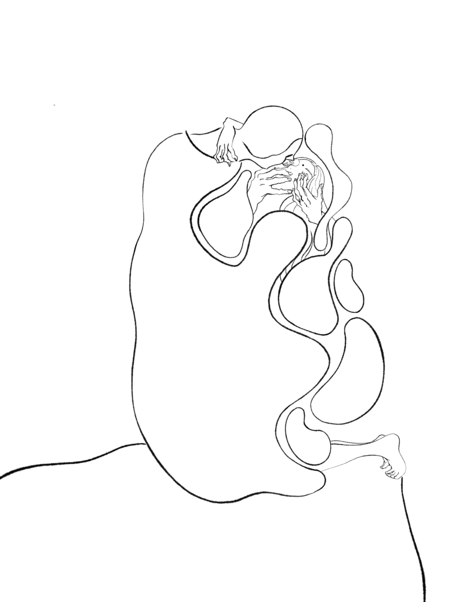
Cleaned up piece, fixes need to be made in: the neck, feet, and points in which the “smoke” connects to the figure.
Final Fixed Art:
Fixes made to the feet, orientation of the hand, the smoke, and neck 🙂
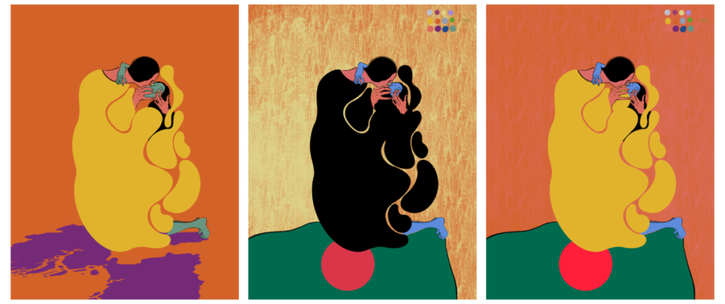
Color Comps:
For my color comps I knew early on that I wanted to go with a more simple color pallet. I knew that with the shapes and overlapping figures that it would be best to stay away from harsh pattern or colors. Early on, I realized that I needed to incorporate Bangladesh more heavily into my design as the focus of my article was violence to women in Bangladesh specifically. In my first color comp I made the cliff the map of Bangladesh territory, however, the colors felt a bit straining to the eyes and too busy. For my next piece I enjoyed the addition of the Bangladesh flag, yet the black was very overwhelming as well as the background pattern. For my last color comp I toned down the color of the background and gave it a slight texture but I felt my choice of saturating the red in the flag was too jarring.
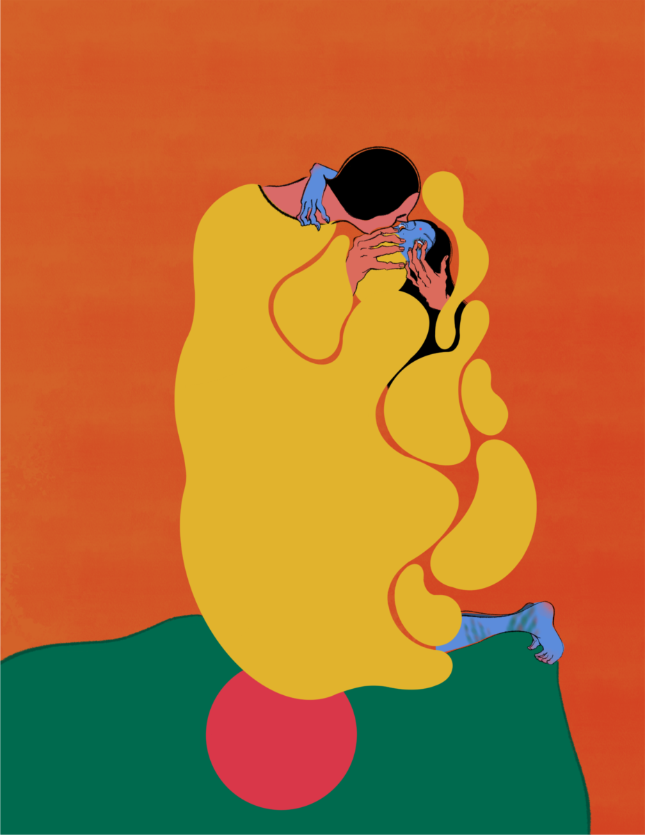
Final Color Piece:
For my final piece I have desaturated the colors of the Bangladesh flag and upped the “violence” aspect of the illustration. Since my piece is focused on domestic violence against women in Bangladesh I decided to add bruise marks in prominent areas such as the legs and around her eye. I also added hints of red to her knuckles and feet to better illustrate strain. It was important to me to make sure the theme was represented best, which is why I kept the shading to just her (keep her as the center of attention).
This course is a practical introduction to the field of illustration. Focus will be placed on
process work and professional practices, presented within contemporary and historical
context. Course includes projects and lectures in a variety of illustration genres.
Professor Woolley
Office Hours: Tuesday 12 – 2pm email for appointment


Leave a Reply