Professor Diana Schoenbrun | COMD 3313 | SP22

Category: Final Project (Page 2 of 8)

Final Poster – Natalie Soto-Bernal

Directed by William Castle

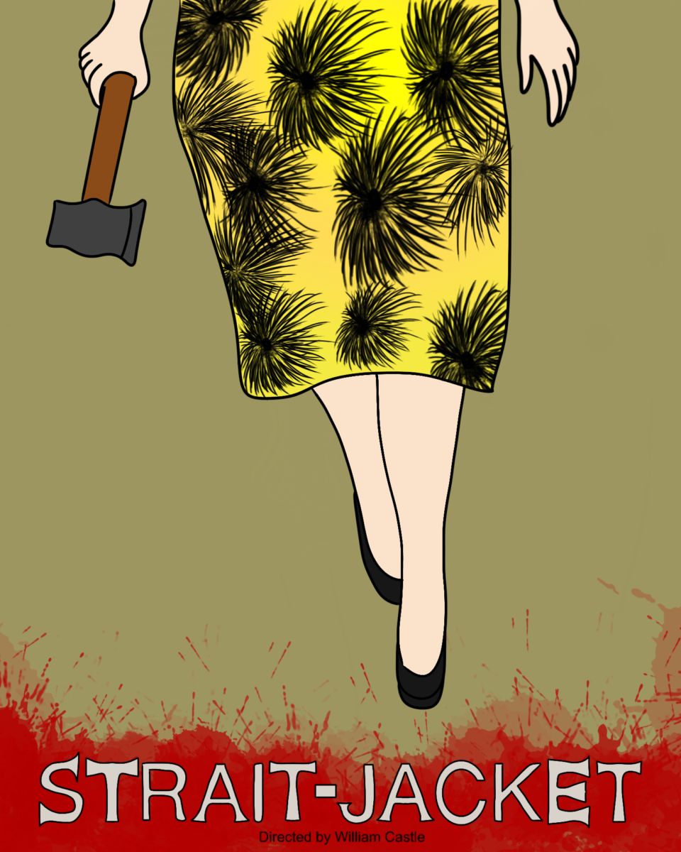
For my final piece I chose to focus on the first sketch I created which shows the killer from the waist down holding a axe in her right hand walking toward the audience. The background behind the movie title and the director is splattered with blood from the fallen victims. I drew out the movie title by hand and made the edges look like the end of an actual axe. I chose to fill my color palette with dull colors; with the exception of the color of the dress, rather than use bright colors. I feel as if using dark and dreary colors works well with the theme of the film. This film was shot in black and white and that made it harder to try and figure out what colors were used throughout the film. Personally I admire the approach because if it were shot in a different manner then it wouldn’t be as suspenseful as it originally was. In the film the director chose not to reveal the face of the killer and I went along with a similar approach and focused on the outfit. I liked how it came out and felt the need to not focus on the face and give away the ending to the viewer.

Nicholas Albanese Final Poster Illustration

Creating this poster was very labourious. I first started by choosing references based off of specific scenes from the movie. I used two different palettes from two outfits that Robin Williams wears in the film. The left was the outfit he wears in Moscow which consists of very dark and muted colors. The one on the right is an outfit he wears in New York towards the end of the film which contains brighter and more expressive colors. To go with the color of the clothing, I also gave the Moscow side of Robin Williams more desaturated skin, making him look pale and depressed. For the New York side, I gave him a brighter, more orange, skin tone to show how happy his character is once he reaches New York. I think the style that I chose ends up jazzing well with the films themes. The main theme of the movie is immmigration and the American dream and I believe my poster illustrates the struggles of Robin Williams’s character as he goes from Russian immigrant to American citizen. I believe the colors also fit the tone as this movie is a slice of life film that shows the full range of emotions from Robin Williams’s character (heartbreak, love, sadness, etc.)

Jessie Zhang- Final Project Movie Poster

For this project, the process was thinking about the more important points of the movie. I figured to add in the upside down cross with the possessed character in it to show the general main idea of possession. I added the two other characters above the cross because they played important roles but only showing their faces to not distract too much from the cross area. For the possessed character, I went with a similar color palette as in the movie scene. For the typeface of the title, I used serif because it fit into the ā€œolderā€ times and more serious. I also decided to put the ā€œpurpleā€ in parts of the text on the poster to relate to the original poster. I also added the red splatters on the background to indicate violence and blood.
« Older posts Newer posts »