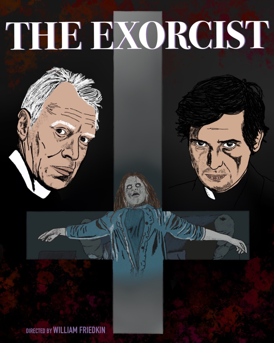
Jessie Zhang- Final Project Movie Poster
Professor Diana Schoenbrun | COMD 3313 | SP22
© 2024 COMD3313, Illustration 1
Theme by Anders Noren — Up ↑
The OpenLab is an open-source, digital platform designed to support teaching and learning at City Tech (New York City College of Technology), and to promote student and faculty engagement in the intellectual and social life of the college community.


Leave a Reply