4/14/2022 – 11:06 AM
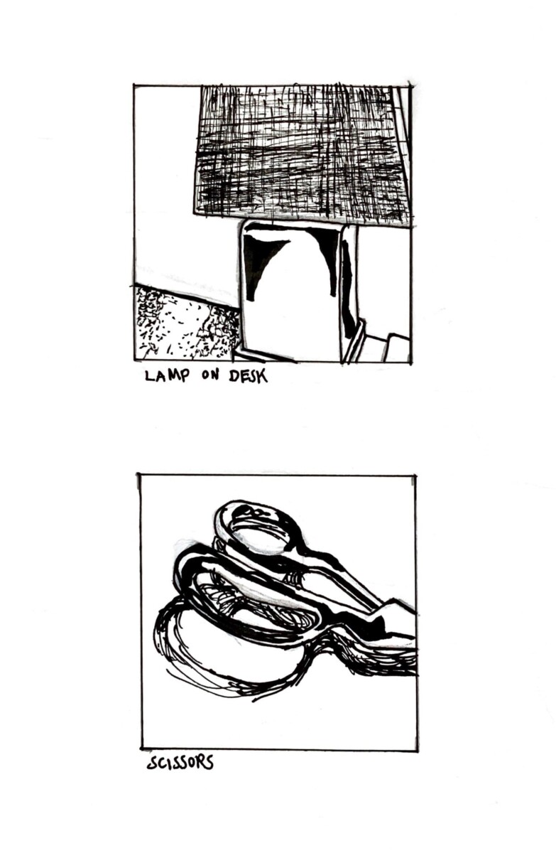
This sketchbook assignment was a bit hard, but I think my two compositions ended up looking okay. For the first composition, I took a picture of the lamp on my desk and drew and inked it. I chose my desk lamp because of the nice woven texture of the lamp shade, and the glossiness of the ceramic base of the lamp. I used cross hatching to render the lamp shade, as cross hatching mimics woven textures quite nicely. Then I used my pigma brush pen in wide curving strokes to render the glossiness of the lamp’s base. And finally I used stippling to render the shadows on the desk next to the lamp. For the second composition, I took a picture of a pair of super glossy heavy silver scissors on my desk and drew and inked them. I chose the scissors because of how unique their shape is and how glossy they are. I used my pigma brush pen in really big curvy strokes to mimic the shadows on the metal which help make the scissors look so glossy, and I made sure to include plenty of white space as that also helped to render the glossiness. To finish the composition I used long curving strokes to render the shadow of the scissors. This was the challenging part, as I had to show the lighter part of the shadow in the part of the curve of the big side of the handle, by using less and more spaced out strokes. I’m happy with how both compositions came out in the end.


Recent Comments