Professor Diana Schoenbrun | COMD 3313 | SP22

Author: Patrick Rogers (Page 2 of 7)

Patrick Rogers – Final, Part 1

5/5/2022 – 9:38 PM

existing Marie Antoinette movie poster

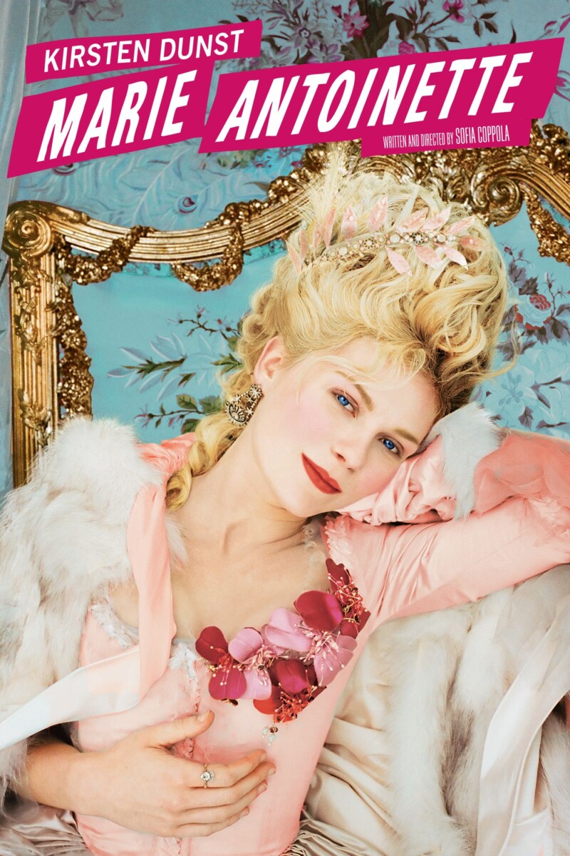
Marie Antoinette – directed by Sofia Coppola

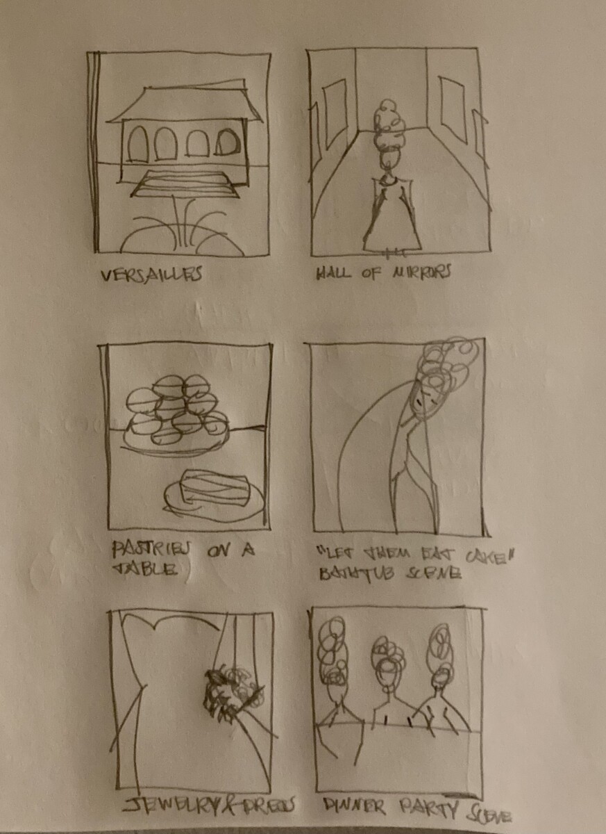
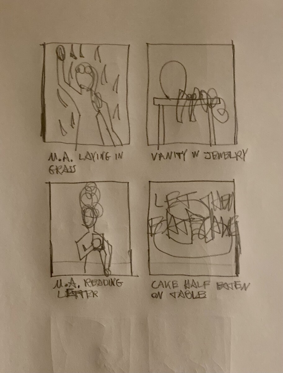
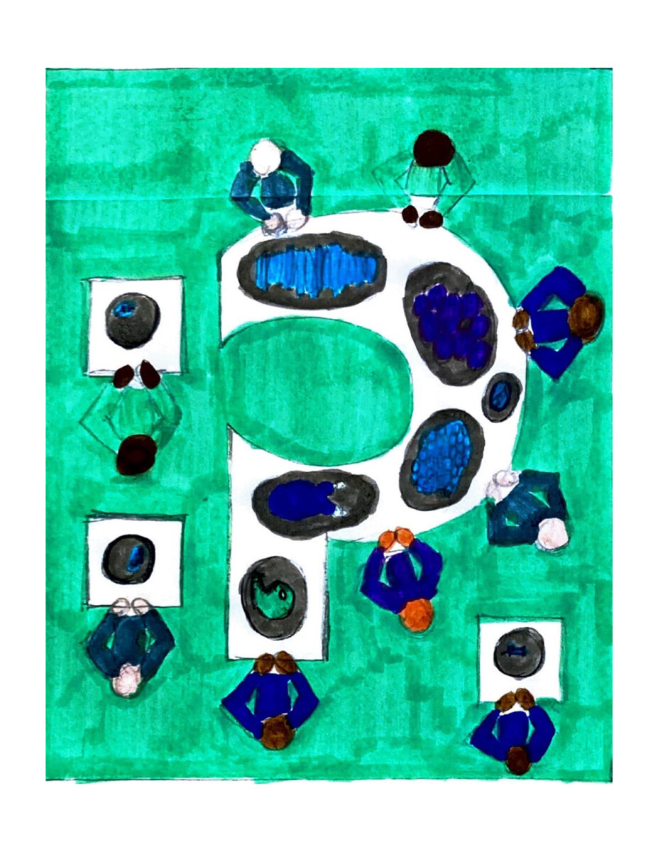
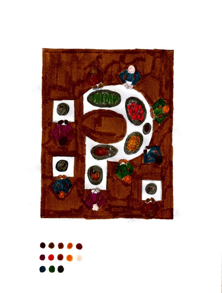
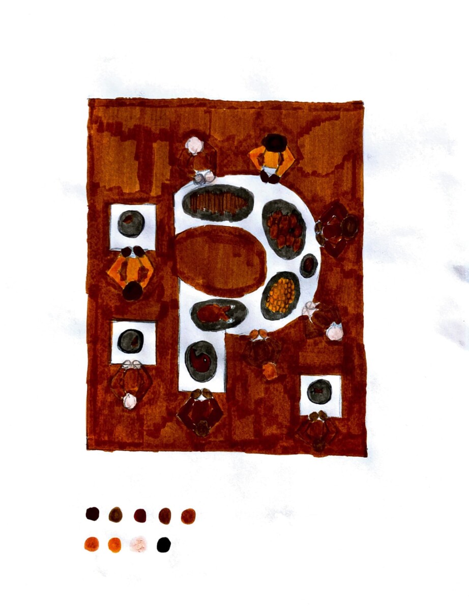
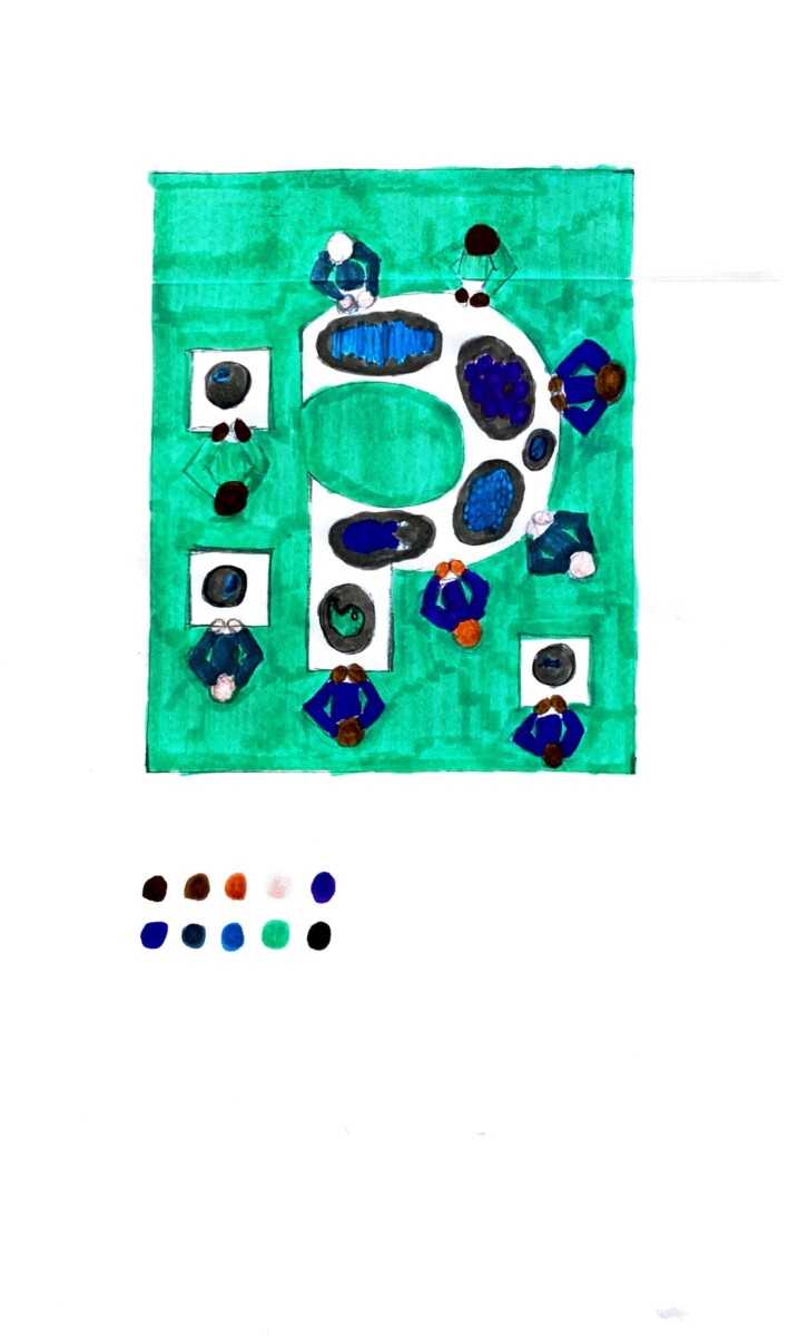
Marie Antoinette is one of my favorite movies of all time, and it has such a distinct visual style, which is why I chose it for my final Illustration project. PLOT SUMMARY – Marie Antoinette is a historical biopic about the life of the onetime queen of France, and it is a rock and roll retelling of her life’s story. The visuals are classic 18th century France, while the music and cinematography are pure rock n roll glamour. It caused quite a stir when it was initially released in the late 00’s, as the artful punk rock elements were not what many people had in mind when they thought of the time period of her life, the 18th century. The movie is all about her life, which was fascinating. She became the queen of France as a teenager, and was eventually beheaded, which ended her life while she was still relatively young. She was notorious for spending loads of the French government’s money on dresses and jewelry, and she seemed to care more about lavish parties than the people of France. The movie shows many of these elements, and is therefore visually sumptuous. C’est magnifique! TARGET AUDIENCE – People interested in independent, arthouse cinema, and fans of Sofia Coppola.

word web for movie poster design
movie poster thumbnails 1
movie poster thumbnails 2

Patrick Rogers – Assignment 2, Part 3

5/2/2022 – 5:22 PM

final composition
final composition – no logo

For my final composition for assignment 2, editorial project, I chose to use the colors option 3, which is only cool colors (mostly blues). I ultimately landed on these colors because the super light blue background made it easy to see all the details, while in the other color options the floors in those compositions are darker, which made it harder to see the details. Also, I am very pleased with how my final composition looks with the T magazine logo. I think it looks great!

nytimes.com/2022/03/18/t-magazine/indulgence-starvation-food-inequality.html

Patrick Rogers – Assignment 2, Part 2

4/27/2022 – 4:27 PM

thumbnails
concept sketch 1
concept sketch 2

nytimes.com/2022/03/18/t-magazine/indulgence-starvation-food-inequality.html

For assignment 2 my client is T, the New York Times style magazine. The article I chose to illustrate is titled “In a Starving World, Is Eating Well Unethical?” In my thumbnail sketches, I tried to show different versions of people feasting at a big table, with other people eating tiny amounts of food, scraps basically, at other smaller tables. I ultimately narrowed it down to two concept sketches. The first shows a big question mark shaped table with people feasting on it and smaller tables around it with one person per table eating scraps of food at each. I thought it would be very effective and interesting to make the table with the feast on it into a metaphorical symbol, showing the theme of the article, which is about the question of – is it ethical to consume luxurious foods while a huge portion of the world’s population doesn’t have access to basic foods? I like this first concept sketch a lot. The second concept sketch is very simple, and shows two tables side by side, one with a cornucopia of lots of food on it, and the other with only the scrap of an apple core on it. This one was meant to show the disparity in access to food between the different parts of the world’s population, and make the viewer think about that main question of the article – is it ethical to consume lots of food while a huge amount of people throughout the world scrape by on a tiny amount of food? I wanted to keep it simple in this concept sketch so the viewer would just stop and think and bring their own perspective to the questions examined in the article.

« Older posts Newer posts »