Professor Diana Schoenbrun | COMD 3313 | SP22

Author: Diana Schoenbrun (Page 9 of 17)

Isolating your line art on a transparent background in photoshop

  1. Scan art in at 300dpi or higher in RGB. Make adjustments with levels or brightness and contrast. 

2. Zoom in and see if the white of the page is pure white and not grey or yellow.

3. Change image to to greyscale. Image>mode >greyscale

4. Open Channels up.

5. Select inside the channel. And hit command.

6. Now do Select Inverse. That will select the line.

7. Now copy onto a new layer, command V.

8. Then adjust levels. Image>Adjustments>levels

9. Move all sliders to the right to increase the darkness.

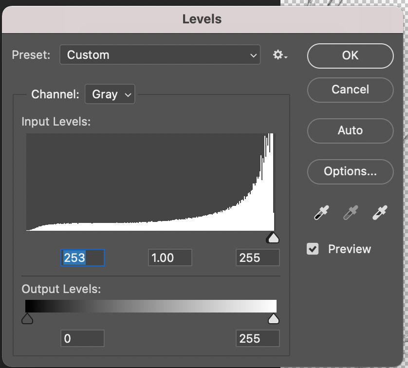
10. Make sure to add a white background layer behind the line layer.

11. Change file back to CMYK or RGB before coloring.

  • to change the color of the line layer you need to lock the layer and then select your color and paintbrush.

Reading Week 5

WGSN’s colour director on the evolution of how humans perceive and define colour

In the reading the the article states:

“Humans connect with colour on a visceral level, and a colour’s psychological associations run deep within human culture and imagination. As such, when faced with making colour selections people tend to be guided by their own subjective colour propensities. “

Jane Monnington Boddy

What color choices do you make ? Do you have color preferences? Why do you think you choose the colors that you choose? Do those colors convey anything specific or remind you of anything?

Respond with commentary in a few sentences.

GO TO: CLASS SITE

DASHBOARD > POSTS > ADD NEW >

Write your post. Add a Descriptive title.

Please add your introduction by [DATE AND TIME].

Choose CATEGORY (bottom right side): Reading

Choose TAG>Week 5

PUBLISH

Assignment 1, Part 5

COLORING YOUR ILLUSTRTATION FOR PACKAGING

  1. You can add color traditionally using watercolor, marker, colored pencil.
  2. Or you can add color digitally using photoshop or procreate to add color to your line art. Use whatever traditional or digital mediums you would like to use.
  3. If traditional, scan your final art, hi res at 300 dpi as a .tiff or .jpg.

Do 2 color studies for the final.

Choose your color palette .

  • Complementary
  • Split-complementary
  • Primary
  • Triadic
  • Warm
  • Cool
  • Monochromatic
  • Analogous
  • Limited (no more than 5, b&w)
  • Personal or using a reference

DUE NEXT WEEK:

  1. Place both color studies in the packing template and save as .jpgs and post on Openlab.
  2. Decide which color palette is most successful and use that one for the ice cream container. Print out or cut out the final art from the packaging template. Remember to cut on the black trim line. Tape art to the actual ice cream container and photograph. If you illustrated the top piece of the container, photograph that as well. Photograph container on a blank background, preferably a white wall. Keep background from being distracting.
  3. Then place the art into the banner template file. Decide where you want the logo to go. Post on Openlab as well.

POST all art

Student Posts>Work in Progress> Week 5

Does the color convey emotion or give feeling to the piece? Why did you choose the colors? Label with your name and date and a description what color palettes you chose and why.

« Older posts Newer posts »