Author Archives: Richard Campbell

Self-Evaluation

This semester has been one big roller coaster; there were some high and low points, not just academically but life in general. I started off this semester feeling pretty confident; the spring semester was good, and my summer break was excellent. Without a reason to doubt myself walking into the fall semester; even though, I did not have an internship as yet. Professor Mason gave me a substantial lead right away, which solved my internship problem. I got lucky, the fact that I did not have a portfolio due to my expert procrastination abilities, the possibility of me landing an internship by applying online were slim to none. I also left my full-time job because they were not flexible enough. I felt like that was a good way to get me focused on seeking out freelance jobs and focusing on school.

This semester I took three courses; Internship, Design Team, and Campaign Development II. Figured this was the best route to take, leaving Senior Project and Portfolio for the spring. In all honesty, I am grateful for all of my professors this semester they were all super helpful. Professor Fikaris was very motivational with his high level of energy and because of him, I was able to push myself and get out of a slum. Professor Franklin provided a fresh laid-back approach to creative thinking, which helped me to come over a huge “brain-fart” I experienced mid-semester. Just being in the same room as Professor Mason watching how he pays attention and the interest he takes in his students’ internship stories, always made me feel like I had someone on my side.

My eyes have opened; I have found new motivation from my peers in this course my situation is no heavier than someone else. I am humbled and appreciate ever experience more, understanding where someone who procrastinates measures up in the world of advertising.

Journal Entry 14 & 15

Post #14

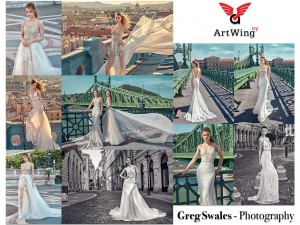
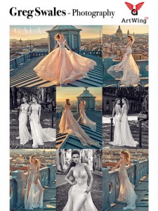
This has been a pretty productive week; I have been working hard and learning a few new things. Scott and Naeem reached out; they wanted another card for Photographer Greg Swales. The shoot they sent over was just beautiful. The photos delivered sexy, elegant, and upscale extremely well. I was asked to create two cards from the files sent; the photos were all from the same shoot so the cards might look similar, so I wrote an email expressing that, and they understood. I completed the two cards; Scott conveyed how blown away he was by responding, “Amazing!” I deiced to take this opportunity to thank him for his kind words about my work and remind him that the semester is coming to an end. I expressed that I would like to meet soon to complete my evaluation form and time-sheet.

Greg Swales_NewStory1 Greg Swales_NewStory2

This week I have also revisited the TEDx Talk: How to Avoid Death by PowerPoint, by David JP Phillips. David spoke about all the horrible ways people designed PowerPoint’s and gave solution on how to create a successful one. David explained the common mistakes like having a bright background, an enormous body of text, and large headlines. He shared that we should have one message per slide, use contrast and size to stare focus, avoid using sentences if speaking at the same time, use a dark background, and only six items per slide. This was extremely helpful to create my PowerPoint for my final presentation.


Post #15

I am really in the zone, super focused and challenging myself. Oh, and I have yet to hear back from the good folks of ArtWing NY to complete my evaluation, so I explained my situation to Professor Mason, and he said, “I will have to get in contact with Scott this is unacceptable.” With the semester coming to an end that means I have final projects to complete; I was finishing up my book cover design for The City Tech Writer 2016 Volume 11. I also have an assignment where Professor Craig Franklin a social media driven event for the last project presented. We all had to create a non-headline driven campaign for a mobile app of our choice. Mine was a wine app by Taste Wine Co; the app is used to educate about wine, and it assist users in finding the right wine for them. Last but not least finish up my final presentation for this class.

So for the City Tech Writers book cover, I did everything in Adobe Illustrator, and I mean everything. I used some shading and highlighting techniques I came up with by tweaking different effects. I also needed a beveled & embossed effect for my text, which took a few layers and effects, because just converting the text to 3D does not create clean enough look. The final product came out beautiful everyone said, “you could see my hard work show.” It felt superb to hear comments like that.

citytechwriter

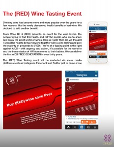
As for the social media driven event for the Taste Wine Co app. I decided to use Instagram, Facebook, and Twitter. I designed the Ad then I displayed it in an Instagram mock-up. I chose to partner with (RED) and do a wine tasting event. I thought that was a good way to utilize the app and a good way to gather people, the majority of proceeds for red wine purchased would go towards (RED)’s movement to ” to deliver an AIDS FREE GENERATION.”

Tastewineco_red_event


journal entry 13

Final preparations made, and it was time to print my project. By the way, I am speaking of Monday figured I would start from there since I mentioned The Seventy-sixth Hornor’s Convocation cover due date last week. So I took a trip over to Remsen Graphics to print, because last time I went to Fedex, yeah silly me. The print for the cover was vibrant and attractive. After leaving Remsen Graphics, I went over to WC Art & Drafting to purchase a precut board for mounting, rubber cement, and X-Acto knife. Made it to class, and then I mounted my print with a border all around like the professor asked. Some of the students rushed or did not follow instructions, so they ruined the artwork. Some displays were crooked or bubbly because they put too much glue not allowing it to dry.

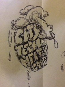
After the client viewed the work and left the professor briefed us on the next project right away. We were each instructed to design a book cover for City Tech Writers Volume 11, and the design should be a visual metaphor. An idea came to me immediately; I wanted to do something to represent the heart of a writer.

Fast forwarding to Tuesday, Scott nor Naeem contacted me for the second week, so once again no new updates about the internship; However, with the free time I decided to get started on my sketches for the next book cover.

IMG_1047

Journal Entry 12

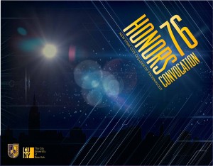
I should know better by now that my supervisors are not consistent. Thought they would have contacted me with some work, but I am not complaining because I have much work to do. Started the Cover for City Tech’s Seventy-sixth Honor’s Convocation. Next Monday it should be ready for print, so I guess no more putting off completing the typography. After an hour of selecting from my long list of combinations and positioning my choice to my liking, I am ready to try a few different fills in Illustrator. Finally settling on a gradient that I tweaked a little, I chose about three yellows and moved around the slider until I was satisfied. Now since the project is almost due, it is time for some feedback; I try to send it out to the instructor, Professor Fikaris is this case, and I usually send it to a few friends ones of the same interest and that are not. Because this file is for print, the color mode is set to CMYK, but I am sending it via multimedia messaging and emailing it; I usually export as a low-res RBG jpg format.

honorconvocation

As for constructive criticism, my professor said, “enlarge the text just a little more and do the same to the school logos on the back of the cover.” A friend of mine thought I should add a stroke to the silhouette of the city skyline. Overall though everyone liked it, and I did as well, but in all honesty, I did not put much effort into this piece.

Journal entry 10 & 11

Journal entry#10

So the week started out well I had an excellent interview with Avis. The only thing left to do was the drug screening, I left after the hiring managers said they would contact me in twenty-four hours. I needed a job, to be honest; I have not worked since January. The plan before I left my last job was to finish up the spring semester and then find something more flexible. I did my calculations, and there was enough money in my bank account to last me until the end of the summer. The spring semester finished and the summer started, but everything was still looking good. I managed to budget myself enough, and I hardly used up my funds; Even though, I still ate, drank, and partied like I had a guaranteed paycheck. I guess the little freelance gigs my older cousin would put me on to helped significantly. One thing led to another, and my funds ran out, thanks, City Tech Financial Aid Center. Back to Avis, they never scheduled me for the drug-screening guess they forgot about me whatever everything happens for a reason. I told myself after quitting G.I.A. back in January that the next job I have will be in my field or something else I enjoy, so for the next few days, I had to reevaluate my situation and find that focus. The drive returned I found myself not stressing over poor finances, and the negative energy transformed into an active force that now propels me towards a goal.


Journal entry #11

Feeling good, highly favored, and focused I have decided to sort some old work and created a folder for possible portfolio pieces. On Tuesday morning, I woke up expecting an email from Scott or Naeem with work to complete, but there was nothing. I decided to contact them after a few hours, so I sent an email with the subject reading, “Touching base.” The body copy read, “Hey guys, Hope all is well; I did not receive any feedback on the cards completed from last week, so hope it is safe to say you guys liked them. Also, there are a few projects I am currently working on that will probably keep me busy throughout the week, but I can take care of anything sent my way between now and five o’clock.” About an hour later I received an email from Naeem requesting a card for photographer Greg Swells new work for Elle. There were thirteen pictures, in the zipped file; ten of them were brown with a warm feel, and the other three were monochromatic. I decided to place four photos at the bottom, six above and then three at the top with the photographer’s name on the right, and logo on the left. Once finished I sent the Greg’s card to Scott and Naeem, they responded right away with praises, telling me they loved it and how much they appreciate my help.

Greg Swales NewElle

That was the only assignment I received for the day. I decided to edit one of the old projects I placed in the folder that contained possible portfolio pieces. The project I came across is a campaign for Naked Juice, so I am going to revamp the project. Originally it was a group project from Campaign Design I. We had a good idea, but it was poorly executed, so I am going to start there.

Journal entry #9

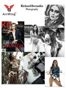
This week has been going pretty smooth; I received an email from Naeem that contained photos from photographer Richard Bernardin. Of course, the task was to create a promotional card by making a collage using the available photos. There were only seven photos presented for this piece; so I had to make the photos a little larger than usual and set the canvas to portrait. Four of pictures were low in saturation, two of them were monochromatic, and the seventh had an average level of saturation with red and white typography it was a magazine cover. There was not much difficulty in this task, so I completed it and emailed it back right away.

RICHARD BERNARDINx

Naeem liked it, but Scott wanted me to nudge the typography’s position. In fact; Scott wanted me to make the change to any of the previous cards with similar alignment issues. I understood the direction he wanted to go, but I did not share the same views because I positioned the elements based on balance. I explained that shifting the position will disrupt the negative space and will throw off the composition. Scott understood, and we agreed that I should only change the ones I find fit. I converted five cards, which happen to be eleven percent of the cards at the time.

Journal entry #8

What a week, being down on myself did not last long; I went from not wanting to celebrate my birthday to having one of the most enjoyable moments with friends. Now back to business, but this week no word from my supervisor; nonetheless there is only one thing to do, and that is to hold up my end of our agreement by dedicating 9 am to 5 pm on Tuesdays. Eight hours later and I am free, so now I will continue to work on a project assigned by Professor Fikaris without the worry of interruptions. So the project is to design the cover for The Seventy-six Honor’s Convocation. Not really sure what direction to take I started by making a list of studies at City Tech, and words that fit into similar categories. If I wrote design and then photography, from there I would record camera, lens, shutter, iris, flash, and lens flair. I then did a Google search on lens flairs, and I thought that would be a refreshing element to incorporate in my design. I already had my color schemes: blue and yellow the school colors, but I planned to use different shades. I also thought about the first words that come to mind when I think honor. I also searched for an element to represent New York and what better way but to use the skyline. cliché, but whatever I planned to use it in a subtle way. I also incorporated some hard lines and angles to give the feel of energy. Most the elements are on the canvas just have to figure out how to layout the typography, after choosing from two pages of possible combinations of course. That decision will not be made today though because I have been staring at this screen quite some time, and I need to step away; plus my stomach has been talking to me, and ­­­­it is very distracting so until next time, bye.

Journal entry #7

Time seems to be moving so fast it is already mid-October my birthday week. Oh, my birthday? October 14th in case you were wondering and yes the class met. Unfortunately, I suddenly came down with a horrible 24hr virus, so I could not make it to class. My best friend thought it would be better if she treated me to lunch, drinks, and a visit to the spa. She figured a massage and aromatherapy would help relieve some tension. In all honesty, I have been under some stress, but I am probably causing it by overthinking and doubting myself. Overthinking things like my age and what I still need to accomplish; questioning my ability to complete a portfolio and getting a start on my career. For instance, I am grateful for the opportunity to be interning for ArtWing NY, but I do not feel like there is any challenge and there is also the fact that I am not able to network and experience the culture of the company. Questions like am I wasting my time would cross my mind, but then I would remember even though this may not be the ideal internship there is still a purpose. If for nothing else but to satisfy the hours needed for the course that brings me a step closer to graduation. Procrastination has also become a prominent issue, but it is not like I am just sitting around doing nothing; nonetheless I could prioritize more. These are the thoughts that arise even more around my birthday another year added as my age goes up; I guess it has to do with realizing that I am not getting any younger. As you may have noticed the massage and aromatherapy were needed.

Journal entry #6

Woke up feeling great today, “today is a good day to have a good day” I read that somewhere. So Scott and Naeem sent me some photos during the week so I can come up with some ideas for Tuesday. Well, today is the day, and it felt good not scrambling and having an idea of what approach I would take creating this collage. The first one I chose to tackle was a technology shoot, shot by Tatsuro Nishimura. Speakers, laptops, IPads, and circuit boards are a few of the subjects in the shoot. Some were colorful appliances, so I made good use of the most memorable shots throughout the card. I also made good use of the shapes of the electronics, by aligning the hard lines to create a good flow to lead the eyes. Once I finished that I moved on to another promo card for Tatsuro, for this one the goal was to create a piece he could send to a potential client within the organic produce industry. There were berries, ice cream, and a beautiful wood with a weathered oak finish in the photos. The purples, greens and browns worked well creating a real organic feel in this collage. I ended up making three different versions because the photos worked so well together the possible combinations seemed endless. After finishing the cards for Tatsuro I was asked to make one for Phil Knott no photos or direction provided, but it was easier to do because I was already in my zone. I was enjoying the hunt and finding ways to be creative even though it was the same structure. I chose to do a collage of Phil’s portrait shots; the portraits featured different celebrities some in color and some in monochrome. All the shots felt raw and full of energy with a good focus on the eyes. I used photos with similar elements like one with a burgundy background, another with a guy in a burgundy shirt, and then I would include a picture with a pale green background. This was my way of creating a flow by playing with complimentary colors and showing repetition in a subtle but effective way. Scott and Naeem were pleased I could tell by the praises in the follow-up email after they received the work I sent.

Journal entry #5

I woke up to a bunch of emails from Scott and I cannot say I liked the tone, it read as if he was angry. Scott was upset that I do not reply to every single email he sends; he started making statements like if things do not change soon, working remote may not be the best option. Scott said the coffee shop where we interviewed could be a place to meet and work every Tuesday. I was not too fond of that idea because I do not remember that place being the best environment for work. So I explained that I do not have a problem with the current set up. I told Scott that last week there were a few network issues on my end, and I also stated that I am only committing to an eight-hour workweek from 9 am to 5 pm on Tuesday’s. In the beginning, this was the same agreement, but I want to believe that he forget due to all the things going on with the renovation and the expansion of his business. I only found out about the increase because the classmate I gave Scott’s contact to also secured an internship but not for ArtWing NY. The internship was for a new business venture to design and code a website; nonetheless, Scott and I quickly resolved out communication issues and got back to business right away. Things were better than ever he was giving more direction and showed understanding when I did not reply to an email right away if it is outside of our scheduled work time. I explained that school and my personal life could get a little overwhelming sometimes, and he understood. The promotional cards became a lot easier to produce as well and, to be honest, I enjoy the work I do for Scott hopefully things continue to flow this smooth between us.