Acevedo-presentation <—— CLICK ME 😀

Acevedo-presentation <—— CLICK ME 😀
My last week at the shop was nice, I didn’t have much due and I worked on the billboard as planned. I have a couple of variations (that I cant post right now because they haven’t been chosen) but they are looking good. I am going to miss Tread, and I will definitely keep in contact with them and visit because they are really great people and I enjoyed my time interning there. If I am given then chance to do it again I will. I still have a lot to learn about my work and myself but this was a fantastic start to it. I got to meet many people and work along with people with great ideas and hopes for the shop. I am now a huge fan and supportive of bikes, even more than I was before. It is just so convenient and great for the environment. I am looking forward in working with more places like Tread to expand my skills and work experience related to the industry. I want to continue exercising what I learned and using it in every “problem solving” issue that I encounter in the future.
The second to last week has approached and I can’t believe it. Everything seems like they happened extremely fast, I keep asking myself where did time go? It has been a real learning experience and I will take it everywhere I go. This week I have a final project and that is to create a billboard. The billboard is for our rental bikes. It will be shown at a very busy street so that a lot of people could view it. This kind of ad will display in the kinds of billboards that change every 30 seconds or so, so this billboard has to be straight to the point with not a billion things to read. I still don’t have the dimensions, but it I have started to sketch out the basic layout of different dimensions just to give myself a head start.
Even if I am not done by next week I will still like to work on the project to not leave them hanging and it wouldn’t be very professional of me. It doesn’t matter that it isn’t paid, the reward for me right now is all the experience I could get from here and on.
After working on the advertisements for social media, I have been given a next project, and that is to create a sign for rentals and the women’s department. The women’s department is fairly new in the shop, so they needed something so that the female audience is aware that there is a section just for them. Right now I am thinking of clever ways to show the female symbol (which my boss wanted to be included in the execution) I thought it was a great idea to use or have the female symbol because 1. I love working with symbols and 2. It is just very recognizable, plus as a designer there’s so many ways you can go about playing with a symbol.
This is how the ads have been looking like so far, all the pictures that have been used have been taken by me although is in the background, I didn’t want to use pictures from other places because I mean…it is not school anymore and I can’t afford the law suit. 

The ads have the same layout, just a different image and of course information.
This has been a great experience so far. I can feel and see myself become a better designer and just learning new things outside of school. Not only am I getting to know about bikes (which I never knew there were so many great things to know about them) I am learning a lot about managing my time and meeting deadlines. I sound a bit hypocritical since I have been slacking with my journals but they all have been for a good caused.
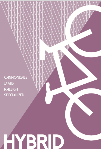
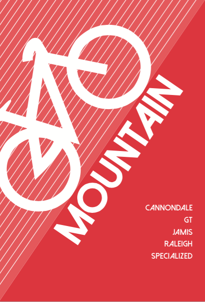
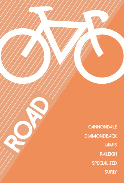
Today I got to see the finalized signs I created printed. They look pretty cool; I like how everyone was able to recognize the kind of bike it was by just looking at the illustrations I made for each of them. I kept them very minimal to no details, but the shape is what makes the brain understand what they are and of course the name helps. Here are the final ads that they chose to print out. These will be hung on the ceiling of the shop and they are all 3 pages each. One page shows the kind of bike it is with an illustration of the bike, second page are the brand names the shop has for that kind of bike and the third one is simply Tread’s logo.
signs2 <—– CLICK ME!
Finally done with signs, they are good to go. I got the news that they will be printed out and displayed on the shop. I can’t wait until I can see them up; I’ve never had anything I ‘ve done displayed to the general public so it is very exciting. I think is really rewarding when you know you have worked hard for something and for it to be shared and shown. I think is a huge deal because it definitely makes you more confident in yourself and in the work you do.
Today I began creating some more ads that basically speak about the sales, like I mentioned last week. The work hasn’t been hectic; they really understand and work with my schedule well. They like to see what I’m working on for other classes and even when there’s not much to do at the shop I can work on some schoolwork while they find a next project for me. The end is nearly a month away and I feel very anxious while at the same time looking forward to creating new things. This semester has been very interesting and this internship has helped me learn things about the way I work outside of school.
Today I went in with the revisions I had made from last week, and I still had to make a couple of changes. I don’t know why I had completely forgotten the fact that the signs are supposed to be big therefore the text has to be large in order for it to be seen…I guess it was a rookie mistake, but they are fixed now! While I was working on the sign revisions, I was taking some pictures around the store. These pictures are the ones I will use to create more advertising for the social media Instagram account. Because spring kind of just started the shop is having last week winter sales and early bike “tune ups”. So I gathered and took as many pictures as I could to have a couple of choices when the time for making the ads comes. The weather is still sort of sucky which makes coming to the internship or doing anything at all a drag. It’s cold and rainy and barely anyone is showing up, so the mood is more down and anything. Next week will be getting warmer so I believe the shop will pick up. Until then I’m keeping myself busy.
Lately I have been just working on the same thing. Basically, revising and making sure that they work. One of my biggest challenges so far has been getting to know the shop’s style (their brand identity). It is easier for me to create something that they think will work if I understand better how they will like to present themselves. Another challenge has been focusing on everything from the internship while managing my other classes. It is difficult for me to give the same amount of time to all of my work pieces.
So far I’ve enjoyed interning at Tread, because the people are nice and friendly. Everyone that works there throws their little bit of criticism to whatever I create which definitely helps me in the long run since they’ve been working there for a while. The signs I made for the different kinds of bike look completely different now than how they first started. I am very pleased with how they have developed because it works better with the shop’s look. I hope that when I am done with all the revisions, it will be something that my boss will approve of and hopefully print out for it to be displayed.
This week I kept working on the rest of the signs for the shop. They were pleased with the first 3 signs, so I kept the theme going and worked on the last 3. I also started working on their instagram account, which needs a bit more work, to gain more followers and raise awareness of TREAD which is one of the biggest bike shops in New York City. My goal is to post pictures of the store and the products they have, the new renovations, inspirational quotes for the cyclists and more…
These are the other 3 signs:
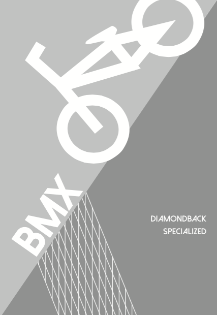
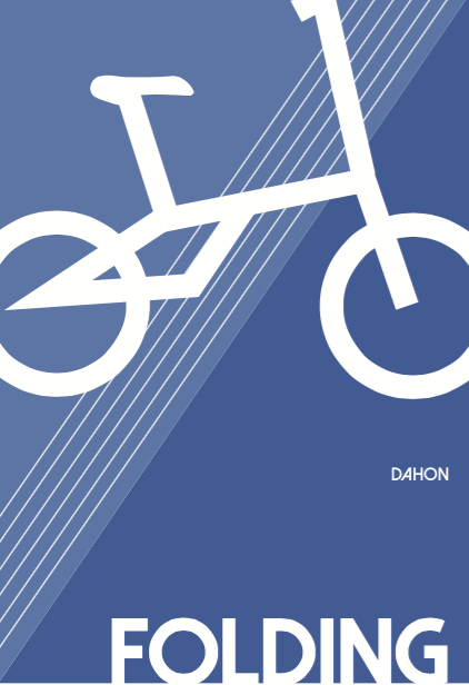
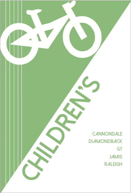
This week’s project was to create signs for the type of bikes the bike shop sales. Which are Hybrid, road, mountain, folding, BMX and children’s bikes. The store is currently being modified to improve its look and make room for more merchandise. The signs will help customers know exactly where to find the bike that they specifically come in looking for. I’ve tried to make every sign relate to each other visually, by using the same pattern as the background and utilizing lines for movement. I used bright colors to maintain a fun mood, and a capitalized san serif font for clear legibility.
There are the 3 first ones:
The OpenLab is an open-source, digital platform designed to support teaching and learning at City Tech (New York City College of Technology), and to promote student and faculty engagement in the intellectual and social life of the college community.

