
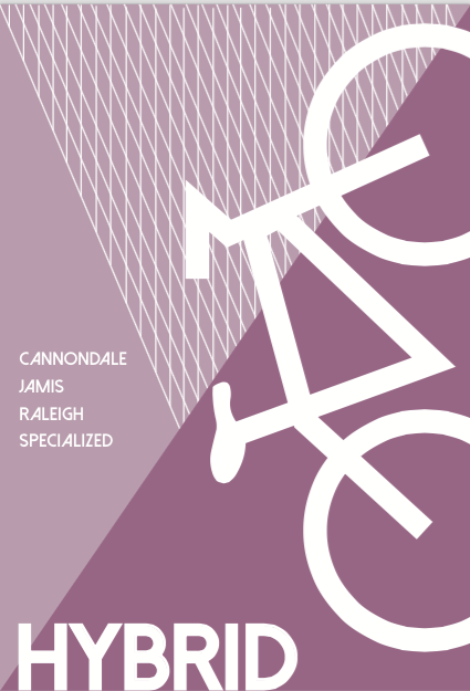
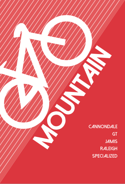
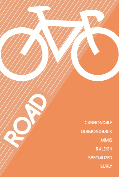
This week’s project was to create signs for the type of bikes the bike shop sales. Which are Hybrid, road, mountain, folding, BMX and children’s bikes. The store is currently being modified to improve its look and make room for more merchandise. The signs will help customers know exactly where to find the bike that they specifically come in looking for. I’ve tried to make every sign relate to each other visually, by using the same pattern as the background and utilizing lines for movement. I used bright colors to maintain a fun mood, and a capitalized san serif font for clear legibility.
There are the 3 first ones:


Dear Nancy,
This looks like a fun project. Personally, I think the middle layout format works best. In my experience, sometimes all you need to do is change the type and background color to achieve an overall result. While I’m pleased to see you’re posting, I really need to see more writing in each entry, about 250–300 words per week. Overall, the writing is clear and direct. Your first two sentences need revising however. The second sentence shouldn’t start with the word “which.” Our textbook, “Rules of Thumb,” can be helpful with problems like this.
Sincerely,