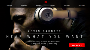
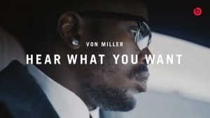
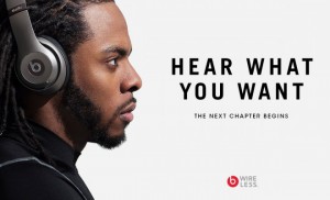
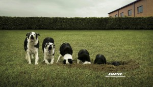
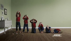
Both Beats and Bose have a different message and different ways of approaching there ads. Beats wants to focus more on the style of the headphones but letting people know that it’s something that you will keep wearing because of how loud it can get. Bose focuses more on the features and benefits of the brand/product using a kid, dog and a construction worker (who makes noise) and sorta has like a domino affect making it look like a volume control. Beats audiences focuses more on Adults, black consumers and people who generally love to listen to music with style. Bose target audience is the opposite which would be adults, audiences that want less noise and people who love tech who take there technology seriously. The Beats ads focuses more on profile focusing on the face with the product, while Bose focused on a mid-shot conceptual ad. Beats focuses on profile shots because it focuses on the product itself on the person’s ear making it look stylish and using celebrities to promote there products and to focus on there target audience which are black people. Bose focuses more on the conceptual photography to effectively communicate there features in real life situations.
Category Archives: Uncategorized
Bose VS. Beats
Bose and Beats are two of the most premium and leading headphone brands in the world, and with premium influence and quality comes a very specific consumer base.
To add some some emphasis on the term “specific consumer base”, we have to look at who exactly the companies really advertise and appeal to. Looking at the “Hear What You Want” campaign from Beats, it is mostly advertised towards people of color largely due to the fact that the campaign shows successful and influential black people. These black people could also in turn be idols and role-models for many fans and consumers of Beats headphones, which also may be sought after for the sound quality of the headphones. It also pushes the idea that anybody can listen to whatever they choose, regardless of what it is.
The Bose campaign, however, has a more… anti-music approach to their advertising. Their campaign focuses more on the noise-canceling technology of their headphones, as they are focusing on consumers who just really don’t like any kind of noise to begin with. Bluntly speaking, the consumer is mostly caucasian-based and more… privileged if you are catching my drift.
Campaign analysis 4-Beats and Bose
Beats and Bose are two leading brands of premium headphones. Compare and contrast Beats “Hear What You Want” campaign with Bose’s Noise Canceling headphones campaign. What is the intended message of each? Who is the intended audience? Describe the style of the photography used for each one. How does the photographic style support the intended meaning and audience appeal of each campaign?
Beats
Bose
Campaign Analysis 3 – Foursquare and Yelp
The tone and audience vary for both Foursquare and Yelp. Yelp is known for their review feature; their users are invested and want to be heard while Foursquare’s social media platform allows you to check-in on location, post statuses and connect with friends. However, both apps do allow you to find attractions and leave reviews.
They’re form of advertising also differs. The Foursquare ads portray two individuals – in some cases they look like total opposites and in others, not so much – who have very different personalities. Whether or not you may be dressed totally different from someone else, the point is that we’re all different and have specific, individual tastes that. In the Yelp commercials, we see scenario after scenario where people come across a certain circumstance where they need a specific service to help them with their situation. Overall, I’d say the largest difference in the style of photography with the ads is the lighting. The Foursquare ads are very well lit while the Yelp commercial has a lot more darkness in it because a lot of the commercial is during the night time or in a darkly lit area, like a restaurant. Something else I noticed was the difference in eye contact between both the ads. The models in the Foursquare ads are not looking at the camera and are preoccupied with something else. In the Yelp commercial however, each individual is speaking to us and engaging us with their situations.
Campaign Analysis 3 – Foursquare and Yelp
The foursquare ad talks about how people are labeled by there appearance, and these people would like to enjoy a specific experience. The Yelp ads shows how we can experience something new through there app.
Chris_A Campaign Analysis 3
For the yelp ad based off of the look and general feel of the ad the demographic is more for a everyday person that might need a quick fix or are willing to try out something new on the go so that way there will be a review for the places they are looking for so that they know what they will be getting into. Clearly a younger more general crowd that can relate to the crazy situations we find ourselves in.
The foursquare feel and take on it is for more sophisticated people that have specific things they like and personality so even though they are at the same place they are there for different reasons but because of what they like brings them together. This ads focus is for people that like specific things not to much into switching things up so they want a good place that meets their needs.
Campaign Analysis 3-Foursquare and Yelp
Foursquare and Yelp are competitors even if Yelp is wildly more popular. Next week’s shoot will be a variation on foursquare’s first advertising campaign:
http://www.businessinsider.com/foursquare-launches-multi-million-dollar-ad-campaign-2014-10
Yelp too is advertising:
http://www.adweek.com/news/advertising-branding/ad-day-yelp-your-awesome-goofy-savior-its-first-national-tv-commercial-167100
Compare these two campaigns. What is similar and different in each one? Sepcifically, what is the tone and the intended audience of each. Then compare the style of photography (even if one is video) used in each. How does this style advance the intentions of the ad campaign?
Campaign Analysis 2 – Shaving Beard
In these series of ads, there are several difference in both of them in terms of how they communicate. The first photo is a horizontal portrait using broad lighting. The image also includes a man with a beard with a squirrel attached to his face. The 2nd ad is a photo of a guy who looks menacing, serious, and tough. The ad uses short light and typography to communicate the brand/product using the athlete as a result for the consumer to shave with confidence. Each image has a different emotional tone to them. The first photo has a calm mood, and the reason why I say that is if you look at the lighting, the color and the expression of the person. He doesn’t seem to be bothered with what is in his face. While the 2nd photograph is more serious, uses colors that reflect the brand, a long with having a stadium as the background to show the setting of the sport as well.
Campaign Analysis 1 – Nicholas Kyriazopoulos
In these compositions they both communicate differently but has certain elements that make them both stand out. For example: The lighting in Raymond Weil shot is coming from above where the shot has been taken showing the contrast of the bodies, while in the Pantone ad you can see they use different colored lightings from different angels and casting shadows that creates an abstract vibrant feeling. The composition itself for both of them have different placements in terms of how they communicate. In Raymond Weil ad you can see that the composition creates an arch where the people create a elevated poses, while Pantone has the people placed within the colors and the environment. In terms of Angel of view, Raymond Weil has a standard mid-shot taken in the same positions, while pantone has a wide-shot that shows all the people in different position & distances from one another. The subject matter of these campaigns is in Raymond Weil you can see the people posing has a more serious approach in there positioning advertising a product, while Pantone is advertising art and abstraction, showing how colors work with one another in having models in the studio to show more life. The two images uses the metaphor of dance in a way to show expression and emotion. For Raymond you have something that’s serious elevated positioning in black and white forming an arch shape and using there arms for the dials on a clock. In Pantone is expresses vibrancy, freedom and just shows the feeling of fun to express how they feel being in that particular environment.
Campaign Analysis
These two images differ in many different ways. For instance….. one image is in black & white while the other in in color. Black & White has always been very powerful along you to feel emotion, creativity, etc. Colored images seem to be to distracting throwing you away from the the whole idea of the image. The black & white image seems to show more movement while the main focus on the colored image is actually the color in itself. “Precision” you can actually say the black and white image is very precise seeing as that the people are in mid air and the image is very crisp. On the other hand the Color image is more emphasized on the color more so then the actually dancing, but thats what usually happens when you incorporate color in an image. The similarities these photos share are the art of dancing. The term Precision for the watch also relates to dancing because if you aren’t precise then you aren’t going to be able to perfect what you are doing, thats like a watch not providing you with the right time it therefore just becomes useless. Precision is the key to success.

