Category Archives: Campaign Analysis 2-Shaving Ads

Campaign Analysis 2

The Schick ad has a half length three quarter view portrait. The Schick ad has broad lighting with little contrast. The ad has this man’s beard that has a animal in place of it and its trying to convey that men’s beards can get out of control and need to shaved. Schick is trying to get men to buy their razors to keep their beards under control. The tone of the photograph is more muted with the colors being really similar. They do this so that the animal in the beard is more camouflaged and makes the viewer really look to see that is not just a plain full beard but a animal instead.

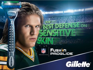
The Gillette ad has a three quarter view portrait that is bust length.  Their ad is trying to convey that using Gillette will help protect those with sensitive skin and they use a NFL player to enforce the idea of protection because in football defense is essential. The overall tone of the ad is very dynamic and is using colors that are included in the razor to help make a cohesive image. The facial expression of the player also helps convey defense because he has a very intense facial expression.

Campaign Analysis 2 – Shaving Beard

In these series of ads, there are several difference in both of them in terms of how they communicate. The first photo  is a horizontal portrait using broad lighting. The image also includes a man with a beard with a squirrel attached to his face. The 2nd ad is a photo of a guy who looks menacing, serious, and tough. The ad uses short light and typography to communicate the brand/product using the athlete as a result for the consumer to shave with confidence. Each image has a different emotional tone to them. The first photo has a calm mood, and the reason why I say that is if you look at the lighting, the color and the expression of the person. He doesn’t seem to be bothered with what is in his face. While the 2nd photograph is more serious, uses colors that reflect the brand, a long with having  a stadium as the background to show the setting of the sport as well.

GrandeJ_shaving ad analysis

The Schick ad’s tagline is free your skin. I feel as though they used an animal on a mans face to symbolize the ruggedness a man’s facial hair can get and used the word “free” to emphasize. It was also an amazing idea to go in a different approach and execution. Their razor is being portrayed to be the one to use when facial hair can be tough and wild.

In the second ad, the Gillete fusion execution, they go in a different approach. Showing a tough looking man, a football player looking right in to the camera which is suppose to give an impactful image and displaying the words sensitive skin gives off a humorous feel. The fusion razor is suppose to relate to the football player with great defensive properties built into the razor.

Chris_A

The first ad what i got from it was that the company sells shavers that are “sharp” enough to with stand any Hair type even if your a hairy animal. Probably focuses more on the quality of blade which would explain the overall sophisticated look of the ad.

The second ad has a toughness and a smoothness to it. They are probably trying to focus on the smoothness of the shave with the smoothness of his skin and the toughness of the guys expression making reference to the sharpness of the blades. So soft on skin tough on hair. Its also soft diffused light which adds to it compared to the higher intensity and grungy look of the other ad but thats because they are trying to portray two different things.

Comparison Between Schick and Gillette Campaigns

Schick and Gillette are both leading competitors in the shaving industry and both have churned out exceptional campaigns in the past, such as Schick’s award-winning “Free Your Skin” campaign. However, there are multiple differences between both of these ads.

For instance, the Schick ad uses a more direct and less contrasty butterfly lightning in their ads to give it a more sophisticated and aesthetically pleasing look. However, Schick manages to communicate their brand through the fact that the “beard” of the model in the shot is actually a squirrel masquerading as a beard. This shows that they are aware of the hipster trend of beards and are parodying it, in a sense.

The other difference between the two is the fact that the Gillette ad uses a more broad lightning for the model in the ad. From my observation, this is likely due to the fact Gillette had intended to accentuate the details of a clean-shaven face – which is starkly in contrast to the Schick ad.

Beards Compare and Contrast

Both of the two ads give off a very different vibe. First, the portrait about the bearded man is a full frontal, waist length, and the man head is 3/4 turned. The lighting is broad with smooth shadows. The ad is in portrait by the way the model looks confident.  The Audience the ad was communicating were hipsters who love to embrace their beards. The tone they are trying to produce are confident hipsters. On the other hand the Gillette ad gives off a different vibe. This is a landscape ad. The model is shown from shoulders and up. He is looking towards the camera and gives a masculinity to his audience. The audience they are trying to pursue is the manly athletic type men who likes a clean cut.

Vlad_Comparison

The two campaigns have quite a few differences between them. The gillette one has this clean shaven football jockey staring right at the camera while the schick ad has the person staring far off into the distance. Gillette has used short lighting while schick used broad lighting. The other main differences revolve around their message and audience. Gillette’s clean shaven campaign is geared more towards that football jockey personality whereas schick’s seems to be geared towards the hipster type of personality. It has a far less serious tone since it literally puts a squirrel on the face of a person. It also seems to say that you don’t need to rush and shave it off your face, having the model stand there with confidence. We can also see the differences in target audience based on the clothing that the models are wearing.