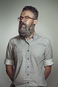
The Schick Free Your Skin ad is a half body shot. I would say that the lighting the photographer used was rembrandt lighting, we only see few shadows on the the side of the model’s face. It’s awesome how they incorporate an animal on the model’s face to feign the guy’s beard. This ad is not straight forward, the viewers cannot tell what the ad is about until they see the brand’s name. The ad to me seems to be targeting hipsters because of the way the model is dress. Also the lighting in the background makes the model look more clean and classy.
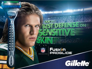
In the Gillette ad the player is looking straight at the camera making it seem like he is challenging the viewers. In the other ad, the model is looking away from the camera. The player looks tough because of the shadows on his face, the shadows make him look aggressive. The Schick ad is more busy, there is a lot of thing going on like the lettering. The ad goes straight to the point, we can tell what it is about and what they are trying to sell, we can tell this because they placed the razor, lettering and the brand in the ad. The ad is targeting not only hipsters but everyone that likes sports, the ones that feel tough just to mention a few.


