Author: Faye Wang (Page 1 of 3)
Draft presentation slides
The trend word that I want to talk about is the “Metaverse”. I know the term is familiar to people in the Internet industry, but for the general public, it’s still underground. However, there is no doubt that it is the mainstream of the future society. I think a lot of people heard about the concept of the metaverse through the news that Facebook changed its name to Meta. The concept of a metaverse is pretty straightforward, an artificial space parallel to the real world, which is an extension of media. The word metaverse was coined in Neal Stephenson’s fiction novel “Snow Crash”, where humans, as programmable avatars, interact with each other and software agents, in a three-dimensional virtual space that uses the metaphor of the real world.
Due to the impact of the COVID-19 pandemic that lasted from the beginning of 2020 to today, social virtualization has accelerated in just two years, and the number of incidents that people use the Internet every day has increased dramatically. People are used to using the Internet to communicate at work and for some entertainment purposes. In my opinion, from the use of software such as Internet games and online conferences to online shopping and takeout orders, all the interactive behaviors that bring convenience to people’s lives through media will be unified into one space by the metaverse. The more people rely on the convenience of the Internet, the sooner the age of the metaverse will come.

Heller highlighted the significant roles of mainstream vs. underground concepts in design. These concepts are defining contemporary design today. For example, commercial culture continues to survive, but intellectual property thefts. Mass marketers use the stolen intellectual property and ideas from visionaries by altering the original ideas to achieve livelihood. These marketers or commercial artists reissue the same for public consumption as a new product. The commercial culture transforms an insurgent into a commodity. Initially, ideas or designs that could have been shocks of new designs have become shlock of modernity (Aldhahi). The early expressions and alternative cultures have become sampling grounds that mass marketers pilfer for their new publications. Invariably, the founders of radical ideas are wellsprings of appropriation. Heller observes that rebellions breed following, who form a new demographic.
Design is one of the most valued topics in the modern world. However, many people have developed negative judgment on this topic, particularly the mainstream appropriation. The mainstream appropriators twist the real meaning and identity of underground designs. The questions surrounding the creation of subversive designs and art remain a concern. The underground designs appear to be a commercial venture because it is no longer an outlet for subversive thinking (Aldhahi). The commercial culture and design must have influenced underground art. It is necessary to consider creating ideas and images with hidden meanings. The mainstream, however, continues to strip away the creation of original images. Heller reiterated that avant-gardes prioritize the mass marketplace instead of original ideas.
The commercial mantra influenced the work in question. It saw the advertising executives borrow or co-opt avant-garde art into their quotidian products and campaigns to capture customers’ attention (Aldhahi). Expressionistic and futuristic veneers understood that the avant-garde modern art features superseded strongly-worded slogans (Heller 99). Commercial artists added new ideas and ornaments to modern art to make them palatable. The styling goods doctrine proved critical in the new product marketing and progression. The underground designs only required a few ideas and elements to make them tolerant and appropriate for commercial purposes. The underground design targeted new and improved modern arts to define the commercial culture.
The work in question has shaped the mainstream in different ways. The experimental designers and artists focus on improving existing arts and designs to achieve their commercial interests and mantra. For these designers, it is needless to waste time investing in original work and ideas (Arzensek 19). The commercial artists only target the modern arts and appropriate them. These artists add ornaments to make them palatable. The two ways of styling the goods included capable mimics and skillful acolytes. These intrepid commercial artists only focused on MAYA because the elitist subculture created a predictable trajectory for mass acceptance. The futuristic veneers threatened the underground design because the mainstream or psychedelic artists overturned the rules of the game. Joan Cornella uses surreal communist and iconic comics and artwork to communicate his message to the audience. The Spanish illustrator and cartoonist use original ideas and incorporate them into black humor (S16Gallery). The illustrator uses the mainstream media, especially social media, to share his exemplary and creative artworks and comics. His cartoons and illustrations make him an influential visual artist capitalizing the distinct cultural characteristics and expressions to make shocking and interesting art. His work fits into this dichotomy because of the cartoonist’s efforts to overturn rigid artist rules and manifest the ideals of modern society.
Aldhahi, Mariam. “How Steven Heller Redefined the Design Industry.” Magenta, February 8, 2017, magenta.as/how-steven-heller-redefined-the-design-industry-c02aca4d742c. Accessed April 25, 2022.
Arzensek, Martin. Underground Vs. Mainstream Cultural Production- Valorising The Underground And Ethnographic Research On Underground Electronic Dance Music Movement. Erasmus School of History, Culture, and Communication: Cultural Economics, and Entrepreneurship, Rotterdam, June 2016.
Heller, Steven. “The Underground Mainstream.” Graphic Design Theory, 2008, pp. 98-101.
S16Gallery. Joan Cornella. S16, n.d, s16gallery.com/artist/joan-cornella. Accessed April 25, 2022.
- I was very interested in the illustrator Joan Cornella and his works. He is Spain’s most famous caricaturist.
- Dark humor and criticism of society are often presented in cartoons which is the most part that attracted me to his works.
- His works always contain current hot topics, politics and race. It can be said that he is an illustrator or artist who cares about social phenomena.
- In his works, there are usually only bright colors and figures to show the absurdity of everyday life. I think it’s the same form of expression that we’ve been talking about in the linguistics articles.
- I think his works belong to surrealism because they are critical in nature.
- I think I can come up a theory because there are too many things that happens in daily life needs artist to criticize with.
- In advertising, the signification of images must be obvious. Certain attributes of the product preconstitute the meaning of the advertising message, and these meanings should be communicated as clearly as possible. If images contain symbols, it is a safe bet that these symbols are fleshed out in advertising and made for easy to understand.
The three massages:
Panazani ad:
- Linguistics, the interpretation of linguistic information in a scene
- Associations between colors and language information
- The relation between image and composition
- The use of text messages
Conclusion:
- language information
- symbol information with a symbol
- symbol information without a symbol
The linguistic message:
In the scene, all elements text, composition, color, symbol and information, as well as the scene itself, constitute the description of the scene, which is linguistic information.

This Starbuck’s ads that Shayne used fascinates me the most. I think this poster is very successful. First of all, it does not use too many colors and lines, or even use any text. In the poster I see five people with different skin tones, hair color, height, race, age and occupation. These figures don’t even need a face depiction. It only uses the silhouettes of five characters to closely connect the Starbucks store staff and customers. It also shows the diversity and inclusion that Starbucks wants to convey to consumers. The front of the poster is an elderly person. In today’s society, the elderly are often ignored by businesses. Putting the elderly at the front of the poster also reflects Starbucks’ respect. Said that this poster expresses strong inclusiveness with seemingly simple lines, which is very successful.
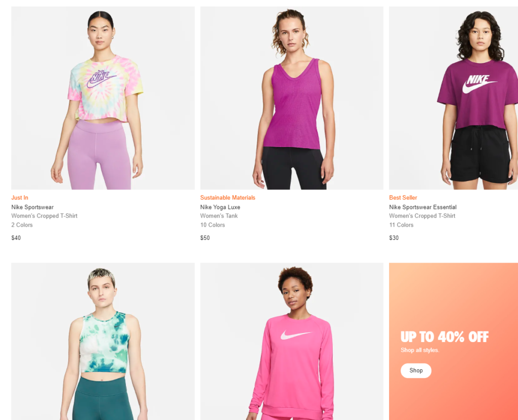
Through this week’s reading, I feel that I’m more willing pay attention to the content of the posters after seeing the advertisements. It is gratifying to find that marketers take great care to include every race, gender and culture in their advertising. It also makes me more willing to learn about inclusive brands. However, I also found many brands under the guise of inclusion, but the actual content is nothing, and I also despise this. Some of the good ads I’ve seen recently are Ami Paris and Nike clothing ads. As we can see below. Ami is a French clothing brand. Ami means friend in French. Their philosophy can also be seen in this poster. No matter gender, skin color or race, everyone can get together and become friends. This poster by Ami brings this affinity to me and reminds me of my time with my friends all at once. I find this poster very successful and infectious.

Another very successful promotion is the model photo from Nike’s official website. In the option of women’s tops, you can feel the diversity of Nike as soon as you open it. After wearing Nike clothing, you can feel their inner self-confidence from different races and different female images. On this site, if you continue to slide down, there are some women who are fatter, who also exude confidence. Nike often uses models with slightly fat bodies in its apparel promotion. I think this is a good idea, which can make more consumers feel immersed in it, because not everyone has a body like a model. Nike has firmly captured the hearts of consumers at this point. Contrary to clothing brands like A&F, I won’t post photos because I despise their promotional ideas.

Finally, let me give a negative example, that is the promotional video for the Year of the Tiger by the well-known luxury brand Gucci. As I said above, Gucci’s advertisement this time is just pretending to be inclusive, and the actual content has no connotation at all. First, the models they brought in were really people of different races and genders. But about Asian models, Gucci seems to have some misunderstandings about the appearance of Asians. The selection and styling of the models seem to be maliciously smearing Asians, which makes me very puzzled. Secondly, the models are all very slender., which is also very unreasonable, and will mislead people that thin is beautiful, especially if teenagers see this kind of advertising, they will develop wrong values. Over all, for me, after watching this commercial video, I have no desire to buy these series of products. In future shopping, I may also consider other brands instead of Gucci.


Recent Comments